Archive for January 2013

Comic Art Friday: The wizard, the witch, and the wardrobe

January 25, 2013

As noted in the first couple of Comic Art Friday posts for this year, my comic art collection has, over the years, become focused on commissioned pieces that fit into my signature themes. A quick glance at my gallery, however, makes clear that I own a boatload of art that isn’t either Common Elements or Bombshells!, or even personally commissioned by yours truly.

When I first started collecting, most of my acquisitions were existing pieces that I hunted up on eBay, or in the “For Sale” galleries on Comic Art Fans. While a fair portion of these random artworks featured characters in whom I had a particular interest — we’ll chat more about my character-specific galleries as the year progresses — many were simply images that I liked at the time, and could pick up for what seemed a reasonable price. Today, I look at some of these and ask myself, “What in the Marvel or DC Universes possessed you to buy THAT?” (Which prompts this Note to Self: We really need to thin the herd this year.) Others still hold elevated status in my collection.

One of my early purchases remains unique: It’s the only item in my entire arsenal that I did not commission, but that directly resulted in my commissioning something else.

Doctor Strange, pencil art by Geof Isherwood

Looking at it now, I remember my first glimpse of this depiction of Doctor Strange by the talented, charming, and all-around nice guy Geof Isherwood. I was never a huge fan of Doctor Strange’s solo adventures. I didn’t really gravitate toward the character until he became the linchpin in Marvel’s superteam, the Defenders. But at the time I saw this piece, I found myself immediately and intensely drawn to its mystery — who’s firing those energy bolts at the Sorcerer Supreme? That story, I felt, needed to be told.

So I bought the art from Geof, and asked him if he’d be willing to draw a companion piece that would represent the other half of this tableau. We decided that the unseen aggressor would be Wanda Maximoff, better known as the Scarlet Witch, one of my all-time favorite heroines. The result was the nifty picture you see below.

The Scarlet Witch (classic costume), pencil art by Geof Isherwood

My intention at the time was to frame both drawings, and hang them on my office wall in such a way that the viewer could see the two images completing a single scene. Alas, the wall space I had to work with didn’t lend itself to such display. (Because of the perspective angles, the pieces don’t line up side by side. The Scarlet Witch has to be positioned slightly above and to the right of Doctor Strange, with roughly twelve to eighteen inches of diagonal air space between them.) That’s unfortunate, because Geof did an excellent job of designing the second image as a match for the first. I content myself with taking Doc and Wanda out of their portfolio every now and again, and laying them on the floor at the appropriate juxtaposition, just to remind myself of the intended effect.

The Scarlet Witch I commissioned from Geof Isherwood is unusual in my collection for a second reason. I don’t typically own more than one representation of a single character by the same artist. However, shortly after Geof completed this piece, he posted another Wanda drawing for sale, this time wearing her Gypsy-inspired costume designed by the great George Perez. I immediately fell in love with it. (I believe it’s the eyes.) Rationalizing the fact that even though this was yet another Isherwood Scarlet Witch, the outfit gave the second work an entirely different flavor, I purchased this one from Geof as well.

The Scarlet Witch (modern costume), pencil art by Geof Isherwood

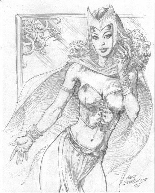
Geof’s second Wanda also holds a special distinction — it’s the only completed artwork I’ve ever asked its creator to alter ex post facto. (I have, on occasion, requested that an inker tweak something, but that’s another post.) In his original conception, Geof gave Wanda a preternaturally imposing bosom — think Power Girl or Red Monika from Battle Chasers, if you’re familiar with either — and designed her bustier to expose considerably more of said bosom’s surface area. In any other situation, I’d have declined — with heartfelt regret — to buy the piece, regardless of how compelling I found other aspects of it. (Again, the eyes.) In this instance, though, I figured I’d built sufficient goodwill with Geof — due to several mutually satisfactory transactions, including the one I’ve already described herein — that it couldn’t hurt to ask whether he’d be willing to entertain a minor alteration or two. The worst that could happen is that he’d say, “No way,” and sell the piece to another collector who’d be delighted with it as it was.

Luckily for me, Geof kindly took eraser and pencil — in that order — to the art, pseudosurgically shrinking Wanda’s frontal real estate from DDD to a more natural C, and adding a strategic dash of virtual fabric to the upper half of her costume. A win-win for all concerned.

Which brings me around to a final point. Anyone who knows me knows that I’m no prude. I have no issue at all with art that depicts the nude or seminude human form. Indeed, I greatly admire the works of classical masters such as Titian, Botticelli, and Rubens, many of which are nudes. But I’ll confess that I’m not a fan of comic art that overexposes the heroes and heroines of my four-color youth. It’s not that I object to such works in and of themselves, or to either their creation or collection. It’s simply that I don’t want them in my gallery, for reasons that have little to do with aesthetics, or with any perceived moral stance.

My issue is a bit more personal, and visceral: I think of these characters as my friends.

I started reading comic books 45 years ago. Over the decades, I’ve spent countless hours immersed in the adventures of my favorite superheroes and superheroines. Even though I don’t take them more seriously than good sense warrants — and I certainly never forget that they are anything but figments of imaginations far more gifted and vivid than my own — I feel at some level personally invested in them.

That said, there are many aspects of the lives of my real-world friends that I am happy to leave untouched… no pun intended. I don’t particularly want to view, for example, the intimate details of my friends’ sexual exploits, any more than I’d care to share those details of my own life with even my closest confidants. Biological functions go on daily in my friends’ lives, to which I feel neither need nor desire to be a witness. And I don’t particularly want to see my friends naked — this despite the fact that I have, if I may be frank, quite a number of aesthetically pleasing friends of both genders, who probably look just fine attired in nothing but the equipment the good Lord gave them.

Not that I don’t want my friends to have happy and mutually fulfilling sexual relationships, or enjoy regular bowel functions, or look simply smashing in the altogether. I do. I just don’t need to examine the evidence.

And I feel pretty much the same about my imaginary friends, too.

It’s kind of like a joke often told by the legendary George Wallace (the standup comedian, not the late racist politician): “Someone said to me the other day, ‘It’s as cold as a well-digger’s butt out here.’ And I said, ‘I don’t want to know my well-digger that well.'”

See? I told you we were going to get way more self-revelatory around these parts in 2013.

And that’s your Comic Art Friday.

Comic Art Friday: Birth of a notion

January 18, 2013

I didn’t set out to be a theme commission guy.

In fact, at the beginning of my art collecting journey, I didn’t know that there was such a thing as a commission theme. Much less did I aspire to have one.

But nearly a decade down the road, my reputation in the insular ranks of comic art collectors is firmly cemented. I’m the Common Elements Guy. And, to a lesser extent, the Bombshells! Guy. Or, to that significant segment of collectors who disdain commissioned art (and those who collect it) in favor of published pages, one of “those guys.” I’m among a tiny minority within the ranks whose collection is defined by commissions focused on one or more unifying themes.

And it all started with this drawing.

Spider-Woman (Jessica Drew) and Spider-Woman (Julia Carpenter), pencils by Michael Dooney

On December 1, 2004 (I don’t recall the date from memory, but I keep records of this sort of thing), I commissioned the above piece from artist Michael Dooney, who’s done a boatload of work for the Teenage Mutant Ninja Turtles franchise. Mike had recently done a pair of drawings for me — pinups of Ms. Marvel and Saturn Girl — and I was madly in love with his style. (I still am. I’ve commissioned Mike more times than any other pencil artist.) For my third Dooney commission, I decided to ask for a depiction of Spider-Woman — more specifically, the original, who wore a red-and-yellow costume and whose real name was Jessica Drew. (That’s her at the top of the picture.)

Jessica came into being in the late 1970s, when Marvel went through a frenzied burst of creating distaff versions of many of their established heroes. Ms. Marvel and She-Hulk evolved from that same gender-equity soup. Marvel’s idea was to lock up trademarks on all of the variations, so that the Distinguished Competition didn’t steal their thunder by coming out with characters using those names. (The two companies had squabbled over Marvel’s creation of Wonder Man when DC already had Wonder Woman, and DC’s release of Power Girl not long after Marvel debuted Power Man.) I always thought Spider-Woman was an interesting heroine, and figured Dooney would do something visually appealing with her.

The exact thought process is now lost to the mists of history, but at some point before I told Mike what character he was drawing, I said to myself, “Wouldn’t it be cool to have both Spider-Women together?” Because, you see, Marvel also had a second Spider-Woman, who came along in the mid-’80s after the first Spider-Woman’s brief blaze of glory had fizzled out. (Jessica was killed off after a 50-issue run in her own title, and although resurrected shortly afterward, was pretty effectively out of the spotlight.) Spider-Woman II’s debut coincided with Spider-Man’s much-publicized switch from his familiar red-and-blue Spandex to an eye-catching black-and-white ensemble (which eventually became a character in itself, the supervillain Venom). The second Spider-Woman’s garb matched the Web-Slinger’s snazzy new togs, which made for a handy promotional gimmick. (Fortunately, her costume was merely a costume, not a symbiotic alien creature in disguise.) Anyway, I thought the contrast between the two Spider-Women’s uniforms and hair — Jessica has black tresses, while Spider-Woman II (Julia Carpenter) is a redhead — would make for a striking image.

At first, Dooney resisted the idea. “I don’t usually do two-character commissions,” he told me via email. Whatever I said in response, however, must have been persuasive — I’m sure that no offer of a firstborn child was involved — because in the end, Mike agreed to draw the two Spider-Women. (If I remember correctly, Mike surrendered to my pleading by saying, “Well, it’s the holidays.”) I had the pencil drawing in hand less than three weeks later. The art was finished in ink by Joe Rubinstein in 2005, as you can see below.

The Spider-Women (Jessica Drew and Julia Carpenter), pencils by Michael Dooney, inks by Joe Rubinstein

When I saw what Mike had done with Jessica and Julia, the proverbial light bulb flashed on in my head. Wouldn’t it be cool to have several pieces pairing characters that are somehow related, but yet are distinct from each other? I immediately started brainstorming. As the idea took shape, I quickly got away from the Spider-Woman template — essentially, two iterations of the same basic character concept, created by the same publisher (even though Jessica and Julia’s powers are quite different, they’re both Spider-Woman) —  and honed in more specifically on what became the Common Elements theme: characters, usually unconnected to each other in continuity (unlike the two Spider-Women), but who share some trivial point of intersection, whether a similarity in name, costuming, or superpowers, or something more obscure.

From this humble origin grew the legend.

Michael Dooney’s “Spider-Women” launched my signature theme. It’s a bit ironic that this piece should be designated as “Common Elements #1,” given that its subject doesn’t precisely fit the now-cast-in-concrete definition of a Common Elements commission. But it’s okay, I think, for the concept to evolve somewhat away from its starting point. That doesn’t change the fact that, had it not been for this artwork, I might never have come up with the theme that has so thoroughly defined me as a collector.

Which brings me to the underlying message of Common Elements. Much of the beauty of life is the balance between contrast and connection. In Eastern philosophical tradition, this balance is typified by the yin-yang symbol — contrasting elements that together form a whole. It’s negative and positive, masculine and feminine, ebony and ivory — living together in perfect harmony. Common Elements is all about finding linkage where no linkage exists, and making connections in unexpected and unorthodox ways, so that things that would not ordinarily appear together come together to create beauty that would be incomplete without one or the other.

I wasn’t thinking of this consciously when I hit on the idea of Common Elements, but I believe this is part of why this theme resonates with me on such a visceral level:

I am a biracial individual. Although my adoptive parents were both African-American, and I thus was raised in a culturally black home environment (whatever that suggests), my biological parents were of different ethnicities. My genetic mother was of European descent; my genetic father, of African descent. As odd as it may sound to people of my daughter’s generation, at the time I was conceived it was illegal in most parts of this country for my biological parents to marry. I have no idea what brought my progenitors together — everything I know about them comes from a single typewritten paragraph of general description about each — but this I do know: Had they not found their way to one another, despite their differences and the then-prevailing environment hostile to those differences — I would not exist. And yet, the fact of my existence proves that, different though they were, my birth parents shared a common biology. Both their differences and their commonalities make me, me — at least, on a physical level.

When I commission a new Common Elements artwork, I’m bringing together artists and characters that, in most cases, have never been united before. I’m defining a connection between heroes and/or heroines who have, in most cases, never been connected before. I’m envisioning something that no one else has seen, and finding a means of bringing it to reality.

I think that’s kind of cool.

In a certain way, that’s kind of like who I am. Which in itself is kind of cool, too.

And that’s your Comic Art Friday.

Comic Art Friday: Let me do right to all, and harm no man

January 11, 2013

As noted last week, I’ve developed a new focus for Comic Art Friday in 2013 — revisiting (more or less chronologically) some of the milestone artworks in my galleries, and considering from a fresh perspective why these pieces helped elevate my collection to its present heights. Because I’ve written about most of these pieces (and the characters they portray) in detail over the years, I’m seizing this opportunity to reflect more on what each of these drawings says about me, not only as a collector and connoisseur of original comic art, but as a human being as well.

Today our spotlight falls onto this potent pinup by Darryl Banks, best known as the penciler of DC’s Green Lantern from 1994 through 2001. Featured here are the seminal pulp magazine hero Doc Savage — often cited as a precursor to Superman — and his cousin Patricia, who periodically accompanied Doc and his assistants on their adventures.

Doc Savage and Patricia Savage, pencils and inks by comics artist Darryl Banks

I commissioned this piece from Darryl sometime in the closing weeks of 2004 (I could look up the exact date, but then, you know, I’d have to look it up), and he drew it during the first few days of 2005. For all I know, it may have been the first commissioned artwork he created that year. I know for certain that it was the first Darryl ever drew for me, but it was far from the last. We’ve done a dozen more projects since this one, including three for my Common Elements theme and a set of four — featuring the key female characters from Will Eisner’s The Spirit — for my Bombshells! gallery. But I’ll always hold a special fondness for this one, the nexus at which my relationship with Mr. Banks began.

As noted above, most comics aficionados know Darryl from his long run on Green Lantern, during which he co-created Kyle Rayner (DC’s Green Lantern standard-bearer for most of the 1990s). I, on the other hand, remembered him as the artist who drew the 1991 Millennium Comics miniseries Doc Savage: The Monarch of Armageddon. That book still holds up as the most effective translation of the Man of Bronze to the comic book medium. (It’s astounding how many attempts at a Doc comic there have been — by both of the major publishers, and by several smaller concerns — and how horribly wrong almost all of them have gone. Case in point: DC’s recent First Wave line, which managed to mangle Doc and several other classic heroes all in one fell swoop.) When I heard that Darryl was taking on commissions, I couldn’t wait to have him draw Doc once again.

You have to understand how important this was to me. Outside of comics, Doc Savage might be my favorite fictional character of all time. Throughout the 1970s, I devoured the Bantam Books paperback reprints of the original Doc novels, the moment each one was published. I practically memorized Philip Jose Farmer’s tongue-in-cheek “biography,” Doc Savage: His Apocalyptic Life, in which the author connects Doc to dozens of legendary characters as part of his Wold Newton chronology. (Capsule summary: Farmer posited that a meteorite strike near the English hamlet of Wold Newton altered the genetic structure of a handful of people who happened to be nearby. The descendants of these folks became, in Farmer’s alternate history, many of literature and popular culture’s seminal heroes, including Tarzan, Sherlock Holmes, and of course, Doc Savage.) To my mind, Darryl Banks (along with Mark Ellis, who wrote The Monarch of Armageddon) was one of the very few creators to see Doc the way I envisioned him through all 181 of the original pulp tales. To have a new Doc drawing from Darryl represented an incredible opportunity.

Doc Savage appealed to me, I think, because although he was an unparalleled physical specimen, his primary weapon was his powerhouse intellect. He surrounded himself with other brilliant minds as well — his assistants included the world’s greatest chemist, attorney, civil engineer, archaeologist, and electrical technologist. (Where Doc’s creator, writer Lester Dent, fell short was in giving Doc helpers whose talents were rarely of genuine benefit. Doc’s chemical expertise ran circles around “Monk” Mayfair’s, he knew more about archaeology than “Johnny” Littlejohn, and he possessed more inventive creativity than “Long Tom” Roberts. And when did a globetrotting superhero ever have need for a lawyer, or a guy who built bridges for a living?) Growing up as “the smart kid,” I loved a hero whose brainpower equaled or surpassed his brawn.

I also like a dash of nobility in my heroes, and Doc most certainly had that. By “nobility,” I don’t mean social status or an aristocratic background. I mean it in the sense of character. We’ve become accustomed in the modern era to heroes whose morals and ethics often barely distinguish them from the villains. Think of the post-Frank Miller Batman, and you’ll see what I mean. Don’t misunderstand — I want my heroes to have human flaws and foibles. The reason I favored Marvel over DC in my youth had much to do with the way Marvel’s heroes always had realistic problems, life challenges, and weaknesses, whereas DC’s Silver Age characters always seemed too good to be true. But I want even my imperfect heroes to be well-intentioned. Spider-Man made mistakes and poor decisions — sometimes horrifically poor ones (ask Uncle Ben) — but you never doubted that behind the mask, Peter Parker was a good guy trying to do the right thing.

Doc Savage had that noble character I admire, and would wish to emulate, in a hero. (As did many of my favorites, both in the comics — Wonder Woman, the Black Panther, the aforementioned Wall-Crawler — and in other media — Bruce Lee’s enigmatic protagonist in Enter the Dragon, to cite an example from a beloved film.) Witness Doc’s oft-repeated credo:

Let me strive every moment of my life to make myself better and better, to the best of my ability, that all may profit by it.
Let me think of the right and lend all my assistance to those who need it, with no regard for anything but justice.
Let me take what comes with a smile, without loss of courage.
Let me be considerate of my country, of my fellow citizens, and my associates in everything I say and do.
Let me do right to all, and wrong no man.

Wouldn’t it be a brighter world if we all tried to live by the Doc Savage code?

It always saddened me that Doc never got his just due in present-day pop culture. Most of the comics about him have been wretched, and don’t get me started about George Pal’s ludicrous 1975 film, Doc Savage: The Man of Bronze. But that Millennium miniseries pretty much nailed Doc. So, what a treat it was to get the artist who created the art for it draw Doc for me! (Later, I acquired from Darryl Banks about two-thirds of his original art pages from the first issue of The Monarch of Armageddon. A stunning double-page cityscape Darryl created for that issue adorns the entranceway of our house.)

Although I had only commissioned one other two-character piece at the time, I felt inspired to pair Doc with his indomitable cousin Pat. Even the most cursory review of my art collection reveals that many of my favorite heroes are, in fact, heroines, and Pat Savage could stand with the best of them. Although she appeared in fewer of her stalwart relative’s adventures than any of his male sidekicks, Pat always showed herself to be as smart and confident as (and often more mature than) any member of the “Famous Five.” Even when Dent and the other Doc Savage scribes fell into the trope of Pat as cliched damsel in distress — everybody in Doc’s inner circle got kidnapped a lot — they generally avoided making her seem foolish or weak in the process.

I very rarely offer specific direction to the artists I commission. In this instance, though, I remember asking Darryl to draw Pat without shoes. I had seen a then-recent example of Darryl’s commission work that depicted Wonder Woman barefoot, and I liked that concept for Pat here. Since James Bama, the artist who painted the iconic covers for Bantam’s reprint paperbacks, frequently portrayed Doc with his shirt hanging in tatters from his muscular torso, it made sense to me that if Pat were duking it out with some nefarious characters alongside Doc, she’d kick off her stiletto pumps to give herself better footing for the fight. (I’ve never understood why any heroine would wade into the fray teetering on high heels. Then again, it worked for Ginger Rogers… even backward.)

One of these days, someone will produce another worthwhile Doc Savage comic series, or better yet, a truly excellent Doc Savage film.  Until that day comes, I’ll keep admiring this fine drawing by Darryl Banks. And, like Doc, I’ll keep striving to make myself better and better, to do right to all, and harm no man. (Or woman. Or transgendered person. I’m an equal opportunity good guy.)

And that’s your Comic Art Friday.

If I had a ballot…

January 8, 2013

…I’d ballot in the morning. I’d ballot in the evening, all over this land.

And assuming that ballot were for the National Baseball Hall of Fame (“the Hall” for the remainder of this post, because I’m not typing that entire name over and over again), here’s who’d be on mine this year.

  • Barry Bonds
  • Roger Clemens
  • Jeff Bagwell
  • Mike Piazza
  • Jack Morris
  • Lee Smith

Tomorrow, the members of the Baseball Writers Association of America (hereafter “the BBWAA,” because, well, see above) will announce their selections. I fully expect, based on the electors who’ve already publicized their votes, that Bonds and Clemens will not make the Hall in this, their first year of eligibility. Indeed, I would not be surprised if Bagwell doesn’t make it either, though the case for his election or omission is more easily argued from either side, in my opinion. (I doubt that Morris, who’s on the ballot for the 14th year, and Smith, who’s on year 11, will ever be elected, for different reasons than the aforementioned players.) Piazza? Hard to predict.

But let’s get this on the table right now: If Bonds and Clemens — the greatest offensive player and pitcher, respectively, of their generation — are not elected to the Hall tomorrow, as I suspect they will not be, it’s a travesty.

Most, if not indeed all, of the electors who left Bonds and Clemens (and possibly Bagwell and Piazza) off their ballots will say it’s because they cheated the game by using performance-enhancing drugs (“PEDs,” because… you know). Here’s the first problem with that: We don’t know whether they did or didn’t.

Now, I know what you’re thinking: We do know. Game of Shadows, and all that. Well, I read Game of Shadows right after it came out, and it impressed me at the time as the work of two muckrakers trying to make a name for themselves. There’s a ton of speculation in the book, and a lot of “he said, they said” scuttlebutt from sources the writers declined to identify, but not a great deal of what folks in the legal profession call “evidence.” The fact remains that we’ve never seen the results of a positive test for PEDs that Bonds failed, and I’m not sure we ever saw one from Clemens either. Bonds was tried in federal court, and was not convicted of perjury regarding PED use. (He was convicted on a single count of obstruction of justice, which may yet collapse on appeal.) The last time I checked, our legal system still operated on the principle of “innocent until proven guilty.”

But what about the evidence of our own eyes? Bonds grew from Bill Bixby (or Eric Bana, Edward Norton, or Mark Ruffalo, take your pick) into the Incredible Hulk right practically in front of us. Don’t get me wrong — I think he used PEDs. I don’t know whether he took anabolic steroids, but I’d guess he at least took human growth hormone (HGH). But what I think and guess is essentially irrelevant. My inferences, deductions, and suppositions are not proof. Like most people, I believe in a lot of things I can’t prove, and I’m entitled to those beliefs. I can’t, however, prove that someone is guilty of something simply because I believe it to be so. Two years ago, I was the foreman on a jury that convicted a man of murder. My fellow jurors and I convicted the defendant on the basis of evidence, not because we looked at the guy and said, “Yeah, I think he did it.” I believe Bonds, Clemens, and every other player suspected of PED use deserves the same consideration.

There’s another factor in this that frequently gets brushed aside. PED use, while clearly contrary to the spirit of fair play and integrity, was not against the rules of baseball during most of what today gets referred to as “the Steroid Era.” Make no mistake, using those substances was against federal and state laws. But unlike, say, cycling or the Olympics, baseball itself did not explicitly prohibit their use, nor test for said use, until well after PEDs were epidemic in the sport. Was that a loophole? Sure. But you can’t penalize people for taking advantage of a loophole if one exists. All you can do is close the loophole, and say, “No more.” Baseball has now done that — we might argue about how effectively — but that creates no retroactive license to go back and slap the wrists of players who might have engaged in activity that was not prohibited by the rules of the sport that then stood. If San Francisco starts metering parking on Sundays (which, not coincidentally, the city did on January 1), the meter reader can’t send me a ticket for not feeding the meter on a Sunday before the law changed.

One more point, and I’ll stop the ranting. People inside the game, whose expert opinions I respect, have estimated that at the height of the Steroid Era, as many as 75 to 80 percent of MLB players may have used PEDs to some degree. That means guys like Bonds and Clemens — and what the heck, throw Bagwell and Piazza in there too — were not outliers if indeed they used. They were part of the flow of traffic, just as you or I are when we nudge our cars upward of the posted speed limit to keep pace with the cars around us. (And we do. Let’s not be all sanctimonious here.) Does that make it right, if they did it? No. But it does mean there was a clear majority of players who were equally in the wrong. Which, to my mind, levels the playing field. It’s no longer “cheating” — and again, as noted above, it actually wasn’t cheating under the then-prevailing rules of the game — if everyone, or nearly everyone, is cheating. Ask the NFL Players Association, which turns a consistent blind eye to the widely intimated idea that perhaps 75 to 80 percent of its membership uses HGH to this very day, even though such usage is currently against the rules of their sport.

Anyone who knows me knows that I love baseball. It has been part of my life for more than 40 years, a part that I now love sharing with my daughter. And I consider myself a purist in a lot of ways — I prefer the National League style of play in which pitchers came to bat, and I enjoy seeing the fundamentals of the game practiced at the highest level. It makes me sad that we had a Steroid Era (assuming we’re not still having a PED Era in some fashion, which may be another example of assuming facts not in evidence). But let’s not kid ourselves: We did have such an era. We did not have a period in which a random handful of players — Bonds and Clemens included — used PEDs. We had a period, probably 20 years or more, during which the majority of major league players “juiced.” The idea that “everyone did it” doesn’t make it right, but it does need to influence how we view those who might have done it, and especially how we evaluate them within the timespan in which they played. Are we going to pretend, from the standpoint of the Hall, that those 20 years didn’t happen? That the statistics don’t count? That the games weren’t played? Ridiculous. We watched, even attended the games. We saw the achievements. They happened. And what’s more, we as fans of the game supported them, with our ticket-buying dollars, with our eyes on the television set, and with our ears to the radio. Let’s not act as though we didn’t. It’s hypocritical to harass the prostitute after we’ve paid for the services.

To those writers who take the holier-than-thou position that Bonds and Clemens, and others of their generation, don’t belong in the Hall because of the PED scandal, I say, “Take a good look in the mirror.” If you covered the game during the PED Era, and made your living by doing so, you were part of the problem too. You could have washed your hands and walked away. But you didn’t. You continued to draw a paycheck from a sport filled with guys dosing up with whatever BALCO and other pharmaceutical factories cranked out. You kept telling the stories, and selling the game. And don’t say you didn’t suspect, because if you didn’t then, why do you now? If you closed your eyes and held your nose all of those years, why can’t you do the same now, and acknowledge the accomplishments — within the context of the game as it was being played during their careers — of the men who provided you the means of your livelihood? Don’t act as though you’re better than they are. You are not.

If I had a ballot for the Hall of Fame, I’d check the boxes next to the six names listed above. Barry Bonds was the most amazing hitter I ever saw. Roger Clemens was one of the game’s most dominant pitchers. Mike Piazza ranks among the best to ever play behind the plate, both defensively and offensively… even if he was a Dodger for a lot of that time. Jeff Bagwell is a borderline call for me, but I’d vote for him. As for Jack Morris and Lee Smith, the former was the best starting pitcher in the American League for an entire decade, and the latter was one of baseball’s first and finest true closers.

In case you’re wondering, my exclusion of Sammy Sosa and Mark McGwire has nothing to do with whether I think they did or didn’t use PEDs. McGwire was a one-trick pony — a player whose only tool was power. He rarely hit for average, had no speed, and for most of his career was a subpar defensive player. He was a beefed-up Dave Kingman or Dick Stuart, to put it another way. Sammy Sosa wasn’t even that good — a pretty solid mid-level star who had a couple of spectacular seasons. I wouldn’t vote for either of them, not because of PEDs, but because to my mind, they weren’t Hall of Fame-caliber players. (Craig Biggio? Tim Raines? Please. Very good, but not great players, whose stats are at least partially inflated by longevity, especially in Biggio’s case.)

You’re welcome to disagree. I won’t argue with your opinion, or your right thereto. But this is my ballot, and I’m sticking to it.

Comic Art Friday: A long year’s journey into daylight

January 4, 2013

Given that we all survived the Zombie Apocalypse — we did survive, didn’t we? — I’ve decided to do something a little different with our Comic Art Friday posts to begin this new year.

The arrival of 2013 brings me almost a decade into my comic art collecting phase. I acquired my first pieces in 2004 — amazing to consider, but there it is. Who knew then that nine years down the road, I’d have amassed a gallery containing… well… even I don’t know exactly how many drawings, to be honest, but somewhere upward of 400. (One of my self-assigned projects for this year is a thorough inventory.)

So, I thought this might be an opportune time to walk back through my collection and revisit some of the key artworks that have brought this behemoth to where we find it today. I don’t know yet all of the twists and turns this narrative may take, but I’m envisioning this as less of a “greatest hits” or “favorite pieces” retrospective (because, frankly, I do that at the end of every calendar year) than as a thoughtful reconsideration of milestones — items that helped direct and define my collecting path. These posts will focus less on the who, what, and where of each artwork (not that we won’t touch on the subject matter; we will, certainly), and more on the why — why I bought or commissioned this piece, and why it has specific meaning to me. That means that some of these posts will end up being not so much about what you see in the picture, than about the man behind the curtain. Or behind the collection, if you will.

I’ll try to keep the flow more or less chronological, but I’m not going to enslave myself wholly to dates. Mostly because on a given Friday, a certain piece from a general time period might plead with me more vigorously to write about it than does one that arrived somewhat earlier. But I will avoid making large leaps backward or forward. And, although I might on occasion choose to spotlight a piece that I purchased preexisting, I’ll concentrate on artworks I’ve actually commissioned, both because that’s the category that makes up the majority of my collection today, and because my commissions hold a unique resonance for me, as I had some part in their creation.

We’ll see where this journey takes us. I wouldn’t be surprised if we all learn some incredible things. (And yes, I know it’s the Incredible Hulk, not the Incredible Thing. Then again, Aunt Petunia’s favorite blue-eyed nephew is pretty incredible in his own right. But I digress.)

2013 should be an interesting year.

Let’s begin with the first comic artwork ever drawn specifically at my behest — this pinup of Booster Gold, penciled by his creator, Dan Jurgens, and later inked by veteran embellisher Joe Rubinstein.

Booster Gold, pencils by Dan Jurgens, inks by Joe Rubinstein

Now, it’s important to note that this is not the first piece of art that I ever commissioned. That honor goes to the Black Panther drawing I ordered from Bob McLeod (co-creator of the New Mutants, and longtime Spider-Man and Superman artist) in early September 2004. However, between that date and late November of that year, when McLeod completed his masterpiece, I purchased a couple of sketches by Dan Jurgens via eBay from a comics dealer in Minnesota. As we were completing our transaction, the dealer mentioned that Jurgens might be stopping by an upcoming local comics convention. The dealer suggested to me that since I liked Jurgens’s work, he might be able to persuade the artist to draw a quick custom sketch for me, if I was interested. The dealer stressed that Jurgens wasn’t actually a guest at the convention, and therefore would not be drawing throughout the weekend for attending fans, but since he (the dealer) knew Jurgens personally, he felt confident that he could corral the artist into one sketch if the subject intrigued him.

For the first time in my nascent commissioning career, I actually had to think about the subject matter before I requested a commission. When I’d approached Bob McLeod, the choice of subject was settled in my mind before I even knew the artist who would draw it — I wanted a Black Panther piece, and I specifically sought out an artist who had worked on the character in one of his earliest incarnations. Plus, I was already a fan of McLeod’s work, and had fairly extensive knowledge of his background and clear expectations of what I wanted. With Jurgens, I hadn’t a clue. I liked the two sketches of his that I’d recently purchased (a Tomb Raider pinup and a fight scenario between Thor and the Hulk), but all I knew of his work beyond that was that (a) he was the creator of Booster Gold — significant mostly because Booster was the first major new character that DC Comics introduced after reshuffling its entire character universe in the 1985 miniseries Crisis on Infinite Earths; and (b) he was one of the key writers and artists who created the 1992 Death of Superman storyline.

“Booster Gold might be fun,” I thought.

Apparently, Jurgens thought so too. He related to the dealer that it had probably been a decade or more at that time since he had last drawn the character he had designed, and he got a special kick out of revisiting the roguish time traveler after so many years. As established as Booster had become, no one asked Dan Jurgens to draw him anymore. Jurgens appreciated, and was perhaps even a trifle touched, that someone remembered his connection to Booster’s origin.

I learned a lesson from that experience that I’ve never forgotten through hundreds of subsequent commissions: Artists are people, too. Drawing comic book characters may be their livelihood, but they also want to enjoy the work, and to feel appreciated for their talents. As a patron, I try to keep that in mind. I make it a point to commission artists to draw things I believe they’ll enjoy drawing, and to be flexible enough to switch subject matter if the artist seems unenthused. I don’t overdirect the project — in fact, I rarely make any suggestion about the content of a commission beyond assigning characters (and I often offer a choice between Option A and Option B), unless the artist insists on additional input. (Some do.) And I do my best to let the artist know that I’m grateful for the time and skill he or she invests in my project.

It’s not uncommon for artists to tell me, once a commission is completed, “I really enjoyed working on this.” Indeed, several artists who’ve drawn pieces for my Common Elements or Bombshells! themes have said that the assignment was the most fun they’ve had in a while. I don’t think that’s an accident. I hope that as a patron, I help foster that enjoyment by being easy to work with, and by choosing subject matter that suits the artist’s style, tastes, and interests.

To me, that’s the very definition of a win-win.

One last note about today’s featured artwork. This piece was selected for publication by Back Issue magazine; it appeared in the May 2007 issue (#22) as part of a retrospective about Booster Gold and his frequent cohort, the Blue Beetle.

And that, friend reader, is your Comic Art Friday.