Archive for August 2010

Just a guy named Joe

August 31, 2010

I went shopping at Trader Joe’s this afternoon.

Now, I realize that doesn’t sound especially momentous. This was, however, the first time I’d darkened the doorstep of a Trader Joe’s in a good eight years — since my corporate days, when I worked a mere two blocks from the local TJ’s and dropped in there frequently. My new life in self-employment keeping me chained to my desk at home most of the time, and with the home of the “Fearless Flyer” being now more than a little out of my way, TJ’s and I have drifted apart.

But not today.

A shiny new Trader Joe’s opened in Santa Rosa a while back, right around the corner from my favorite Hawaiian barbecue joint — which, as fate would have it, has been closed ever since some nutcase drove his car through the front of the restaurant. With the news of the recent death of Trader Joe’s reclusive German owner, Theo Albrecht, fresh in my mind, and with a few hours of free time on my hands, I decided to venture in and check out the goods.

For the benefit of those of you unfortunate enough to live out of range of a Trader Joe’s, I’ll explain what I’m talking about. Trader Joe’s is a chain of specialty markets that’s big here in California. Originally a group of convenience stores, Trader Joe’s changed its image in the late 1960s, adopting a Polynesian motif and stocking select products sold mostly under its house brand names. (These often riff on the ethnicity of the comestibles in question — my chicken quesadillas, for example, bore the moniker “Trader Jose’s.”) Unlike a conventional supermarket, where you can buy practically anything your stomach desires, Trader Joe’s focuses on a narrow blend of gourmet and organic foods and household products. The store caters to a niche clientele including foodies, aging hippies, and bargain hunters.

Eschewing big-budget advertising, Trader Joe’s mostly draws customers in via its “Fearless Flyer,” a multipage direct-mail circular printed on cheap paper and featuring cartoons in the style of Victorian-era illustration. The store’s merchandise profile changes constantly — you learn never to get hooked on a Trader Joe’s item, because they’ll stop selling it the moment you do — but often includes unique products (especially seafood and frozen entrees) you’d never find anywhere else. Because almost all of the product line is branded in-house, TJ’s “cuts out the middleman” and frequently offers surprisingly good value for such an upscale retailer.

I strolled into the shiny new-ish TJ’s today with few expectations. I ended up needing a second handbasket to carry all of the stuff I lugged to the cash register, where a stone-faced college student in an aloha shirt (that’s part of the TJ’s vibe — all of the employees wear colorful Hawaiian shirts, and summon one another to the registers not with an intercom, but with a hand bell) totaled and bagged my purchases. I came away with frozen dinner items to feed myself for the next week, a few snacks, two cans of whole bean coffee, and a box of vanilla almond granola (quite tasty — I’m eating a bowl as I type).

The store was brightly lit and cheery, if rather spartan in decor — another Trader Joe’s trademark — and everyone, both staff and shoppers, seemed happy to be there. (Everyone, that is, except my cashier, whose personality made the prosaic bag of raw almonds I bought seem lively by comparison.) I know I was.

Thanks, Trader Joe.

Comic Art Friday: Imperius Rex!

August 27, 2010

I’m always tickled when a new addition to my Common Elements theme lands on my doorstep. The arrival of today’s featured artwork, however, represented a genuine coup for my signature gallery.

Hourman and Metamorpho, pencils by comics artist Ramona Fradon

Ramona Fradon, who created the above piece, was one of the first female artists — and one of the relative few, even to this day — to make her mark in the superhero comics genre. She broke into the business in the early 1950s, when the very idea of women working in mainstream comics was practically unheard of. Becoming the regular artist on Aquaman, Ms. Fradon garnered acclaim for her distinctive graceful style.

In the 1960s, after an extended maternity leave, Ms. Fradon returned to comics as the co-creator (with writer Bob Haney) of Metamorpho, the Element Man. (That’s him on the right in today’s drawing.) During the following decade, she worked extensively for DC Comics (on such series as Plastic Man, Freedom Fighters, and the comic for which many know her best today, Super Friends), and on rare occasion for Marvel (most notably, Fantastic Four #133). Then, in 1980, she transitioned into newspaper comics, taking over the art chores on the long-running strip Brenda Starr when creator Dale Messick retired. Ms. Fradon drew the intrepid reporter’s adventures for the next 15 years.

I had the honor of meeting Ms. Fradon four years ago at WonderCon, as she was about to be inducted into the Will Eisner Comic Book Hall of Fame. Here, she’s being interviewed by cartoonist Scott Shaw! (and yes, he spells it with an exclamation point).

Ramona Fradon and Scott Shaw!, WonderCon 2006

Ramona Fradon is mostly retired these days, but she’s still drawing for her fans, as the commission above attests. And as one can clearly see, her skills remain as sharp as ever, even though the artist is now well into her 80s.

As for the subjects of today’s featured item: Given the chance to commission Ms. Fradon, I wanted her to revisit the character she helped create. Metamorpho, like The Thing of the Fantastic Four, is a hero whose superpowers come at the price of a normal human appearance. Due to exposure to a radioactive meteorite, adventurer Rex Mason’s body gains the ability to transmute into any chemical element. This unique talent enables Rex to change into almost anything he can imagine — think Plastic Man on steroids. Sadly, the one change he can’t effect is making himself fully human. (I’ve never quite understood why, but that’s comics for you.)

Accompanying Metamorpho is another hero named Rex — specifically, Rex “Tick-Tock” Tyler, the original Hourman. As was the case with many superheroes of comics’ Golden Age, Tyler acquired his power from ingesting chemicals; in his case, the vitamin compound Miraclo. A dose of Miraclo gave Tyler superhuman strength and endurance, but only for the 60 minutes the effect lasted — hence the name Hourman. (Frankly, I always thought advertising one’s weakness to the world would be the most foolish move a superhero could make — sort of like Superman calling himself Captain Allergic-to-Kryptonite. If I were a supervillain, I’d figure out a way to keep Hourman confined or occupied for 61 minutes, then I’d beat the stuffing out of him.) Interestingly, as the years progressed, Tyler actually became addicted to Miraclo — one of the first examples of comics dealing with such a powerful health and social issue.

Speaking of time, I’m out of it for now.

So that, friend reader, is your Comic Art Friday.

Comic Art Friday: A flashback from the inkwell

August 20, 2010

Today’s Comic Art Friday is dedicated to the Inkwell Awards, the annual honors issued to inkers, those unsung heroes and heroines of the comic art world who transform (often rough) pencil drawings into clear, completely finished art suitable for publication.

The Inkwell Awards are the brainchild of my friend Bob Almond, an enormously talented inker perhaps best known for his lengthy stint on Marvel’s Black Panther, in collaboration with penciler Sal Velluto and writer Christopher Priest. In addition to his always exceptional artistic efforts, Bob is a tireless advocate for practitioners of his chosen craft, spending a great deal of his time and personal resources educating comics fans about the underappreciated, often misconstrued work of inking artists.

Over the years that I’ve been collecting and commissioning original comic art, I’ve learned a wealth of inking lore from Bob. And, thanks to the numerous commissioned projects he’s done for me (more than 40 at last count), my galleries sparkle with his expertly applied inks.

Given the fact that Bob and the rest of the Inkwell Awards team are currently soliciting votes for this year’s honors — an election in which you, friend reader, are cordially invited to participate — I thought this might be an excellent occasion to leap into the Wayback Machine and revisit the very first commission Bob ever inked for me.

Here’s the original pencil art, as Bob received it. If you stopped by here last week, you’ll recognize the distinctive style of Al Rio.

Superman and Supergirl to the rescue, pencils by comics artist Al Rio

This was a preliminary sketch Al created for a drawing he eventually auctioned off as a benefit for victims of the Indian Ocean tsunami that hit southern Asia on Boxing Day 2004. As the word “preliminary” suggests, and as you can see, this pencil sketch is a nicely drawn but still fairly rough outline of the idea Rio had in mind. (In fact, Al’s finished artwork bears only a passing resemblance to this initial concept. In the final product, Superman was replaced with Batman, and Supergirl gave way to a grieving mother.)

Bob Almond took this sketch and embellished it to a high gloss. He refined the figures, solidified the background elements, and added numerous details that are only hinted at — or in many instances absent altogether — in Al Rio’s pencil rough. When Bob’s work on the piece is complete, it’s no longer just a drawing. It has become a living, breathing example of finished comic art.

Superman and Supergirl, pencils by Al Rio, inks by Bob Almond

Anyone with a discerning eye can see that the inker’s contribution to the completed work extends far beyond merely tracing the penciler’s lines, as many uneducated comics fans suppose. The inker’s additions are indispensable to the art as the reader expects to experience it.

If you follow this link, you can read Mr. Almond’s own commentary about this commission, including Bob’s detailed description of the techniques and tools he employed.

Every day in the world of comic books, talented men and women practice the fine art of inking. Their toils often go unheralded, especially by comparison with those of their penciling colleagues. Still, for every Jack Kirby who has become a household name through the power of his pencil, there is a Joe Sinnott, a Frank Giacoia, or a Mike Royer inking away in the background, making those pencils look fantastic.

And yes, a Bob Almond too. (Bob’s much too young to have inked Kirby. But he certainly would have done The King proud.)

If you’re a comic art aficionado who values the abilities of inkers both historic and contemporary, please take a moment to surf over to the Inkwell Awards website and vote for your favorites. You’ll be glad you did.

And that’s your Comic Art Friday.

A day for roses

August 19, 2010

Today would have been KJ’s half-birthday.

Roses for KJ's half-birthday, August 19, 2010

The custom of half-birthdays — and ultimately, half-anniversaries — was one that I brought into our relationship from my childhood. Because my birthday is only six days before Christmas, my major gift-receiving opportunities were bunched together into a single week of the calendar year. It became my habit, therefore, to observe my own half-birthday — the date exactly six months from my actual birthday — by doing a little something nice for myself on that day.

When KJ and I became a couple, we continued to acknowledge half-holidays. We never really exchanged gifts on those days, but we always made note of the date with a card or something.

Today seemed like a good day for roses.

This being a special occasion, the roses are real. A chain grocery store near the cemetery sells a dozen pink roses quite inexpensively — I’ve purchased them there a couple of times previously. My plan is to find a set of silk ones that can remain on the crypt at all times without maintenance, except for occasions like this when I’ll swap the artificial ones for fresh.

In case you’re wondering, KJ’s crypt is unmarked in this photo only because her marker hasn’t yet arrived. It should be ready for installation in about a month. The mausoleum requires that all of the markers follow an identical pattern, so they acquire them from the same source. KJ’s will consist of her name, birth year, and death year stamped from steel in a sleek sans-serif font.

And yes… it still feels a little bit peculiar to be writing about this.

The Blacker the Berry, the hotter the Torch

August 17, 2010

For an individual who spends as much time using technology as I do, I’m really something of a closet Luddite. My Luddism, however, manifests in odd, inconsistent ways. (Inconsistent to a casual observer, that is — my often oblique approach to things makes perfect sense here in Swanworld.)

I resisted owning a cellular phone for years. Part of my resistance stemmed from the fact that, as those of you who know me in meatspace are well aware, I despise talking on the phone. I rarely use the phones in the house or office, I reasoned, so why would I want to tote one around? Another part was that, being something of a lone wolf, being constantly connected to the rest of the world by a mobile device rankled me more than a little.

At long last, as my family’s needs for contact evolved, I surrendered to the inevitable and purchased an inexpensive phone that could be loaded with usage minutes as I needed them. The device didn’t do anything except make and receive the occasional call or text message — and I’d owned it for years before I sent my first text — which suited me just fine.

With the most recent alterations in my life, however, I’ve rethought a lot of long-held practices. Among these: my cell phone. More and more frequently, I find myself in situations where an Internet-enabled mobile device would come in mighty handy. Plus, with The Daughter heading back to college in a week — and with our primary means of communication over that distance being text messaging — I wanted something with which I could generate a text more quickly (and less fumble-fingeredly) than I can on the numeric keypad of my Motorola handset.

In addition, as my career has changed focus, I’ve been paying an unseemly amount every month for a business phone line that I rarely use. (Everything is e-mail and file transfer these days.) Those funds could be redirected toward upgrading my mobile communications experience.

It was time to buy a smartphone.

Yesterday afternoon, with The Daughter along as my technical adviser, I ventured out into the harsh, unfeeling world of wireless merchandising and came home with this… the BlackBerry Torch 9800.

I'm picking BlackBerrys... who's with me?

We spent the better part of an hour fiddling with the floor models of the various smartphones affiliated with AT&T. (Before you AT&T Wireless haters wax all self-righteous on me, I had significant logistical reasons for going with that provider. Don’t shoot the messenger.) The Daughter liked the Apple iPhone 4, and with good reason — it’s a beautiful device which appeared, based on my limited exposure, to function like a dream. But the iPhone posed one serious hurdle for me — its thin frame and glass faceplate looked and felt fragile in my chubby fist. It’s also a bit too lengthy to fit comfortably in a pocket.

BlackBerry’s newest innovation, while lacking some of the dash and flash of the iPhone (though we all know how Steve Jobs really feels about Flash), had a thickness and heft that felt more solid — and less breakable — to clumsy me. Its grippy rubberized backplate clung to my palm as though tailored to fit it. I also was entranced with the Torch’s slide-out QWERTY keyboard, which elegantly alleviates my ineptitude with multitap texting. And, although the Torch’s touchscreen — a BlackBerry first — may lag somewhat in performance when compared with the zippy-slick iPhone, to my aging eyes it’s slightly less glare-inducing than the iPhone’s mirror finish, and the Torch’s plastic face simply feels more forgiving to my fingers than the iPhone’s glass.

I’m well aware that the techies are less than impressed these days with Research in Motion’s product line, including the somewhat tepidly reviewed Torch. But I’m not trying to impress anyone. I just want to be able to surf the ‘Net wherever I am at any hour of the day, swap text messages with my outbound offspring, keep up with my friends on the various social networks, check and respond to my e-mail, and maybe even call the local pizza joint with an order once in a while. Based on the last 24 hours’ exploration, my new BlackBerry torch will do all of that just fine.

Besides which, I have it on excellent authority that Facebooking from the porcelain throne is wicked cool.

I can hardly wait.

Burn this!

August 16, 2010

I’m not a huge fan of holidays. (Well, except for International Talk Like a Pirate Day. But that goes without saying.)

Burn a Confederate Flag Day, however, sounds like a celebration I could get behind.

https://i0.wp.com/lh5.ggpht.com/_Mh1TZAM-AWU/TFYvb-b7lPI/AAAAAAAAC4c/QeKt2Zku2xA/burnrebelsq.png

After all, racist whackos have been burning things — like, say, crosses — for decades. Turnabout is fair play.

I’m not suggesting that anyone should go so far as to burn racist whackos. That would be taking things a little far. Then again, if you wanted to throw a photo of your favorite racist whacko (there are so many to choose from these days — Limbaugh? Beck? Dr. Laura? Mad Mel Gibson? — you many need multiples) on the pyre as you’re toasting your rebel banner on September 12, that would be all right with me.

Just be sure to clean up the mess afterward. Don’t forget, Talk Like a Pirate Day is only a week later. You don’t want random ashes lying around on the big day.

Comic Art Friday: Stars fell on Rio

August 13, 2010

It’s a Comic Art Friday the 13th, but you know what? I’m feeling lucky.

When I feel lucky, I turn to my signature commission theme — Common Elements, in which otherwise unrelated comic book characters who share some… well… common element meet up on the drawing table of a talented artist.

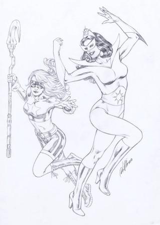
Today, Brazilian superstar Al Rio finds two star-crossed superwomen engaged in a merry chase. Leading the parade at right is Star Sapphire, the long-time nemesis-slash-paramour of Hal Jordan, best known of the numerous heroes who’ve borne the title Green Lantern. In hot pursuit at left is Stargirl, one of the youngest members of the current incarnation of comicdom’s senior superteam, the Justice Society of America.

Stargirl and Star Sapphire, pencils by comics artist Al Rio

Star Sapphire, like Carol (Ms. Marvel) Danvers and Dr. Bill (Goliath) Foster, is one of a handful of characters whose civilian identities were well established in comics before they adopted their costumed identities. In this instance, Carol Ferris had been around for three years in Green Lantern’s storyline as both the owner of the company that employed Hal Jordan as a test pilot and as Hal’s on-again, off-again girlfriend. Then, when an alien gemstone endowed Carol with Green Lantern-like powers, she took on the name Star Sapphire. Unfortunately for Hal, the influence of Carol’s power gem also turned her into a villainess — one of his primary adversaries for the rest of his career.

Courtney Whitmore, like many of the JSA’s present-day lineup, is a legacy — that is, she came into the superheroing fraternity by way of a prior connection. In Courtney’s case, her stepfather Pat Dugan enjoyed an adventuring career as Stripesy, the adult sidekick to the adolescent Star-Spangled Kid. Many years later, teenaged Courtney took up the Kid’s costume and nom de guerre. To keep Courtney from getting her inexperienced self killed, the mature Pat donned an Iron Man-like exoskeleton of robotic armor to become his stepdaughter’s partner and guardian, S.T.R.I.P.E. In time, Courtney received the cosmic staff of Jack Knight, the second Starman, and changed her code name to Stargirl in Jack’s honor.

For this Common Elements commission, I offered Al Rio three possible pairings from which he could select. I wasn’t surprised, given Mr. Rio’s predilection for attractive females, that he chose these two scintillating “stars” for his newest creation. I was, however, most pleased by the result. There’s a reason why Al is one of the pencilers most represented in my collection — that reason is on eye-catching display here.

Yes, it’s Friday the 13th, but have no fear — the stars are in alignment.

And that’s your Comic Art Friday.

A Swan’s view of the universe

August 11, 2010

Things in life can be divided into three basic categories.

There are things you can do something about. This is an almost infinitesimally small category.

There are things you can’t do anything about. This is an almost infinitely large category.

There are things you might be able to do something about eventually, but time will have to do its work in bringing that eventuality to you.

Do something about the things you can do something about.

Don’t worry about the things you can’t do anything about.

As for the things you’re waiting for time to resolve… while you’re waiting, you might as well enjoy a good cup of coffee. Or a cream soda.

You don’t have to look at your world this way, but that’s how I perceive mine.

Back to the future

August 10, 2010

The immortal baseball scribe Thomas Boswell once wrote, “Time begins on Opening Day.”

Someone else (I’d tell you his or her identity, but there’s no consensus on the Internet) opined, “Today is the first day of the rest of your life.”

Ian Anderson, the auteur behind the legendary rock band Jethro Tull, sang of “skating away on the thin ice of a new day.”

Or, as the great Buckaroo Banzai, MD, PhD, put it: “Remember, no matter where you go, there you are.” (That doesn’t really have anything to do with the other quotes. I just love that line.)

At any rate, the long hibernation of SSTOL has ended. A new day dawns here today. You can now expect to drop by this tiny corner of cyberspace and find fresh content a-bubbling, which hasn’t been true for some while… the reasons for which you know. (If you don’t know, you can find out here.)

We commence the rebirth of the cool with an announcement which in itself is pretty darn cool: I’m returning to the staff of DVD Verdict — the ‘Net’s premier location for entertainment product reviews — as a writer of cogent criticism.

I first joined DVD Verdict way back in 2002. During my previous tenure on staff, I penned 145 detailed product reviews, and also served an 18-month stint as an associate editor. I resigned with deep regret about three years ago, when my late wife KJ’s illness was diagnosed. In my heart of hearts, I always knew the day would come when I’d want to write for the site again.

Today, that day has come.

I extend my sincere appreciation to Chief Justice (that’s Editor-in-Chief in the non-Verdict world) Michael Stailey, Chief Counsel (read: Managing Editor) Melissa Hansen, and their crew of talented collaborators for welcoming me warmly back into the fold. I’m looking forward to contributing to the site again, especially in anticipation of some exciting initiatives that will continue Verdict’s ascent into the stratosphere of online entertainment resources.

So, come join me at DVD Verdict. You’ll be glad you did.

And hey — welcome also to the next phase of SSTOL. I’m looking forward to sharing with you here once again.

Thanks for keeping the faith.