Archive for the ‘Comic Art Friday’ category

Comic Art Friday: The brother from another mother

February 8, 2013

In the nascent days of my Common Elements commission theme — before I had any clue it would take on a life of its own, spawning well over 100 commissions to date — the connections between the featured characters were often simple and rather obvious. (Sometimes they still are.) And yet, even in those early concepts, my subconscious frequently bubbled up a more subtle subtext.

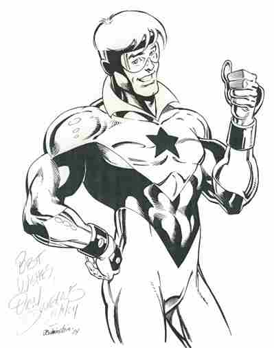
That’s certainly true in Common Elements #3, which I commissioned on New Year’s Day 2005. Artist Jeffrey Moy — probably best known for his work on DC’s Legion of Super-Heroes — served up this pinup-style piece pairing Luke Cage, Power Man with Karen Starr, Power Girl.

Power Girl and Power Man, pencil art by Jeffrey Moy

The superficial common element between Luke and Karen is pretty clear — they both have the word “Power” in their fighting identities. (Cage long ago abandoned the “Power Man” handle — as well as the flashy outfit — and now simply goes by his own name.) The pair, however, share another commonality, in that they represent caricatures of masculinity (Cage with the open shirt displaying his bulging musculature — a shirt which had the unusual knack of getting shredded off his torso in practically every issue) and femininity (artist Wally Wood famously drew Power Girl’s bust increasingly larger over a several-issue run, until an editor finally took notice and ordered him to quit). Granted, most superheroes — male or female — can be viewed as hypersexualized gender stereotypes, but Cage and Power Girl were created with those stereotypes in mind more flagrantly than others.

None of this has anything to do with the reason why this Common Elements piece marks a milestone in my collecting career. It’s important because it’s the first tangible evidence of my friendship with fellow collector Damon Owens.

After all these years, I don’t recall exactly how Damon and I began corresponding. (Damon probably does, and I’m sure he’ll correct any errant reportage that follows.) I think he might have sent me a note about my Bob McLeod Black Panther commission when I posted it to my Comic Art Fans gallery. Whatever the impetus, it became immediately clear that the two of us shared much in common. (There’s that Common Elements thing again.) Our casual correspondence evolved into a virtual friendship (we’ve never met in person; Damon lives in suburban Houston, while I’m in San Francisco) that persists to this day.

Without question, part of the connection between Damon and me is that we are both African American. That may not sound like a big deal to you, but I can tell you from a long lifetime of experience that black folks (and racial minorities of all shades, for that matter) have historically been underrepresented in science fiction and fantasy fandom in general, and in comic book fandom — okay, let’s call it geekdom — in particular. Thankfully, that’s changing — I see a lot more faces from a lot more races at comics conventions these days than I did in the 1970s, when I would often be the only person of color I encountered at a Star Trek or science fiction con. (Not that I encountered myself. You know what I mean.) But there’s still an element of “hey! another one of us!” when I run into someone of my background who’s into comics; someone who understands firsthand some of my frustrations with the mainstream comics industry’s embarrassing and often downright offensive depictions of black characters (or its failure to depict such characters at all), as well as its corresponding ill-treatment of many talented African American comics artists and writers.

Damon also shares my predilection for theme commissions, though he was in the game long before I was. His collection still contains many incredible pieces that, when I look at them, make me want to pitch all of my portfolios into the nearest Dumpster. (I lie down with a cool compress on my forehead until the temptation subsides.) Damon’s signature theme features The Brotherhood, an Avengers- or Justice League-style assemblage of legendary black superheroes from across the comics industry. He’s gotten some of the top talent in comics to draw scenarios starring these characters, and the results inspire in me both awe and envy.

From the beginning of our friendship, Damon has proven an invaluable resource for artist recommendations. It was Damon who tipped me to Jeff Moy’s availability for commissions, resulting in the piece shown above. This would be the first, but hardly the last, time that my interaction with an artist resulted from an introduction by Damon. In fact, as I’ve been composing this post, I’ve received two emails from an artist who’s working on my latest Common Elements addition — an artist to whom I was referred by the redoubtable Mr. Owens.

Last evening, I attended a screening of the documentary film White Scripts and Black Supermen: Black Masculinities in Comic Books, at the Museum of the African Diaspora here in San Francisco. Following the screening, the filmmaker, Dr. Jonathan Gayles of Georgia State University in Atlanta, joined us via Skype for a discussion about the film and the issues contained therein. While I didn’t agree with every point made in the film — you know me; do I ever agree 100% with anyone about anything? — I found it a fascinating and enlightening (if occasionally frustrating) conversation. I especially appreciated Gayles’s interviews with the late Dwayne McDuffie, a veteran comics writer who is even better remembered as the story editor and producer of the popular Justice League animated series, as well as such figures as comics historian Bill Foster and writer/producer Reginald Hudlin.

Many of the documentary’s participants related accounts that mirrored my own childhood experiences, in which finding superheroes who looked like ourselves proved challenging. Among my most vivid memories as a young comics reader is the day I found the first issue of Luke Cage, Hero for Hire on a supermarket rack in Kokomo, Indiana, and for the first time saw an African American hero on the cover of a comic with his name in the title. I remember equally well the series of early-1970s issues of Jungle Action featuring the Black Panther, and the run of Captain America and the Falcon — the latter being Marvel’s very first African American hero (the Panther, who preceded the Falcon by a few years, was African, but not American) — during that same time period. These comics and characters weren’t perfect — in those days, their adventures were being scripted almost entirely by writers of the Caucasian persuasion, whose attempts at “black” dialogue often sank to ludicrous depths — but they were steps in a fresh new direction. By the late ’70s, Storm was a major character in X-Men, long-running supporting character Bill Foster (no relation to the comics historian) had taken up the mantle of Goliath, and even the ultraconservative DC had introduced John Stewart (a.k.a. “the black Green Lantern”) and Black Lightning. Again, it wasn’t a lot, but it was something.

Diversity remains a problem in comics, not just for black fans, but for Latino and Asian readers as well. The list of prominent non-Caucasian superheroes remains a short one, and the list of such characters that aren’t stereotypical in some way is shorter yet. (One of my favorite recent additions to the superhero pantheon is DC’s Mister Terrific, the rare black comics hero whose race is almost entirely incidental to the nature of his presentation.) And that’s not even considering the depiction of female characters, or gay characters of either gender, in mainstream comics. The industry still has a long way to go toward realistic, genuinely human portrayals of characters who aren’t white males (or, as in the case of Superman, space aliens who conveniently happen to look like Caucasian human males). As a wise person once observed, the wheels of progress grind slowly. But grind they must.

I look forward to the day when all comics readers — people of every ethnicity, gender, background, and orientation — can open a comic book (or view a digital comic, as the future of the industry lies in that direction) and see heroes and heroines with whom they can fully identify, and in whom they can see the materialization of their own fantasy selves. Won’t that be awesome?

After all, our most precious Common Element is our humanity.

And that’s your Comic Art Friday.

Comic Art Friday: If it ain’t broke, don’t Vixen

February 1, 2013

Back in the early weeks of 2005, I was still just beginning to get my head around the notion that actual comic book artists — people whose work I’d seen and admired on the four-color printed page — would draw pictures just for me, if I offered them money. My first visit to a comics convention boggled my mind with a fresh new dimension: comic book artists would sometimes draw pictures just for me, while I watched.

I suppose it’s not entirely accurate to say that WonderCon 2005 was my initial foray into the con scene. During my high school days in the 1970s, I was active in Star Trek fandom — shocking, I know, but yes, I was a hardcore Trekkie — and attended several Trek conventions here in the Bay Area. (I should tell some of those stories sometime.) I also went to at least one comics-focused con a few years after that, but memory blurs the details. It might have been one of the early iterations of WonderCon, when the event was still being held in Oakland.

WC ’05, however, holds the distinction of being my first con as a comic art collector. More specifically, it yielded the first artwork I ever commissioned in person: this gracefully brush-inked sketch of Vixen, by the comic artist known as Buzz.

Vixen, pencils and inks by comics artist Buzz

Thinking about it now, I don’t remember precisely why I chose Vixen –noteworthy as DC Comics’ first African American superheroine — as the character whose likeness I wanted to commission on this particular occasion. I think I had read somewhere that one might be more likely to get a drawing from an artist at a con if one asked for something out of the ordinary. I figured that Vixen, while not a completely obscure character, probably spawned fewer requests than, say, Wonder Woman. Plus, she looked cool.

I chose Buzz to draw her because… well… he was the first artist whose table I approached where there wasn’t a line ahead of me.

A serendipitous choice, in the end, because Buzz created a striking image. He also didn’t seem to mind my periodic hovering over his shoulder as the piece took shape over several hours. The process fascinated me. I’ve seen painters doing their thing — I couldn’t tell you how many episodes of Bob Ross’s PBS series I’ve watched — and I’ve observed artists sketching in pencil and charcoal, but I had never really watched anyone work with ink before. Even though I’d been looking at comics for decades by this time, I’d never given much thought to the idea that inking might be done with a brush. The word ink always suggested a pen to me, so I’d supposed that comics were inked with something along the line of a fountain pen. (Which I now understand is often the case. Some inkers prefer pen, others brush, and many use both, depending on the demands of the work at hand.)

Buzz’s finished Vixen image evolved from his second stab at the drawing. He spent quite a bit of time puzzling out exactly how he wanted to compose the shot — given the nature of the character, he wanted a look that read both beautiful and feral. He’d actually begun sketching out a pose before he decided to start over from scratch. Rather than erasing his initial rough, Buzz flipped the board over and resumed drawing on the opposite side. Which means, of course, that his first attempt remained intact on the reverse.

Buzz Vixen preliminary pencil sketch

Buzz didn’t ask me (at least, I don’t recall that he did), but I would have been perfectly pleased had he continued down his original path. Then again, I’m easy to please when it comes to the art I commission. As an artist myself — albeit in the very different milieus of writing and acting — I understand the compulsion to get the work right, according to one’s inner muse. When I write, for example, I hyper-edit. Unlike many writers, who will blow through a quick first draft just to get the ideas on the page (or screen), I dither over every sentence before I move on to the next. The fact that I’m a painfully slow typist* facilitates this; I have a fair amount of time to look at my words. The end result is that, although it takes me longer than most to get to the end of my first draft, it’s usually close to final product. I’ll do a sanity read-through to clean up typos and to fact-check, but I rarely need an extensive rewrite.

My intensively analytical creative approach is, on the other hand, sometimes crippling to me as an actor. But that’s a whole other post.

Buzz’s real name, in case you were curious, is Aldrin Aw. If you know your space exploration history, you’ll see where his nom de plume comes from.

And that’s your Comic Art Friday.

*Swan Factoid: I can’t touch-type. I’ve tried to learn, repeatedly — I took two typing classes in school, and I’ve tested several versions of typist-training software — but my brain and my hands just don’t work together that way. Although I know the QWERTY keyboard cold, I manipulate it mostly with my two index fingers, plus the middle finger of my left hand. My typing style has been described as “two crabs fighting.” It’s not terribly efficient or speedy, but it works.)

Comic Art Friday: The wizard, the witch, and the wardrobe

January 25, 2013

As noted in the first couple of Comic Art Friday posts for this year, my comic art collection has, over the years, become focused on commissioned pieces that fit into my signature themes. A quick glance at my gallery, however, makes clear that I own a boatload of art that isn’t either Common Elements or Bombshells!, or even personally commissioned by yours truly.

When I first started collecting, most of my acquisitions were existing pieces that I hunted up on eBay, or in the “For Sale” galleries on Comic Art Fans. While a fair portion of these random artworks featured characters in whom I had a particular interest — we’ll chat more about my character-specific galleries as the year progresses — many were simply images that I liked at the time, and could pick up for what seemed a reasonable price. Today, I look at some of these and ask myself, “What in the Marvel or DC Universes possessed you to buy THAT?” (Which prompts this Note to Self: We really need to thin the herd this year.) Others still hold elevated status in my collection.

One of my early purchases remains unique: It’s the only item in my entire arsenal that I did not commission, but that directly resulted in my commissioning something else.

Doctor Strange, pencil art by Geof Isherwood

Looking at it now, I remember my first glimpse of this depiction of Doctor Strange by the talented, charming, and all-around nice guy Geof Isherwood. I was never a huge fan of Doctor Strange’s solo adventures. I didn’t really gravitate toward the character until he became the linchpin in Marvel’s superteam, the Defenders. But at the time I saw this piece, I found myself immediately and intensely drawn to its mystery — who’s firing those energy bolts at the Sorcerer Supreme? That story, I felt, needed to be told.

So I bought the art from Geof, and asked him if he’d be willing to draw a companion piece that would represent the other half of this tableau. We decided that the unseen aggressor would be Wanda Maximoff, better known as the Scarlet Witch, one of my all-time favorite heroines. The result was the nifty picture you see below.

The Scarlet Witch (classic costume), pencil art by Geof Isherwood

My intention at the time was to frame both drawings, and hang them on my office wall in such a way that the viewer could see the two images completing a single scene. Alas, the wall space I had to work with didn’t lend itself to such display. (Because of the perspective angles, the pieces don’t line up side by side. The Scarlet Witch has to be positioned slightly above and to the right of Doctor Strange, with roughly twelve to eighteen inches of diagonal air space between them.) That’s unfortunate, because Geof did an excellent job of designing the second image as a match for the first. I content myself with taking Doc and Wanda out of their portfolio every now and again, and laying them on the floor at the appropriate juxtaposition, just to remind myself of the intended effect.

The Scarlet Witch I commissioned from Geof Isherwood is unusual in my collection for a second reason. I don’t typically own more than one representation of a single character by the same artist. However, shortly after Geof completed this piece, he posted another Wanda drawing for sale, this time wearing her Gypsy-inspired costume designed by the great George Perez. I immediately fell in love with it. (I believe it’s the eyes.) Rationalizing the fact that even though this was yet another Isherwood Scarlet Witch, the outfit gave the second work an entirely different flavor, I purchased this one from Geof as well.

The Scarlet Witch (modern costume), pencil art by Geof Isherwood

Geof’s second Wanda also holds a special distinction — it’s the only completed artwork I’ve ever asked its creator to alter ex post facto. (I have, on occasion, requested that an inker tweak something, but that’s another post.) In his original conception, Geof gave Wanda a preternaturally imposing bosom — think Power Girl or Red Monika from Battle Chasers, if you’re familiar with either — and designed her bustier to expose considerably more of said bosom’s surface area. In any other situation, I’d have declined — with heartfelt regret — to buy the piece, regardless of how compelling I found other aspects of it. (Again, the eyes.) In this instance, though, I figured I’d built sufficient goodwill with Geof — due to several mutually satisfactory transactions, including the one I’ve already described herein — that it couldn’t hurt to ask whether he’d be willing to entertain a minor alteration or two. The worst that could happen is that he’d say, “No way,” and sell the piece to another collector who’d be delighted with it as it was.

Luckily for me, Geof kindly took eraser and pencil — in that order — to the art, pseudosurgically shrinking Wanda’s frontal real estate from DDD to a more natural C, and adding a strategic dash of virtual fabric to the upper half of her costume. A win-win for all concerned.

Which brings me around to a final point. Anyone who knows me knows that I’m no prude. I have no issue at all with art that depicts the nude or seminude human form. Indeed, I greatly admire the works of classical masters such as Titian, Botticelli, and Rubens, many of which are nudes. But I’ll confess that I’m not a fan of comic art that overexposes the heroes and heroines of my four-color youth. It’s not that I object to such works in and of themselves, or to either their creation or collection. It’s simply that I don’t want them in my gallery, for reasons that have little to do with aesthetics, or with any perceived moral stance.

My issue is a bit more personal, and visceral: I think of these characters as my friends.

I started reading comic books 45 years ago. Over the decades, I’ve spent countless hours immersed in the adventures of my favorite superheroes and superheroines. Even though I don’t take them more seriously than good sense warrants — and I certainly never forget that they are anything but figments of imaginations far more gifted and vivid than my own — I feel at some level personally invested in them.

That said, there are many aspects of the lives of my real-world friends that I am happy to leave untouched… no pun intended. I don’t particularly want to view, for example, the intimate details of my friends’ sexual exploits, any more than I’d care to share those details of my own life with even my closest confidants. Biological functions go on daily in my friends’ lives, to which I feel neither need nor desire to be a witness. And I don’t particularly want to see my friends naked — this despite the fact that I have, if I may be frank, quite a number of aesthetically pleasing friends of both genders, who probably look just fine attired in nothing but the equipment the good Lord gave them.

Not that I don’t want my friends to have happy and mutually fulfilling sexual relationships, or enjoy regular bowel functions, or look simply smashing in the altogether. I do. I just don’t need to examine the evidence.

And I feel pretty much the same about my imaginary friends, too.

It’s kind of like a joke often told by the legendary George Wallace (the standup comedian, not the late racist politician): “Someone said to me the other day, ‘It’s as cold as a well-digger’s butt out here.’ And I said, ‘I don’t want to know my well-digger that well.'”

See? I told you we were going to get way more self-revelatory around these parts in 2013.

And that’s your Comic Art Friday.

Comic Art Friday: Birth of a notion

January 18, 2013

I didn’t set out to be a theme commission guy.

In fact, at the beginning of my art collecting journey, I didn’t know that there was such a thing as a commission theme. Much less did I aspire to have one.

But nearly a decade down the road, my reputation in the insular ranks of comic art collectors is firmly cemented. I’m the Common Elements Guy. And, to a lesser extent, the Bombshells! Guy. Or, to that significant segment of collectors who disdain commissioned art (and those who collect it) in favor of published pages, one of “those guys.” I’m among a tiny minority within the ranks whose collection is defined by commissions focused on one or more unifying themes.

And it all started with this drawing.

Spider-Woman (Jessica Drew) and Spider-Woman (Julia Carpenter), pencils by Michael Dooney

On December 1, 2004 (I don’t recall the date from memory, but I keep records of this sort of thing), I commissioned the above piece from artist Michael Dooney, who’s done a boatload of work for the Teenage Mutant Ninja Turtles franchise. Mike had recently done a pair of drawings for me — pinups of Ms. Marvel and Saturn Girl — and I was madly in love with his style. (I still am. I’ve commissioned Mike more times than any other pencil artist.) For my third Dooney commission, I decided to ask for a depiction of Spider-Woman — more specifically, the original, who wore a red-and-yellow costume and whose real name was Jessica Drew. (That’s her at the top of the picture.)

Jessica came into being in the late 1970s, when Marvel went through a frenzied burst of creating distaff versions of many of their established heroes. Ms. Marvel and She-Hulk evolved from that same gender-equity soup. Marvel’s idea was to lock up trademarks on all of the variations, so that the Distinguished Competition didn’t steal their thunder by coming out with characters using those names. (The two companies had squabbled over Marvel’s creation of Wonder Man when DC already had Wonder Woman, and DC’s release of Power Girl not long after Marvel debuted Power Man.) I always thought Spider-Woman was an interesting heroine, and figured Dooney would do something visually appealing with her.

The exact thought process is now lost to the mists of history, but at some point before I told Mike what character he was drawing, I said to myself, “Wouldn’t it be cool to have both Spider-Women together?” Because, you see, Marvel also had a second Spider-Woman, who came along in the mid-’80s after the first Spider-Woman’s brief blaze of glory had fizzled out. (Jessica was killed off after a 50-issue run in her own title, and although resurrected shortly afterward, was pretty effectively out of the spotlight.) Spider-Woman II’s debut coincided with Spider-Man’s much-publicized switch from his familiar red-and-blue Spandex to an eye-catching black-and-white ensemble (which eventually became a character in itself, the supervillain Venom). The second Spider-Woman’s garb matched the Web-Slinger’s snazzy new togs, which made for a handy promotional gimmick. (Fortunately, her costume was merely a costume, not a symbiotic alien creature in disguise.) Anyway, I thought the contrast between the two Spider-Women’s uniforms and hair — Jessica has black tresses, while Spider-Woman II (Julia Carpenter) is a redhead — would make for a striking image.

At first, Dooney resisted the idea. “I don’t usually do two-character commissions,” he told me via email. Whatever I said in response, however, must have been persuasive — I’m sure that no offer of a firstborn child was involved — because in the end, Mike agreed to draw the two Spider-Women. (If I remember correctly, Mike surrendered to my pleading by saying, “Well, it’s the holidays.”) I had the pencil drawing in hand less than three weeks later. The art was finished in ink by Joe Rubinstein in 2005, as you can see below.

The Spider-Women (Jessica Drew and Julia Carpenter), pencils by Michael Dooney, inks by Joe Rubinstein

When I saw what Mike had done with Jessica and Julia, the proverbial light bulb flashed on in my head. Wouldn’t it be cool to have several pieces pairing characters that are somehow related, but yet are distinct from each other? I immediately started brainstorming. As the idea took shape, I quickly got away from the Spider-Woman template — essentially, two iterations of the same basic character concept, created by the same publisher (even though Jessica and Julia’s powers are quite different, they’re both Spider-Woman) —  and honed in more specifically on what became the Common Elements theme: characters, usually unconnected to each other in continuity (unlike the two Spider-Women), but who share some trivial point of intersection, whether a similarity in name, costuming, or superpowers, or something more obscure.

From this humble origin grew the legend.

Michael Dooney’s “Spider-Women” launched my signature theme. It’s a bit ironic that this piece should be designated as “Common Elements #1,” given that its subject doesn’t precisely fit the now-cast-in-concrete definition of a Common Elements commission. But it’s okay, I think, for the concept to evolve somewhat away from its starting point. That doesn’t change the fact that, had it not been for this artwork, I might never have come up with the theme that has so thoroughly defined me as a collector.

Which brings me to the underlying message of Common Elements. Much of the beauty of life is the balance between contrast and connection. In Eastern philosophical tradition, this balance is typified by the yin-yang symbol — contrasting elements that together form a whole. It’s negative and positive, masculine and feminine, ebony and ivory — living together in perfect harmony. Common Elements is all about finding linkage where no linkage exists, and making connections in unexpected and unorthodox ways, so that things that would not ordinarily appear together come together to create beauty that would be incomplete without one or the other.

I wasn’t thinking of this consciously when I hit on the idea of Common Elements, but I believe this is part of why this theme resonates with me on such a visceral level:

I am a biracial individual. Although my adoptive parents were both African-American, and I thus was raised in a culturally black home environment (whatever that suggests), my biological parents were of different ethnicities. My genetic mother was of European descent; my genetic father, of African descent. As odd as it may sound to people of my daughter’s generation, at the time I was conceived it was illegal in most parts of this country for my biological parents to marry. I have no idea what brought my progenitors together — everything I know about them comes from a single typewritten paragraph of general description about each — but this I do know: Had they not found their way to one another, despite their differences and the then-prevailing environment hostile to those differences — I would not exist. And yet, the fact of my existence proves that, different though they were, my birth parents shared a common biology. Both their differences and their commonalities make me, me — at least, on a physical level.

When I commission a new Common Elements artwork, I’m bringing together artists and characters that, in most cases, have never been united before. I’m defining a connection between heroes and/or heroines who have, in most cases, never been connected before. I’m envisioning something that no one else has seen, and finding a means of bringing it to reality.

I think that’s kind of cool.

In a certain way, that’s kind of like who I am. Which in itself is kind of cool, too.

And that’s your Comic Art Friday.

Comic Art Friday: Let me do right to all, and harm no man

January 11, 2013

As noted last week, I’ve developed a new focus for Comic Art Friday in 2013 — revisiting (more or less chronologically) some of the milestone artworks in my galleries, and considering from a fresh perspective why these pieces helped elevate my collection to its present heights. Because I’ve written about most of these pieces (and the characters they portray) in detail over the years, I’m seizing this opportunity to reflect more on what each of these drawings says about me, not only as a collector and connoisseur of original comic art, but as a human being as well.

Today our spotlight falls onto this potent pinup by Darryl Banks, best known as the penciler of DC’s Green Lantern from 1994 through 2001. Featured here are the seminal pulp magazine hero Doc Savage — often cited as a precursor to Superman — and his cousin Patricia, who periodically accompanied Doc and his assistants on their adventures.

Doc Savage and Patricia Savage, pencils and inks by comics artist Darryl Banks

I commissioned this piece from Darryl sometime in the closing weeks of 2004 (I could look up the exact date, but then, you know, I’d have to look it up), and he drew it during the first few days of 2005. For all I know, it may have been the first commissioned artwork he created that year. I know for certain that it was the first Darryl ever drew for me, but it was far from the last. We’ve done a dozen more projects since this one, including three for my Common Elements theme and a set of four — featuring the key female characters from Will Eisner’s The Spirit — for my Bombshells! gallery. But I’ll always hold a special fondness for this one, the nexus at which my relationship with Mr. Banks began.

As noted above, most comics aficionados know Darryl from his long run on Green Lantern, during which he co-created Kyle Rayner (DC’s Green Lantern standard-bearer for most of the 1990s). I, on the other hand, remembered him as the artist who drew the 1991 Millennium Comics miniseries Doc Savage: The Monarch of Armageddon. That book still holds up as the most effective translation of the Man of Bronze to the comic book medium. (It’s astounding how many attempts at a Doc comic there have been — by both of the major publishers, and by several smaller concerns — and how horribly wrong almost all of them have gone. Case in point: DC’s recent First Wave line, which managed to mangle Doc and several other classic heroes all in one fell swoop.) When I heard that Darryl was taking on commissions, I couldn’t wait to have him draw Doc once again.

You have to understand how important this was to me. Outside of comics, Doc Savage might be my favorite fictional character of all time. Throughout the 1970s, I devoured the Bantam Books paperback reprints of the original Doc novels, the moment each one was published. I practically memorized Philip Jose Farmer’s tongue-in-cheek “biography,” Doc Savage: His Apocalyptic Life, in which the author connects Doc to dozens of legendary characters as part of his Wold Newton chronology. (Capsule summary: Farmer posited that a meteorite strike near the English hamlet of Wold Newton altered the genetic structure of a handful of people who happened to be nearby. The descendants of these folks became, in Farmer’s alternate history, many of literature and popular culture’s seminal heroes, including Tarzan, Sherlock Holmes, and of course, Doc Savage.) To my mind, Darryl Banks (along with Mark Ellis, who wrote The Monarch of Armageddon) was one of the very few creators to see Doc the way I envisioned him through all 181 of the original pulp tales. To have a new Doc drawing from Darryl represented an incredible opportunity.

Doc Savage appealed to me, I think, because although he was an unparalleled physical specimen, his primary weapon was his powerhouse intellect. He surrounded himself with other brilliant minds as well — his assistants included the world’s greatest chemist, attorney, civil engineer, archaeologist, and electrical technologist. (Where Doc’s creator, writer Lester Dent, fell short was in giving Doc helpers whose talents were rarely of genuine benefit. Doc’s chemical expertise ran circles around “Monk” Mayfair’s, he knew more about archaeology than “Johnny” Littlejohn, and he possessed more inventive creativity than “Long Tom” Roberts. And when did a globetrotting superhero ever have need for a lawyer, or a guy who built bridges for a living?) Growing up as “the smart kid,” I loved a hero whose brainpower equaled or surpassed his brawn.

I also like a dash of nobility in my heroes, and Doc most certainly had that. By “nobility,” I don’t mean social status or an aristocratic background. I mean it in the sense of character. We’ve become accustomed in the modern era to heroes whose morals and ethics often barely distinguish them from the villains. Think of the post-Frank Miller Batman, and you’ll see what I mean. Don’t misunderstand — I want my heroes to have human flaws and foibles. The reason I favored Marvel over DC in my youth had much to do with the way Marvel’s heroes always had realistic problems, life challenges, and weaknesses, whereas DC’s Silver Age characters always seemed too good to be true. But I want even my imperfect heroes to be well-intentioned. Spider-Man made mistakes and poor decisions — sometimes horrifically poor ones (ask Uncle Ben) — but you never doubted that behind the mask, Peter Parker was a good guy trying to do the right thing.

Doc Savage had that noble character I admire, and would wish to emulate, in a hero. (As did many of my favorites, both in the comics — Wonder Woman, the Black Panther, the aforementioned Wall-Crawler — and in other media — Bruce Lee’s enigmatic protagonist in Enter the Dragon, to cite an example from a beloved film.) Witness Doc’s oft-repeated credo:

Let me strive every moment of my life to make myself better and better, to the best of my ability, that all may profit by it.
Let me think of the right and lend all my assistance to those who need it, with no regard for anything but justice.
Let me take what comes with a smile, without loss of courage.
Let me be considerate of my country, of my fellow citizens, and my associates in everything I say and do.
Let me do right to all, and wrong no man.

Wouldn’t it be a brighter world if we all tried to live by the Doc Savage code?

It always saddened me that Doc never got his just due in present-day pop culture. Most of the comics about him have been wretched, and don’t get me started about George Pal’s ludicrous 1975 film, Doc Savage: The Man of Bronze. But that Millennium miniseries pretty much nailed Doc. So, what a treat it was to get the artist who created the art for it draw Doc for me! (Later, I acquired from Darryl Banks about two-thirds of his original art pages from the first issue of The Monarch of Armageddon. A stunning double-page cityscape Darryl created for that issue adorns the entranceway of our house.)

Although I had only commissioned one other two-character piece at the time, I felt inspired to pair Doc with his indomitable cousin Pat. Even the most cursory review of my art collection reveals that many of my favorite heroes are, in fact, heroines, and Pat Savage could stand with the best of them. Although she appeared in fewer of her stalwart relative’s adventures than any of his male sidekicks, Pat always showed herself to be as smart and confident as (and often more mature than) any member of the “Famous Five.” Even when Dent and the other Doc Savage scribes fell into the trope of Pat as cliched damsel in distress — everybody in Doc’s inner circle got kidnapped a lot — they generally avoided making her seem foolish or weak in the process.

I very rarely offer specific direction to the artists I commission. In this instance, though, I remember asking Darryl to draw Pat without shoes. I had seen a then-recent example of Darryl’s commission work that depicted Wonder Woman barefoot, and I liked that concept for Pat here. Since James Bama, the artist who painted the iconic covers for Bantam’s reprint paperbacks, frequently portrayed Doc with his shirt hanging in tatters from his muscular torso, it made sense to me that if Pat were duking it out with some nefarious characters alongside Doc, she’d kick off her stiletto pumps to give herself better footing for the fight. (I’ve never understood why any heroine would wade into the fray teetering on high heels. Then again, it worked for Ginger Rogers… even backward.)

One of these days, someone will produce another worthwhile Doc Savage comic series, or better yet, a truly excellent Doc Savage film.  Until that day comes, I’ll keep admiring this fine drawing by Darryl Banks. And, like Doc, I’ll keep striving to make myself better and better, to do right to all, and harm no man. (Or woman. Or transgendered person. I’m an equal opportunity good guy.)

And that’s your Comic Art Friday.

Comic Art Friday: A long year’s journey into daylight

January 4, 2013

Given that we all survived the Zombie Apocalypse — we did survive, didn’t we? — I’ve decided to do something a little different with our Comic Art Friday posts to begin this new year.

The arrival of 2013 brings me almost a decade into my comic art collecting phase. I acquired my first pieces in 2004 — amazing to consider, but there it is. Who knew then that nine years down the road, I’d have amassed a gallery containing… well… even I don’t know exactly how many drawings, to be honest, but somewhere upward of 400. (One of my self-assigned projects for this year is a thorough inventory.)

So, I thought this might be an opportune time to walk back through my collection and revisit some of the key artworks that have brought this behemoth to where we find it today. I don’t know yet all of the twists and turns this narrative may take, but I’m envisioning this as less of a “greatest hits” or “favorite pieces” retrospective (because, frankly, I do that at the end of every calendar year) than as a thoughtful reconsideration of milestones — items that helped direct and define my collecting path. These posts will focus less on the who, what, and where of each artwork (not that we won’t touch on the subject matter; we will, certainly), and more on the why — why I bought or commissioned this piece, and why it has specific meaning to me. That means that some of these posts will end up being not so much about what you see in the picture, than about the man behind the curtain. Or behind the collection, if you will.

I’ll try to keep the flow more or less chronological, but I’m not going to enslave myself wholly to dates. Mostly because on a given Friday, a certain piece from a general time period might plead with me more vigorously to write about it than does one that arrived somewhat earlier. But I will avoid making large leaps backward or forward. And, although I might on occasion choose to spotlight a piece that I purchased preexisting, I’ll concentrate on artworks I’ve actually commissioned, both because that’s the category that makes up the majority of my collection today, and because my commissions hold a unique resonance for me, as I had some part in their creation.

We’ll see where this journey takes us. I wouldn’t be surprised if we all learn some incredible things. (And yes, I know it’s the Incredible Hulk, not the Incredible Thing. Then again, Aunt Petunia’s favorite blue-eyed nephew is pretty incredible in his own right. But I digress.)

2013 should be an interesting year.

Let’s begin with the first comic artwork ever drawn specifically at my behest — this pinup of Booster Gold, penciled by his creator, Dan Jurgens, and later inked by veteran embellisher Joe Rubinstein.

Booster Gold, pencils by Dan Jurgens, inks by Joe Rubinstein

Now, it’s important to note that this is not the first piece of art that I ever commissioned. That honor goes to the Black Panther drawing I ordered from Bob McLeod (co-creator of the New Mutants, and longtime Spider-Man and Superman artist) in early September 2004. However, between that date and late November of that year, when McLeod completed his masterpiece, I purchased a couple of sketches by Dan Jurgens via eBay from a comics dealer in Minnesota. As we were completing our transaction, the dealer mentioned that Jurgens might be stopping by an upcoming local comics convention. The dealer suggested to me that since I liked Jurgens’s work, he might be able to persuade the artist to draw a quick custom sketch for me, if I was interested. The dealer stressed that Jurgens wasn’t actually a guest at the convention, and therefore would not be drawing throughout the weekend for attending fans, but since he (the dealer) knew Jurgens personally, he felt confident that he could corral the artist into one sketch if the subject intrigued him.

For the first time in my nascent commissioning career, I actually had to think about the subject matter before I requested a commission. When I’d approached Bob McLeod, the choice of subject was settled in my mind before I even knew the artist who would draw it — I wanted a Black Panther piece, and I specifically sought out an artist who had worked on the character in one of his earliest incarnations. Plus, I was already a fan of McLeod’s work, and had fairly extensive knowledge of his background and clear expectations of what I wanted. With Jurgens, I hadn’t a clue. I liked the two sketches of his that I’d recently purchased (a Tomb Raider pinup and a fight scenario between Thor and the Hulk), but all I knew of his work beyond that was that (a) he was the creator of Booster Gold — significant mostly because Booster was the first major new character that DC Comics introduced after reshuffling its entire character universe in the 1985 miniseries Crisis on Infinite Earths; and (b) he was one of the key writers and artists who created the 1992 Death of Superman storyline.

“Booster Gold might be fun,” I thought.

Apparently, Jurgens thought so too. He related to the dealer that it had probably been a decade or more at that time since he had last drawn the character he had designed, and he got a special kick out of revisiting the roguish time traveler after so many years. As established as Booster had become, no one asked Dan Jurgens to draw him anymore. Jurgens appreciated, and was perhaps even a trifle touched, that someone remembered his connection to Booster’s origin.

I learned a lesson from that experience that I’ve never forgotten through hundreds of subsequent commissions: Artists are people, too. Drawing comic book characters may be their livelihood, but they also want to enjoy the work, and to feel appreciated for their talents. As a patron, I try to keep that in mind. I make it a point to commission artists to draw things I believe they’ll enjoy drawing, and to be flexible enough to switch subject matter if the artist seems unenthused. I don’t overdirect the project — in fact, I rarely make any suggestion about the content of a commission beyond assigning characters (and I often offer a choice between Option A and Option B), unless the artist insists on additional input. (Some do.) And I do my best to let the artist know that I’m grateful for the time and skill he or she invests in my project.

It’s not uncommon for artists to tell me, once a commission is completed, “I really enjoyed working on this.” Indeed, several artists who’ve drawn pieces for my Common Elements or Bombshells! themes have said that the assignment was the most fun they’ve had in a while. I don’t think that’s an accident. I hope that as a patron, I help foster that enjoyment by being easy to work with, and by choosing subject matter that suits the artist’s style, tastes, and interests.

To me, that’s the very definition of a win-win.

One last note about today’s featured artwork. This piece was selected for publication by Back Issue magazine; it appeared in the May 2007 issue (#22) as part of a retrospective about Booster Gold and his frequent cohort, the Blue Beetle.

And that, friend reader, is your Comic Art Friday.

Comic Art Friday: The best of 2012

December 28, 2012

It’s the Katharine Hepburn edition of our annual “Best of Comic Art Friday” post. (Old-time film buffs will recall Spencer Tracy’s famous commentary on the sex appeal of his frequent co-star: “There ain’t much meat on her, but what there is, is cherce.” By which he meant “choice.” I guess you had to be there.)

2012 saw, by far, the fewest new entries into my comic art collection of any single year since I entered the hobby nearly a decade ago. But as I examined the handful of pieces that came my way this year, I’ve got to admit that we made up in quality for our paucity in quantity. Some of the new artworks I acquired rank among the very finest in my gallery, and that takes some doing.

So, without further muss or fuss, here are my favorites from among the pieces that landed in my lap in 2012.

Favorite Common Elements Commission, Heroes Division:
“Did Someone Call For a Doctor?” (Doctor Strange, Doctor Mid-Nite, Doctor Druid)
Pencil art by Frank Brunner

Doctor Strange, Doctor Mid-Nite, and Doctor Druid, pencil art by Frank Brunner

In these days of cookie-cutter comic art, there are increasingly few artists whose style is so unique and recognizable that an item of their work could not possibly have been drawn by anyone else. Frank Brunner, who’s best remembered for his work on Marvel’s more esoteric titles (Doctor Strange, Howard the Duck, the unfortunately named Giant-Size Man-Thing) in the 1970s, is largely retired from commission projects these days, but graciously consented to create this masterpiece featuring three superhero doctors: Strange, Druid, and Mid-Nite.

Favorite Common Elements Commission, Co-Ed Division, Pencils Only:
“Somebody Scream!” (Tyroc and Songbird)
Pencil art by Peter Vale

Tyroc and Songbird, pencils by comics artist Peter Vale

Brazilian talent Peter Vale made me scream with delight when first I saw this matchup of sonic superstars — the Legion of Super-Heroes’ Tyroc and the Thunderbolts’ Songbird. The level of detail Vale delivered here is nothing short of incredible. You’ll be doing the art (and yourself) a disservice if you don’t click the image and get a bigger, closer look.

Favorite Common Elements Commission, Co-Ed Division, Pencils and Inks:
“First Thing We Do, Let’s Kill All the Lawyers” (Josiah Power and She-Hulk)
Pencils and inks by Tom Grummett

Josiah Power and She-Hulk, pencils and inks by comics artist Tom Grummett
One of the finest artists active in comics today, Grummett invokes the spirit of Jack Kirby in bringing together battling attorneys She-Hulk and Josiah Power, the latter of whom was a Grummett co-creation. I simply love the energy (and the “Kirby crackle,” which is energy of a different sort) in this drawing.

Favorite Common Elements Commission, Wicked Cool Concept Division:
“Heavenly Creatures” (Halo and Angel)
Pencils and inks by Sean Chen

Halo and Angel, pencils and inks by comics artist Sean Chen
Sean Chen shocked and surprised me with his inspired take on Michelangelo (the Sistine Chapel painter, not the Teenage Mutant Ninja Turtle). I can’t imagine a more appropriate scenario for heroes named Angel and Halo to find themselves in. This piece illustrates the primary reason I like to give my commission artists free rein on their projects — I would never have thought of a design concept this awesome.

Favorite Bombshells! Commission:
Tara, Queen of the Space Pirates
Pencils and inks by Darren Taylor

Tara, the Pirate Queen, pencils and inks by Darren Taylor
I added only one new entry to my Bombshells! pinup theme this year, but Darren “Roadkill” Taylor made it a doozy. The fact that the Pirate Queen shares her sobriquet with the lovely woman who married me this spring is icing on a spectacular cake.

Favorite Inking Commission:
Red Sonja
Inks by Bob Almond, over pencil art by Al Rio

Red Sonja, pencils by Al Rio, inks by Bob Almond

The comic art world suffered an inordinate number of tragic losses in 2012. Few affected me personally as much as the January suicide of the brilliant Al Rio. The Brazilian artist created one of the first pieces I ever commissioned — it remained, for several years, the most costly commission in my entire collection. I acquired numerous additional Rio works — both existing pieces, and newly commissioned drawings — in the years since. I purchased this unfinished sketch from Al Rio’s longtime representative shortly after the artist’s passing. Seeing it completed by my favorite commission inker, Bob Almond, gives me hope that Rio’s special talent will not be soon forgotten.

Favorite Silly-Grin-Inducer:
Thundarr the Barbarian, Princess Ariel, and Ookla the Mok
Pencils by Phil Noto, inks by Bob Almond

Thundarr the Barbarian, inks by Phil Noto, inks by Bob Almond

As noted above, Bob Almond has become my go-to guy for commission inking over the past decade. Bob’s versatility and chameleon-like gift for melding his skills with those of almost any penciler — as well as his easygoing demeanor and dependability — has resulted in our doing dozens of projects together. This one, our 50th, sprang from a fun, nostalgic sketch by comic artist and veteran Disney designer Phil Noto. I was a few seasons past my Saturday morning cartoon period by the time Thundarr the Barbarian debuted, but knowing that the character designs came from the pens of legendary creators Alex Toth and Jack Kirby, I gave the show a shot and enjoyed it. Having this fun drawing on my wall makes me smile.

Those were the highlights of this collecting year. Thanks for indulging my obsession.

May 2013 be kind to you and everyone you love, friend reader. We’ll see you back here for more stuff — as the great Chuck Barris used to say — in the new year.

And that’s your Comic Art Friday.

Comic Art Friday: First thing we do, let’s kill all the lawyers

November 30, 2012

Shame on me — I haven’t posted a new Comic Art Friday since the dawn of the Internet. Okay… it hasn’t been quite that long, but it’s been a while. So, let’s rectify the omission, shall we?

In a Facebook group to which I belong, comic art collectors were recently asked to identify the greatest comic artists alive today. Along with the names you’d probably guess first — Neal Adams, George Perez, Adam Hughes, John Byrne — Tom Grummett garnered several mentions, including one from your Uncle Swan. Which is appropriate, because Grummett is one of the best in the business today, even though his name hasn’t quite reached household status outside the core of comics fanatics. Deftly blending old-school power and personality with a sleek, thoroughly modern sensibility, Grummett’s work on such titles as The Adventures of Superman, Superboy, New Titans, New Thunderbolts, and X-Men Forever has been dazzling readers for more than 20 years.

As you can see below, I pounced on the opportunity earlier this year to commission Tom for my Common Elements theme. (Click the image for a close-up look at Mr. Grummett’s spectacular drawing.)

Josiah Power and She-Hulk, pencils and inks by comics artist Tom Grummett

Featured in this potent panel are two of comicdom’s most prominent practitioners of the legal arts (that’s “attorneys” for the prosaically minded among us). On the left is Josiah Power, co-created Tom Grummett and writer Kurt Busiek as the star of DC’s Power Company series. On the right is mean, green Jennifer Walters, better known as the savage and sensational She-Hulk.

It’s tough to think of a more atypical superhero than Josiah Power. He doesn’t use an alias or secret identity, wear a costume, or even employ his awesome metahuman powers — seen in full display in Grummett’s artwork here — very often. Josiah prefers to work behind the scenes as leader of the Power Company, a team of superheroes for hire that’s structured like a law firm. He’s usually depicted in his normal human form, nattily attired in business suit and tie. Only on rare occasions, when his team is severely threatened, does Josiah explode into action in his transmogrified state — a gigantic, golemesque monster with skin like stone, crackling with energy. Even Superman himself stands in awe of Josiah’s might, describing him as one of the most powerful beings he’s ever encountered.

Josiah is also one of a small number of openly gay heroes in mainstream comics. He’s half of a stable, long-term couple with his partner Rupert. It’s refreshing to see a gay character portrayed in a superhero universe who is in no way stereotypical, and for whom his sexual orientation is an incidental aspect of his overall person, and not a device for sensationalism.

She-Hulk rates mention as the last major character created by Stan Lee before his retirement as the main man at Marvel. (Stan has “unretired” on a frequent basis since, both for Marvel projects and his own independent works.) Spawned during the television network run of The Incredible Hulk, She-Hulk served as a preemptive strike against the TV show’s producers, who were considering introducing a female counterpart to the Green Goliath. To enable Marvel to retain the rights to any such character, Stan and artist John Buscema concocted Dr. Bruce Banner’s lawyer relative, who gains her own emerald awesomeness via a blood transfusion from Cousin Brucie. Unlike her infamous family member, Jennifer not only controls her transformation into her super-sized self, but also retains her own personality and emotional balance while Hulked out. In fact, Jennifer eventually decides that she prefers her green Amazonian body, and simply stops changing back into her “normal” appearance. She continues to both practice law and fight supervillains in her tall, muscular, vividly verdant persona.

Also unlike her cousin, Jennifer is a social creature. She’s been affiliated with most of Marvel’s non-mutant superteams at one time or another, including the Fantastic Four (stepping in for an absent Ben “The Thing” Grimm), the Avengers, Heroes for Hire, and SHIELD.

Tom Grummett outdid himself in pitting his legal-eagle creation against the self-described “baddest babe in the universe.” Wouldn’t it be cool if this scene actually took place in the middle of a trial? I think our judicial system would be infinitely more entertaining if all lawyers settled cases by transforming into superhuman warriors and duking it out in the courtroom. Heck, I’d volunteer for jury duty just to watch.

And that’s your Comic Art Friday.

Comic Art Friday: Remembering Ernie Chan

June 1, 2012

While we were off gallivanting about the Hawaiian islands (more on that sojourn to follow), I received the sad (and to me, unexpected) news of the passing of comics artist Ernie Chan. Coming so closely on the heels of two other tremendous losses from among my personal favorites in the comic art field — specifically, Al Rio and Tony DeZuniga — Ernie’s death came as an especially great shock.

Storm and Beta Ray Bill, pencils and inks by comics artist Ernie Chan

In an industry often characterized by enormous egos and self-important personalities, Ernie Chan was one of the nicest, least pompous creators I’ve ever met. His smiling face and easygoing demeanor were indelible highlights of the comics conventions I attended over the years. I always looked forward seeing and chatting with Ernie — and of course, adding a new piece of his artwork to my collection.

Shang-Chi and the Bronze Tiger, pencils and inks by comics artist Ernie Chan

Ernie was among the dozen or so talented artists who joined the American comics industry from the Philippines in the early 1970s, under the pioneering leadership of Tony DeZuniga. Quickly, Ernie established himself as a two-way star, both as a penciler and inker. In the former capacity, he shone as DC Comics’ busiest cover artist during the mid-’70s, frequently signing his work “Ernie Chua” (a misspelling on his immigration paperwork). At Marvel, Ernie gained acclaim as inker on Conan the Barbarian, over the pencils of the legendary Big John Buscema. Ernie would revisit Robert E. Howard’s Cimmerian warrior in hundreds of drawings and commissions, including the Common Elements teamup with Iron Man he’s holding in this photo I took at WonderCon 2011.

Ernie Chan at WonderCon 2011

I frequently referred to Ernie as the Amazing Chan for his speed in delivering commissioned art. On more than one occasion, Ernie completed a fully penciled and inked piece for me in less than a day — not a convention sketch, mind you, but a detailed, cover-quality illustration completed in his home studio. Once, he sent me a scan of a finished Common Elements commission — this one, featuring Hawkeye and Lady Rawhide — before I knew that he’d even accepted the job. Now that’s fast.

Hawkeye and Lady Rawhide, pencils and inks by comics artist Ernie Chan

I’ll miss Ernie’s lively humor and fun-loving personality as much as I’ll miss seeing new creations spring from his potent pencils and pens. He was always a hoot to chat with, engaging to his fans, and with an inerrant eye for feminine pulchritude.

Rest in peace. Mr. Chan.

And that’s your Comic Art Friday.

Comic Art Friday: Avengers assemble!

May 4, 2012

Unless you’ve been living in an underwater grotto for the past year or so, you know what today is: the U.S. premiere of Marvel Studios’ summer blockbuster, The Avengers. (Also known as Avengers Assemble, if you happen to live in the U.K. In which case, you already saw the movie a week ago.) While I didn’t feel compelled to queue up for a midnight showing, I do have the flick on my weekend to-do list.

In the meantime, I thought it would be fun to revisit a few pieces from my galleries featuring the heroes from the film’s roster of Avengers. It’s a much shorter list than the slate of current and past Avengers in the Marvel Comics universe, which, the last time I counted, has included more than 80 heroes and heroines over the superteam’s half-century of history.

Interestingly, there’s never been an incarnation of Avengers in the comics that included the movie’s Big Six — Captain America, Iron Man, Thor, Black Widow, Hawkeye, and the Hulk — at the same time. The Hulk, a founding member of the team, ditched the others by the second issue of the original run. He made guest appearances in a couple more early stories, but was gone entirely by issue #6. To the best of my knowledge, ol’ Greenskin hasn’t been an active Avenger at any time since early 1964, a year before Hawkeye signed on, and nearly a decade before the Widow became a permanent member.

Let’s start with one of the first drawings I acquired when I began collecting original art. Thor faces off with his not-so-jolly green compadre in this scene penciled by Dan Jurgens and inked by Bob Almond.

Thor vs. the Hulk, pencils by Dan Jurgens, inks by Bob Almond

Next up, here’s the Incredible One again, this time doing battle with yet another fellow founding Avenger, Iron Man. The late, great George Tuska — the definitive Iron Man artist of the 1970s — lent his potent pencil and imagination to this one.

Iron Man vs. the Hulk, pencils by George Tuska

People who don’t follow comics closely might assume that Captain America was an original Avenger, so identified is he with the team. In fact, Cap didn’t join until Avengers #4 — he was busy being frozen in ice prior to that. No sooner had the Star-Spangled Super-Soldier thawed out, though, that he became the heart and soul of the ever-changing ensemble, assuming his longtime leadership role in Avengers #16 when the remaining founding members — Iron Man, Thor, Ant-Man (who’d changed his code name to Giant-Man by then), and the Wasp — departed en masse. Cap’s been the center of the Avengers most of the time since. Here he is with his doppelganger and one-time fellow Avenger, the U.S. Agent (or USAgent, if you prefer), as drawn by Ron Lim and embellished by Bob Almond.

Captain America and the U.S. Agent, pencils by Ron Lim, inks by Bob Almond

The Black Widow didn’t become a full-fledged Avenger until 1973, though she made periodic guest shots before then. At the time she joined the team, the Widow was probably best known as the partner (both in and out of costume) of the blind crimefighter Daredevil, whose comic she co-headlined for four years. Readers of a certain age, however, will recall that before she settled in with the Man Without Fear, the spy formerly known as Natasha Romanoff starred in her own year-long series in Marvel’s Amazing Adventures in 1970 and ’71. In this Common Elements commission by Ty Romsa, the Widow chills with Silver Sable, one of the very few Marvel heroes who has never been an Avenger. (At least, not yet.)

Silver Sable and Black Widow, pencils by Ty Romsa

Alas, I don’t have a solo drawing of Hawkeye in my collection. Which surprises me, because I’ve always liked the guy. (I’m tempted to throw up my Mike Grell Green Arrow instead, just to see whether anyone would even notice the difference.) He does, however, make an appearance in my Common Elements series, in a terrific piece drawn by the legendary Ernie Chan.

Go see The Avengers. But wait a day or two until the crowds thin out. It’ll still be the same movie, but you’ll be able to get a better seat.

And that’s your Comic Art Friday.