Archive for the ‘Comic Art Friday’ category

Comic Art Friday: There’s no “I” in “Superteam”

June 28, 2013

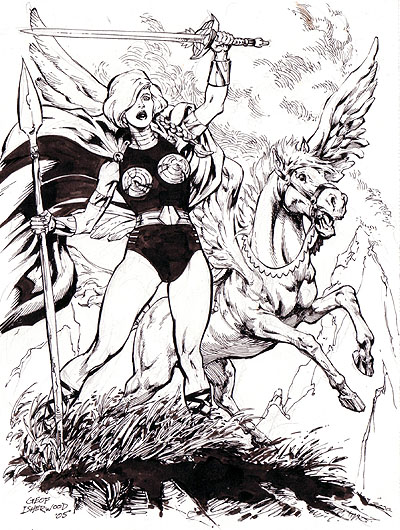
I’ve commented a few times recently about the inventory I’m conducting. I’m roughly a third of the way through the process: Common Elements and the book dedicated to Supergirl art are completely done, as is the book in which I keep miscellaneous odd-sized pieces that don’t fit well into the 14″ x 17″ Itoya Profolios I use for storage. At the moment, I’m halfway into the Bombshells! theme group, and will probably work on the Wonder Woman portfolio next.

Two Fridays ago, we considered a piece I rediscovered as I delved through that miscellaneous stack. Here’s another I’d forgotten was in there.

Justice League preliminary pencil sketch by Barry Kitson

It’s a preliminary sketch by Barry Kitson, the British superstar who first made his mark in the UK on Judge Dredd. On this side of the Pond, Kitson’s pencils have elevated numerous properties for both major comics publishers, including noteworthy runs on Marvel’s Amazing Spider-Man and The Order, and DC’s Teen Titans, Legion of Super-Heroes, Batman: Shadow of the Bat, and Adventures of Superman.

When I bought this sketch a few years back — and still more recently, when I stumbled upon it again — I had no idea why Kitson had drawn it. Thanks to another collector who posts to Comic Art Fans, however, I now know that it was a preliminary study for a mini-poster Kitson created for the late, more-or-less-lamented Wizard Magazine to promote DC’s then-upcoming JLA: Year One series, which Barry penciled. I found this image of the finished piece online, so you can see how it turned out once fully penciled, inked, and colored.

JLA: Year One mini-poster by Barry Kitson, published in Wizard Magazine

I still don’t know who “Pete” is, to whom Kitson inscribed the prelim. Based only on the note, I’m guessing that “Pete” was a collector who bought some of Kitson’s JLA: Year One pages, and Kitson included the sketch as a bonus. Unfortunately, I didn’t record the identity of the person from whom I bought the piece, and given that I’ve slept several hundred times since then, I no longer remember. Somehow, I don’t think that person’s name was Pete, but I could be wrong.

On the other hand, I remember quite well why I wanted the item in the first place, aside from the obvious fact that I don’t own anything else by Barry Kitson. My favorite comic series have always been supergroup and team-up books. I always felt I was getting more for my money when multiple heroes and/or heroines appeared on the cover of a comic. Thus, I gravitated toward books offering that benefit.

Which leads me into a bit of Listology…

Uncle Swan’s Top 12 Favorite Superhero Teams of All Time

12. Metal Men. This unusual bunch consisted of six sentient robots invented by the brilliant scientist Will Magnus. Each robot was constructed primarily from a different chemical element, and manifested the unique properties of — and personality traits suggested by — his or her constituent metal. Gold, the team leader, was brave and noble, and could stretch his robot body into any imaginable shape. Iron was strong, both in physical power and in attitude. Lead was dense, literally and figuratively. Tin was weak and emotionally unstable. Mercury was — wait for it — mercurial. Platinum, usually called Tina, was a beautiful female robot with a passionate crush on her creator Dr. Magnus. (More recent reboots added a second female member, the sharp-tongued Copper.) The Metal Men’s adventures played as much for comedy as for drama, which was probably why I enjoyed them so much back in the day.

11. The Champions. Remember when you were a kid, and you had access to a self-service soda fountain? There was always the temptation to mix all the different flavors together in one cup, just to see what it tasted like. If you did that same thing with superheroes, you’d get the Champions. In the mid-1970s, Marvel writer Tony Isabella had the idea of putting together a bunch of second-tier characters who had nothing in common, just to see what would happen. Thus, we had Angel and Iceman from the original X-Men lineup, teamed with the demigod Hercules, the demonic motorcyclist Ghost Rider, and the Russian spy turned superheroine Black Widow. Yeah, that made no sense at all. And ultimately, it didn’t work — the Champions folded after just 17 issues. They were fun while they lasted, though.

10. New Warriors. Despite the name, there was never an “Old Warriors” or “Original Warriors” team. Which begs the question, Why not simply call this group “Warriors”? I dunno. Maybe they wanted to distinguish themselves from the street gang in Walter Hill’s classic movie, or from my favorite basketball team. And how long can you call yourselves “New Warriors” before you stop being “new”? Whatever the case, the New Warriors came together as a band of rebellious young heroes under the leadership of high-tech urban ninja Night Thrasher. Founding members included human rocket Nova, flame-wielding Firestar, aquatic Namorita, energetic Speedball, and Marvel Boy, who quickly realized how lame his code name sounded and started calling himself Justice instead. Today, the New Warriors are best known as the catalysts for Marvel’s epic Civil War crossover event.

9. Heroes for Hire. As is typical of Marvel’s superteams, the all-about-the-Benjamins Heroes for Hire have undergone more lineup changes than you can shake a no-prize at. Originally, the team consisted of Luke Cage, a.k.a. Power Man, and his martial artist pal Iron Fist. The Daughters of the Dragon — Misty Knight and Colleen Wing — often worked alongside the duo. Over the decades, the ever-shifting roster has mostly centered around Misty as de facto leader — sometimes in partnership with Colleen, but lately without — with support from a variety of morally ambiguous types, including most frequently the mercenary Paladin. Shang-Chi (Master of Kung Fu), the Black Cat, Silver Sable, and the Punisher are among the more prominent characters who’ve wandered onto and off the team at various times. Always an entertaining assemblage.

8. Suicide Squad. Similarly to Heroes for Hire, Suicide Squad has served as a focal point around which to gather some of DC’s more questionably heroic characters. As originally conceived, the Squad consisted mostly of former supervillains who agree to serve as covert government agents in exchange for clemency. At the head of the organization is the powerful and ambitious Amanda “The Wall” Waller, who manipulates the team to further her own shadowy objectives. In addition to out-and-out baddies as Deadshot and Captain Boomerang, the Squad also enlisted more typically heroic members, including Bronze Tiger, Nightshade, and Vixen. A noteworthy event in the Squad’s early history involved the death of its field leader, Rick Flag.

7. Legion of Super-Heroes. My comics-reading friends and I often referred to these far-future Superhero Scouts as “the Legion of Stupid Heroes,” for their propensity toward juvenile code names (male members were typically designated as “Boy,” “Lad,” or “Kid,” while females were “Girl,” “Lass,” or some similarly ridiculous feminine identifier) and ludicrous powers (illustrated most notoriously by Bouncing Boy, who was basically a human Spaldeen, and Matter-Eater Lad, who… well… I’m killing brain cells just thinking about him). But I loved the Legion in spite of their silliness, because their adventures were fun, their youthful enthusiasm and camaraderie were endearing, and you could tell that the writers didn’t take the whole business too seriously. Hey, remember that? When superheroes didn’t always have to be so depressingly serious? Man, I miss those days.

6. Justice League of America. DC’s all-star super-squad raised the bar for all who would follow their 1960 debut. I still like the expanded original lineup the best: Superman, Batman, Wonder Woman, Green Lantern Hal Jordan, the Flash, Aquaman, Martian Manhunter, plus early additions Green Arrow, Hawkman, and the Atom. Basically, all the major superhero food groups are covered right there. (Don’t get me started on the proliferation of random spinoffs — Justice League International, Justice League Detroit, Justice League Dark, Justice League of Their Own… okay, I made that last one up. But you get the idea.) The JLA always seemed a bit superfluous — if you have Superman, Batman, and Wonder Woman, do you really need any of the others? — and its stories worked best when the Triumvirate were marginalized or absent altogether. Still, I have to give them credit for being the first superteam of the Silver Age and beyond. Which brings us to the original superhero conglomerate…

5. Justice Society of America. From the day I first discovered the JSA, I liked them better than their modern-day counterparts. For one thing, the original constituent characters are just so weird and loopy in that retro sort of way that you can’t help but dig them. I mean, come on — Hourman? A superhero whose powers run out in an hour? Who advertises that weakness to every villain he faces by making it HIS NAME? How do you not love that guy? Put him alongside the Spectre (a reanimated corpse who loves killing people in bizarre ways), the Sandman (“I’ll put you to sleep with my gas gun!”), the original Atom (who had no powers at all, aside from a heavy-duty case of Short Man Syndrome), and Doctor Fate (basically, Mandrake the Magician with a cool helmet), and you’ve got a recipe for comic greatness. The JSA’s present-day incarnation, with its ginormous cast featuring such stalwarts as Power Girl and the current Mister Terrific alongside holdover founders such as the original Flash and Green Lantern Alan Scott, has been fun too.

4. The Defenders. Billed as Marvel’s “non-team,” the defenders started with an unbeatable three-star core: the Hulk, Namor the Sub-Mariner, and Doctor Strange. The big three were soon joined by the cosmically powered Silver Surfer, plus a motley array of supporting players — most notably Valkyrie, Nighthawk, and Hellcat — who eventually came to dominate the stories. Unlike the aforementioned Champions, a cut-and-paste crew that never quite gelled, the Defenders’ nonsensical admixture of heroes pretty much always worked, even as the roster evolved to include such ill-fitting pieces as the Gargoyle and Damian Hellstrom, the Son of Satan. The former Justice League creative team of writers Keith Giffen and J.M. DeMatteis and artist Kevin Maguire reconvened the first four Defenders for a hilarious seriocomic miniseries in the mid-2000s.

3. X-Men. I still have a soft spot for the original roster: Angel, Cyclops, Beast (pre-blue fur), Iceman, and Marvel Girl (the not-yet-Phoenix Jean Grey), plus the wheelchair-bound Professor Charles Xavier. The first tears I ever shed over a comic book came with “The Death of Professor X” in Uncanny X-Men #42 (March 1968). I remember how sad I was when Marvel relegated the team to reprint stories for several years in the early 1970s. However, I remember with equal vividness seeing the cover of Giant-Size X-Men #1 on the comic rack at Subic Bay Naval Base in 1975, and being introduced to the second-generation team starring Wolverine, Storm, Nightcrawler, Colossus, and former villain Banshee alongside returnee Cyclops. The early issues of the revived run, written by Chris Claremont and drawn first by Dave Cockrum, then by John Byrne, remain among my favorite comics of all time. (I’ve enjoyed the various animated series and live-action films, too, though not as much as those amazing comics.)

2. The Fantastic Four. A squabbling family of superheroes — super-intelligent, emotionally distant dad; romantic but exasperated mom; brash kid brother; and gruff-but-lovable uncle — unlike anything that preceded them. The first comic book I can recall reading was a hand-me-down copy of Fantastic Four Annual #3. I was immediately addicted, as though the ink on the pages was suffused with crack cocaine. And it was the FF (quickly followed by Spider-Man) who sealed that addiction. They seemed so much like real people — unlike most heroes in juvenile fiction of the time, they fought and argued and teased and lovingly poked fun at each other, all while saving the world from galactic menaces. I wanted to be Reed Richards more than I wanted to be any other comic book hero until the arrival of the Black Panther: he was a super-genius with an insufferable ego and an answer for everything (hmm… know thyself?), who saddled himself with the lamest code name in comics (“Mister Fantastic”? Really?) and got stuck with the least useful superpower on the team.

1. The Avengers. For me, the Avengers really came to life once the founding lineup — Iron Man, Thor, Ant-Man (who soon changed code names to the more impressive Giant-Man), and the Wasp, plus the Hulk, who took off after the first issue — dissolved. Captain America, thawed from his icy suspended animation in Avengers #4 and granted “founding member” status in the Hulk’s stead, was tasked with rebuilding the team from scratch, and made what seemed like incomprehensible choices for “Earth’s Mightiest Heroes”: Hawkeye, Quicksilver, and the Scarlet Witch, all reformed villains. The new mix of quirky, often conflicting personalities gave the stories more emotional heft. With the return of ex-Ant/Giant-Man Hank Pym (now called Goliath, and eventually Yellowjacket) and the Wasp, and the additions of Hercules, the android Vision (who married the Scarlet Witch) and the Black Panther, the Avengers developed into a premier team. The roster would change almost constantly from then on — I think practically every hero and heroine in the Marvel Universe has been an Avenger at some point or other — but the tradition was now firmly established.

And that, superteam members, is your Comic Art Friday.

Comic Art Friday: Off the cliff

June 14, 2013

In last week’s Comic Art Friday post, I noted several theme commission collectors whose galleries continue to inspire my own efforts. With today’s featured artwork, I’m reaching back to one of the first theme collections of which I ever took serious notice.

Tesla Strong, pencils, inks, and markers by comics artist Phil Noto

Walt Parrish is revered in comic art collecting circles as “The Cliff Guy.” As you look at Phil Noto‘s drawing of Tesla Strong (daughter of Tom Strong, hero of Alan Moore and Chris Sprouse’s eponymous series for America’s Best Comics), which moved from Walt’s collection to mine about three years ago, you can appreciate where the nickname came from. Walt’s theme was “comics characters on a cliff.” That’s it — simple, elegant, evocative. His online galleries once held hundreds of artworks, from rough sketches to elaborately finished pieces, built around that concept.

Artists always seemed particularly inspired by the “Cliffs” theme, perhaps because it challenged them to come up with some unique way to depict a character on a cliff. So they played around with perspectives, angles, and poses. Characters stood on cliffs, fell off cliffs, dangled from cliffs, or even looked up at cliffs. Quite a number of the “Cliffs” drawings were intensely dramatic. Almost as many were humorous. All were unique.

About three years ago, Walt sold a large portion of his art collection. At the same time, he took down all the images from his “The Cliff Guy” website. His remaining galleries at Comic Art Fans, last updated in December 2010, showcase a smattering of pieces marked as “Art I Used to Have.” I don’t know whether Walt stopped collecting altogether, or if he merely decided to downsize his holdings and forgo a public presence for the remainder. I certainly don’t know his reasons for doing whatever he did, and it would be unfair for me to speculate.

All I know is, I miss the Cliffs.

I’m glad to own a reminder of Walt’s terrific theme. But I have to admit — it makes me more than a trifle sad to look at it, thinking of the once-inspiring collection whence it came.

Tesla seems sad, too.

At the moment, I’m engaged in a massive project: a comprehensive inventory and catalog of my comic art collection. It’s a ton of work, but it’s also been great fun, as I reconnect “up close and personal” with every single piece of art I own. I’m forced to recall how I acquired each item — both those I’ve commissioned, and the many others I’ve purchased that existed before they came my way — and the reasons for each acquisition. I’ve rediscovered a few pieces I’d completely forgotten that I owned — today’s feature being one example. I’ve certainly encountered some that made me question my judgment at the time of purchase. For the most part, I’ve experienced profound joy at seeing these creations again, at holding the paper in my hands and admiring each pencil line, pen mark, and brush stroke. The scans you see here never reveal the complete extent of the artist’s mastery. Only when observing the physical artwork directly can you truly drink in all of the magic.

Yet, with all of the laughter and wonder I draw from this exercise, there’s a darker undercurrent. I ask myself whether the day will come when these images no longer impart any pleasure to me, and I will find myself with endless stacks of paper that afford no value, tangible or intangible. Will there come a time when my galleries lie empty, save for a sorrowful sampling of “Art I Used to Have”?

I thought I might have reached that point three years ago, when KJ died. (For the benefit of any newcomers in the crowd, my first wife — referred to herein as KJ — passed away in 2010 at the far-too-young age of 44, following a 10-year battle with breast cancer.) To say that KJ tolerated my art collection is to understate the mystery that said collection — and my obsession with it — presented for her. Never having been a comics reader, she felt neither attraction nor attachment to images of fictional characters in outlandish costumes, and never really comprehended why I felt both. She certainly distressed at times over the fiscal investment that fueled my predilection. Yet, she graciously (or at the very least, mostly silently) went along as I filled ever-increasing numbers of portfolios and frames with superheroes and superheroines, with little more than a head shake and heavy sigh.

Amid the crushing, debilitating sadness that accompanied KJ’s final months, and the aftermath of her passing, I often asked myself whether she was right.

Indeed, I contemplated at more than one juncture selling off the entire lot that would sell, and destroying the rest in a bonfire. I thought perhaps that would be a fitting tribute, given her disdain for all of it. I could not see, at times, that even I would ever find happiness in these admittedly temporal, juvenile pictures again.

But eventually, the darkness parted.

And I stepped back from the cliff.

I have always been, and fear that I always will be, an insular creature. That I have lived so much in the fields of my own imagination stems largely from childhood circumstances that I’ll sketch in the briefest terms — I grew up an adoptive child, and an only child, in a family that moved constantly (my dad was career Air Force) and loved sparingly. Always a highly intelligent (I could show you the test scores) yet socially awkward kid, my closest friends were often the characters in fantasy novels and stories I read, in science fiction films and TV shows I watched — and especially, in my omnipresent comic books.

These heroes and heroines became an essential, inextricable component of my inner self. They gave the childhood and adolescent me the power to soar, to strive, to subdue, and to survive.

I’m an infinitely more complete person as an adult. These days, I read precious little fantasy literature, even comics. (Most comics being published today aren’t being written for me, anyway.) But the images in my comic art collection are like talismans, of times when I treasured the company of superheroes. I still see my would-be self in these characters. Just as I now see my daughter in, say, Tesla Strong.

These days, I just enjoy the pictures. I feel a tickle of nostalgic happiness when I look at every drawing in my collection, especially the ones I’ve commissioned. So I guess I’ll keep looking, at least for the time being.

Sure, I know they’re just fantasy. But also I remember all the times when they kept me off the cliff.

And to some extent, they still do. Even now.

Thanks, superheroes.

And that’s your Comic Art Friday.

Comic Art Friday: Do you feel lucky, punk?

June 7, 2013

As proud as I am of the way my primary commission theme, Common Elements, has evolved over the years, I still find myself looking at the themes of other collectors and thinking, “Man, I wish I had more stuff like THAT.”

Every time I browse the galleries of such theme commission powerhouses as these —

  • Michael Finn (who specializes in reimagining classic comics covers in a concept appropriately called “One Minute Later…”);
  • Brian Sagar (whose collection extrapolates upon his favorite comic series from the Bronze Age, Marvel Two-in-One);
  • Chris Caira (he of the wickedly inventive “Trophy Wall” theme);
  • And especially my good friend Damon Owens (best known in collecting circles for his commissions featuring The Brotherhood, a cross-publisher superteam of African-American heroes and heroines, Damon keeps creating new themes all the time, each one more eye-openingly clever than the last) —

I realize that my own efforts merely scrape the tip of the proverbial iceberg.

Specifically, I marvel at how these other collectors pack so many characters into their commission projects. Most artists charge for commissions based on the number of figures they have to draw, which means that an artwork featuring multiple characters can get pricey in a jiffy. For that reason, more than 90% of my Common Elements projects feature only two characters, and most of the handful featuring three or more were drawn by artists who quoted a set page rate as opposed to a per-figure upcharge.

All of this means that when I get the opportunity to commission a Common Elements scenario with more than two heroes, I thank my lucky stars.

Speaking of lucky…

…”luck” is the theme for today’s featured artwork, rendered with painstaking detail by Brazilian artist Allan Goldman. (Be sure to click on the image below to get a closer look. Trust me — you really, really want to. This is one I wish I could invite you all over to see in person, because the scan just can’t show you every nuance.)

Lady Luck, Jack of Hearts, and Gambit, pencils by comics artist Allan Goldman

From left to right, that’s…

Lady Luck. Created in 1940 by the legendary Will Eisner (The Spirit), Lady Luck was one of the earliest costumed heroines to headline her own comics feature.

Jack of Hearts. The brainchild of writer Bill Mantlo and artist Keith Giffen, the half-human, half-alien Jack has appeared mostly as a secondary character in the Marvel Universe since the mid-1970s.

Gambit. Familiar as a member of the X-Men, the sweet-talking, staff-wielding Cajun Remy LeBeau has the power to imbue objects with kinetic energy — most frequently, the playing cards he uses as throwing weapons.

What I love most about Common Elements — aside, of course, from the incredible images these concepts evoke from the artists who draw them — is the fact that every Common Elements scenario implies a story that in most cases would never be told in an actual comic. Because the heroes featured in a given scene are often the intellectual property of competing comics publishers — and sometimes, of comics publishers that no longer exist, as in the case of Lady Luck — there’s no way these characters would ever come together, outside of this theme.

Part of the fun is imagining what menace would unite this specific combination. In the piece we’re looking at today, for instance, why might this rooftop meeting take place? What foe might either Lady Luck, Jack of Hearts, and Gambit be confronting that would cause one of them to reach out to the other two and say, “We need to talk”? What challenge might require these three unusual and varied skillsets, and specifically, why these? And who is the implied fourth person who’s just entered the scene, from whose point of view we’re observing?

I have my own thoughts about the answers to the above questions. Allan Goldman had his, as he was conceiving and drawing the piece. You likely have yours as well. All of these thoughts are probably very different. Each of us is making up our own individual, personal, unique story as we go.

Isn’t that awesome?

That’s the hidden beauty of Common Elements. It’s one reason why my answer to Dirty Harry Callahan’s infamous query is, “Why, yes… yes, I do.”

And that’s your Comic Art Friday.

Comic Art Friday: The tao of Steve

May 31, 2013

Big Wow ComicFest… the gift that keeps on giving.

In last week’s Comic Art Friday, we checked out the superfluity of goodness that came home with me from the Bay Area’s favorite comics confab earlier this month. That abundance did not yet include an additional item that I commissioned during the con for completion afterward.

Now it does.

Valkyrie and Taarna, mixed media art by Steven E. Gordon

When I first rolled up on Steven E. Gordon‘s table in Artist’s Alley on Saturday, his name did not immediately register with me. I did, however, admire the samples of his art that were on display. After chatting for a bit with Steve and his wife, I told him I’d return on Sunday with a commission project for him. Steve advised me that he probably wouldn’t be able to start the piece before the con ended, but that he would gladly take my information and send me the art when it was done.

At home on Saturday night, I Googled Steve to get a better idea of his style, with a view to choosing a Common Elements concept appropriate to his talents. I was astounded to discover that I actually knew Steve’s previous work quite well — I just didn’t realize who he was.

As it turns out, Steve Gordon possesses one of the most extensive and impressive resumes in the animation business. In film, he’s worked as an animator, designer, and animation director on numerous projects, ranging from Disney classics (The Black Cauldron; The Great Mouse Detective; Oliver and Company) to several directed by the legendary Ralph Bakshi (Lord of the Rings; American Pop; Cool World). In television, Steve has contributed his talents to a host of series, from Mighty Mouse to The Avengers.

With the light of giddy anticipation breaking over my mental horizon, I realized that I just met a key contributor to one of my all-time favorite animated features: Ralph Bakshi’s sword-and-sorcery epic, Fire and Ice — the product of Bakshi’s collaboration with the dean of fantasy illustrators, the late, lamented Frank Frazetta. Sometimes described (not altogether inaccurately) as “Conan the Animated Barbarian,” Fire and Ice melds Frazetta’s unmistakable design aesthetic with Bakshi’s storytelling and unique cinematic style, including ample use of the latter’s trademark rotoscoping technique. From a narrative perspective, it’s not the most original film Bakshi ever directed, what with veteran comics scribes Roy Thomas and Gerry Conway importing a bucketload of tropes they’d each previously employed writing Conan’s adventures for Marvel. But without question, Fire and Ice stands among Bakshi’s most visually appealing creations, thanks in large part to Frazetta’s input, along with background artists James Gurney (Dinotopia) and Thomas Kinkade (yes, that Thomas Kinkade), as well as Peter Chung, who would go on to create Aeon Flux for MTV. And of course, the work of animation director Steven E. Gordon.

Having made the Fire and Ice connection, I knew what Steve’s Common Elements assignment would be — two characters who would fit perfectly into Bakshi and Frazetta’s world of swordplay and mystical mayhem: Marvel’s Viking vixen, Valkyrie, and Taarna, the iconic heroine from my beloved Heavy Metal: The Animated Film.

Aside from the obvious “blade-slinging beauty” angle, Val and Taarna share two other, more subtle commonalities. Both have real monomymic real names — Valkyrie’s true identity is simply called Brunnhilde — and both are seen to be reincarnated in multiple persons. Over her career in comics, the spirit of Brunnhilde has been reborn in several women, most notably Barbara Norriss and Samantha Parrington. At the conclusion of Heavy Metal, we find Taarna’s spirit alive new in the young girl seen previously in the linking segments (titled “Grimaldi”) throughout the film.

Steve’s sensibility as an animation designer fits these heroines like an armored gauntlet. Who wouldn’t want to watch an entire movie of Taarna and Val wading into pitched battle against hordes of hostile foes? Sign me up!

Not only did Steve turn out his take-home commission assignment beautifully and speedily — I received a scan of the finished piece less than a week after Big Wow concluded — he also graciously autographed the cover of my Fire and Ice DVD. (He did seem a touch surprised that someone actually owned one.) Now if only I could run into Ralph Bakshi one of these days…

And that, friend reader, is your Comic Art Friday.

Comic Art Friday: How now, Big Wow?

May 24, 2013

Last year, Big Wow ComicFest coincided with the Pirate Queen’s and my honeymoon. (A honeymoon outranks a con every time.) That accident of timing, coupled with the greedy [plural expletive redacted] at ComicCon International moving our beloved WonderCon to SoCal, meant that I hadn’t had the chance to attend a comics convention these past two years. It was, therefore, with giddy anticipation that I awaited this year’s Big Wow.

My eagerness did not go unrewarded.

Unlike WonderCon, which has become increasingly multimedia-focused over the past decade, Big Wow remains mostly what it claims to be — a festival celebrating comics, and the talented people who make them. Perhaps in part due to WonderCon’s departure, the event has ballooned to attract many of the biggest names in the industry, including the legendary Stan Lee, who drew hordes of autograph-seekers to his signing appearance on Sunday afternoon. The focus on comics means that one need not wade through acres of gaming displays and movie studio publicity machinery to access artists, many of whom spent the weekend busily sketching away for their fans.

Namely, yours truly.

After scoring a gorgeous Supergirl commission from Brian Stelfreeze at (what proved to be San Francisco’s final) WonderCon two years ago, a companion Stelfreeze ranked high on my shopping list for Big Wow 2013. Thanks to Brian’s fan group coordinator, I was able to arrange a Mary Marvel commission in advance of the show, and Brian spent a fair chunk of Saturday working on her. I’d specifically asked Brian to draw Mary old-school — that is, not in the hypersexualized style in which the character is often presented these days. (Mary is, after all, supposed to be a teenaged girl.) Brian complied with a wonderfully adorable rendition that captures Mary’s sweetness perfectly. Both artist and commissioner took delight in the result.

Brian Stelfreeze and Mary Marvel, Big Wow 2013

Mary Marvel, pencils and inks by comics artist Brian Stelfreeze

I’d also reached out prior to the convention to Steve Mannion, who’s probably best known for his Fearless Dawn creator-owned series. Steve has done several commissions for me over the years, including two entries in my Common Elements theme. I’m always fascinated by his unique, distinctly off-kilter style. This outing, I decided to have him draw Mantis, a heroine from the Bronze Age period of the Avengers for whom I’ve always had a certain fondness. Steve did not disappoint, turning in a quirky-cute portrayal of the Celestial Madonna. This One likes her very much.

Steve Mannion and Mantis, Big Wow 2013

Mantis, pencils by comics artist Steve Mannion

Ron Lim, one of comics’ underrated classic superhero artists, can always be counted on for a solid commission under the time pressure of a con. My original plan for Ron was to have him draw a solo piece featuring the Falcon. As I approached his table, I decided instead to have him add a third Common Elements project to the two he’d drawn previously. I came up with the concept on the spot, pairing Falcon — Marvel’s first African-American superhero — with Storm, the company’s first black superheroine. And of course, Ron rocked the execution like nobody’s business. I couldn’t resist fitting Ron’s young son, who spent the weekend happily sketching alongside his dad, into the photo. (Ron assured me that his son did not draw any part of this commission. But give the kid a few years. The apple does not fall far from the tree.)

Ron Lim and son, Big Wow 2013

Storm and the Falcon, pencils by comics artist Ron Lim

I hadn’t crossed paths with David “BroHawk” Williams in a few years, but I was delighted to see that Big Wow’s website used the Mary Marvel commission David drew for me back in 2008 as an example of his work. Dave recalled that piece fondly when we chatted at Big Wow — a typically self-critical artist, Dave noted several details in Brian Stelfreeze’s rendition of Mary that he wished he himself had included. I enjoyed chatting with him about his recent and current projects, as well as watching him polish off this striking portrait of Vixen. Dave is another criminally undervalued talent whom I’d love to see doing more high-profile comics work.

David Williams and Vixen, Big Wow 2013

Vixen, pencils and inks by comics artist David Williams

One of the genuine pleasures of conventions is meeting in person artists I’ve interacted with, and even commissioned, via the Internet. This time out, I had the opportunity to thank Drew Johnson for the incredible Common Elements commission he completed for me earlier this year. Not coincidentally, I brought Drew’s artwork with me to the con, and got him to pose for a photo with his creation.

Drew Johnson with his Common Elements commission, Big Wow 2013

Having dialed in my collecting focus on commissions in recent years, I rarely buy preexisting art these days. A handful of pieces, however, managed to find their way home with me from Big Wow this year. The big prize among these was a stunning noir-inspired drawing by pinup artist Jim Silke, whose work I’ve admired for a long time. Jim’s work generally rides above my usual price point, so I mostly content myself with salivating over his portfolios whenever I see him at a con, and hope that someday I’ll stumble on that winning Powerball ticket. When I saw this piece on Saturday, I immediately felt drawn to it — and Jim’s listed price on it fell into a range where I could at least permit the flirtation. I showed it to the Pirate Queen on Sunday, and her reaction surprised me: “You should buy it.” I demurred, but I found myself back at Jim’s table several more times during the day. (I tried to pick times when Jim had stepped away. I didn’t want to be one of those people.) After I’d collected my last completed commission for the weekend, I still had enough budgeted cash left to cover the Silke. With the Pirate Queen’s blessing, I brought her home. Jim was probably more relieved than anything.

Jim Silke and his femme fatale, Big Wow 2013

Pencil pinup by artist Jim Silke

Cat Staggs has worked on various Star Wars properties, and more recently has been drawing interiors and creating digitally painted covers and pinups for DC. This introspective Saturn Girl is the original pencil art for one of the latter, and I was thrilled to pick it up for a surprisingly discounted price. I’ve posted both the pencil art I purchased and a scan of the finished painting, so that you can see how Cat completed her masterpiece.

Saturn Girl, pencils by comics artist Cat Staggs

Saturn Girl, digital painting by comics artist Cat Staggs

Most comic art fans know Joel Adams as “Neal Adams’s son.” While that is true, it’s a more than a trifle unfair to Joel, who’s a talented artist in his own right. I couldn’t decide whether I liked his Supergirl or his Spider-Woman more. Lucky for me, Joel offered a price for the pair that made it unnecessary to choose between them.

Spider-Woman, pencils by comics artist Joel Adams

Supergirl, pencils by comics artist Joel Adams

Part of the fun of a convention’s Artists Alley is wandering past all the tables of budding artists whose work I’ve never seen before. Most of these I glance at and keep walking, usually with a smile and a (hopefully encouraging) nod to the artist. Every once in a while, I come across something that actually makes me stop and take a longer look. At Big Wow, that happened to me at the table of Ramon Villalobos, a young artist previously unknown to me. I found Ramon’s style intriguing enough to pick up two of his original drawings. There’s an otherworldly, yet somehow retrospective, quality in his work that appeals to me. There’s some Frank Quitely in Ramon’s style, some Los Bros Hernandez, and maybe even a bit of Juan Gimenez in there as well.

Wonder Woman, pencils and inks by comics artist Ramon Villalobos

Mary Marvel, pencils and inks by comics artist Ramon Villalobos

A panel we attended on Sunday stands out among the highlights of the con: The legendary Olivia DeBerardinis, in my opinion the greatest female pinup artist ever, being interviewed by Jim Silke, no slouch himself in the pinup genre. Both the Pirate Queen and I enjoyed hearing Olivia’s unique perspective on the art world in general, and specifically on her place in it as a woman who paints women almost exclusively. I’m rarely starstruck, but I could not resist having a photo taken with Olivia after her panel, and having her autograph a copy of her Bettie Page art book.

Olivia and fan, Big Wow 2013

All in all, Big Wow 2013 proved well worth the investment of time and capital. I’m already looking forward to next May.

And that’s your Comic Art Friday.

Comic Art Friday: Raiders of the lost archaeology

May 10, 2013

And… we’re back.

Sorry about the dearth of activity for the last little while. The Pirate Queen and I jetted off Down Under from late March into mid-April for an extended tour of Australia and New Zealand. As we chat, I’m pulling together my notes and photographs for a series of posts showcasing the highlights of the trip. Check back here next week for the first fun-filled romp.

We now return you to your regularly scheduled Comic Art Friday.

Lara Croft and Hawkgirl, pencils by comics artist Drew Edward Johnson

Longtime readers know that I keep lengthy lists of potential concepts for my two signature commission themes, Common Elements and Bombshells! That way, when the opportunity to commission an artist presents itself, I have several ideas ready to roll. I also keep a “wish list” of artists whose availability I monitor, in hope that I might jump on the chance to add their talents to my theme galleries.

I love it when the cosmos aligns, and the two lists intersect.

Drew Edward Johnson found his way onto my radar as one of a handful of artists who’ve been regulars on both of my favorite DC headline heroines, Wonder Woman and Supergirl. Drew’s commission list had been closed for some time, so when he began taking assignments again, I couldn’t wait to get on his list. I had the perfect Common Elements scenario in mind: a pairing of two of comics’ greatest archaeologists — Lara Croft, Tomb Raider, and Shiera Hall, the Silver Age version of Hawkgirl (or Hawkwoman, if you prefer… more on that in a moment).

Lara Croft is familiar to most as the lead character from the Tomb Raider video game franchise, as well as a pair of live-action feature films starring Angelina Jolie in the title role. Lara, however, has also enjoyed a successful history as a comic book heroine. She starred in a monthly series published by Top Cow Productions from 1999 to 2005, as well as several miniseries and one-shot specials during that period. Most of these comics presented Lara in different storylines from either the video games or films. (Drew Johnson was one of the pencil artists on Tomb Raider: Journeys, a 12-issue limited series that began in 2001.)

Although Lara began life as little more than a distaff Indiana Jones knockoff, I find that her comics capers have developed her into a vital, unique, and compelling character — a tough, resourceful, and brilliant scientist-adventurer who fearlessly engages any foe. Most of the writers who’ve scripted her books have attempted to give her a quirky British sensibility, which provides an interesting texture. Much is made of Lara’s appearance — she’s an attractive, athletic woman, usually drawn with a prominent bustline — but in the main, her stories in the comics don’t focus on exploitation. I think she’s a terrific heroine, one who’d make a great lead for a weekly TV series.

Hawkgirl suffers from the same insanely convoluted continuity that has plagued Hawkman, her frequent partner in life and combat, over the decades. In fact, it’s more accurate to speak about Hawkgirl in the plural than in the singular, because there have been several versions (often conflicting in origin, backstory, and name) since the character debuted in 1940. At times, she’s been presented as Shiera Hall, a reincarnated princess/goddess from ancient Egypt; at others, she’s been Shayera Hol, a police officer from the planet Thanagar; in still other versions, she’s been Kendra Saunders, a tormented young woman possessed by the spirit of a previous Hawkgirl. Umm… yeah. I won’t even attempt to untangle all of that twisted history in this space.

In recent years, Hawkgirl underwent yet another revision, this time as a member of the Justice League of America as shown in the animated TV series Justice League and Justice League Unlimited. Her television persona possessed organic wings — historically, Hawkgirl’s wings have generally been explained as prosthetics, fashioned from the mysterious Nth Metal — and developed a complex, realistic romantic relationship with Green Lantern John Stewart. In my opinion, this Hawkgirl combined the best elements of the character’s potential, allowing her to flourish as an independent entity freed of her status as Hawkman’s significant other and sidekick.

Back to our earlier point: Depending on which iteration of the female Hawk we’re discussing, the character has employed both Hawkgirl and Hawkwoman as her code name at various times. Throughout most of her history, however, she’s been Hawkgirl — which, sexism aside, does roll more trippingly off the tongue. Since Hawkgirl is her most familiar nom de guerre, and the one most fans would associate with the uniform she wears here, that’s what we’ve used. I hope this doesn’t cost me decades of feminist street cred.

Uniting these two heroines is, for me, a chance to extol the virtues of the multidimensional superheroine. Neither Lara Croft or Hawkgirl is just a hot chick in abbreviated attire. They’re scientific explorers with expertise in an academically rigorous field. I believe it’s important that we have female role models in our culture who embrace a broad array of skills and disciplines. Young girls need to see that women can be smart and talented, and not mere eye candy. If heroes are crack shots and expert fighters, why not have heroines — such as Lara Croft — who can outshoot and outfight the best of them? And if a hero can swing a medieval mace, why can’t a heroine — a heroine who also can explain the historical significance and context of that weapon? If there’s an Indiana Jones, there ought to be a Lara Croft. If there’s a Justice League, there ought to be a Hawkgirl (okay, okay… Hawkwoman) in it.

As for the argument, “But do they have to be gorgeous?” well, that’s how we like our heroes, regardless of gender. There’s a reason why Harrison Ford nabbed the Indiana Jones role (which was originally intended for Tom Selleck, by the way; he couldn’t get out of his Magnum P.I. contract fast enough to make Raiders of the Lost Ark) and, say, Steve Buscemi or Rick Moranis didn’t. If masculine heroism is going to be typified by Harrison Ford, it’s hard to say that the ladies shouldn’t be represented by the likes of Angelina Jolie.

For this commission, Drew Johnson decided to create a look for Lara Croft that differs from her classic image — no braid, no sunglasses, no cargo shorts — yet keeps her clearly identifiable. I like Drew’s approach a great deal — retrospective yet sleekly modern, and beautifully heroic. I also appreciate that he gives her a more naturally athletic frame, without the exaggerated proportions (read: mammary appendages) that people sometimes associate with Ms. Croft. Together, we decided to use Hawkgirl’s Silver Age costume — both of us favored that particular look among the multiple designs she’s worn during her decades-spanning tenure.

The scenario portrayed here, incidentally, is all Drew — with a single exception that he revealed on his blog. After he originally sketched the layout, Drew showed his rough draft to his studio mate, Chris Moreno. Chris thought Drew’s first take on Hawkgirl felt a mite too static, so he suggested a different pose. Drew liked Chris’s retooling, and used the alternate Hawkgirl positioning in his final pencils. Nothing like a little collaboration between two titanic talents.

And that’s your Comic Art Friday.

Comic Art Friday: Everything old is new again (including this post)

March 8, 2013

[Note from your Uncle Swan: I’ve told this tale before — on March 21, 2005, to be precise. But since it’s been eight years to the month since I last told it, and inasmuch as that telling resides on my legacy blog which many of you have probably never visited, I think there’s little harm in telling it again. However, if you’re a long-time reader who followed me here from the old blog location, you may have read the following — minus an edit here or there — before. In that case, feel welcome to take this Comic Art Friday off.]

Someone — I believe it was Rod Stewart — once said, “Every picture tells a story, don’t it?” I don’t know whether that’s true of every picture, but it’s certainly the case with this one.

The Scarlet Witch, pencil art by Bob McLeod (1992)

I picked up this pencil sketch of Wanda Maximoff, the Scarlet Witch, from an art dealer at WonderCon in February 2005. Drawn in 1992 according to the signature — and signatures never lie — it’s the work of the great Bob McLeod, who created the very first piece of custom art I ever commissioned, a gorgeous pinup of one of my favorite heroes, the Black Panther.

Bob McLeod is best known in the sequential art trade as an inker. In fact, in my never-humble opinion, Bob is one of the finest inkers in the business — in part because he’s also a terrific pencil artist. But because McLeod is most closely associated with inking, one doesn’t see very much of his raw pencil art. (Well, you might have if you ever checked out Rough Stuff, the short-lived magazine that Bob edited for Two Morrows Publishing, the folks who bring you Alter Ego, Back Issue, and The Jack Kirby Companion. In Rough Stuff, Bob frequently showcased uninked pencils from artists whose work is rarely seen in that condition.)

That’s one reason I was so excited to find this sketch, which shows Bob’s fine grasp of expression and anatomy to perfect, unvarnished advantage. The other reason was that I thought it would be fun to have Bob revisit and complete the drawing thirteen years after he began it.

So, a few days after I purchased it, I packed the sketch off to Bob. Below, you see the finished art, vintage 2005.

The Scarlet Witch, inked pencils by Bob McLeod (2005)

Dramatic, huh? Yes, believe it or not, both of these pictures are scans of the exact same physical piece of art, scanned (about four weeks apart) at two stages of its development. Not only can you see the amazing change a comic art drawing undergoes from its pencil origins to camera-ready inks, but you can also get a sense of the way one artist’s personal style evolves over the course of several years.

In comparing the two versions, Bob McLeod joked that the Scarlet Witch appears to have shed about 30 pounds between 1992 and 2005. I wish it were that easy to lose a few, by means of a handful of brush strokes and a strategically applied eraser!

And that’s your Comic Art Friday.

(All-new material next week, I promise.)

Comic Art Friday: The best surprise is a surprise

March 1, 2013

One of the most legendary origin stories in comics — an industry fraught with legendary origin stories — is the one about the Silver Surfer. Not the origin story of the Surfer in Marvel Comics’ fictional universe, but rather the origin of the character in the all-too-real world.

Cognoscenti will recall that in the Silver Age (the roughly 15-year period from the mid-1950s until around 1970), Marvel’s output was scripted via what came to be known as “the Marvel Method.” Instead of giving the pencil artist a complete manuscript from which to draw the story, the writer — usually Stan Lee, in those days — would instead provide a more general outline that might range from a few paragraphs (or even a few sentences) to a mere list of plot points. The artist would develop the visual story however he deemed fit. When the pages were completed, the writer would then fill in dialogue and captions that suited whatever the artist had drawn. This often meant that the writer had little clear idea what images would appear on those pages when they came off the artist’s table.

When Lee received from artist and co-creator Jack Kirby the pencil art for Fantastic Four #48, famous today as the first book in the three-issue arc that introduced the cosmic supervillain Galactus, he was surprised to see that Kirby had drawn in a character riding a flying surfboard. Kirby explained that he thought Galactus — a gigantic, supremely powerful humanoid being who consumed planets to ingest their energy — needed a herald, someone who would warn the denizens of worlds in Galactus’s path to prepare for their doom. After some initial reluctance, Lee wrote the character into the story. Later, the Surfer became a major point of contention between Lee and Kirby, who each had radically different ideas about how the Surfer’s persona and back-story should evolve.

As I’ve intimated in previous Comic Art Fridays, I tend to be a Marvel Method scripter when it comes to my commissions. Typically, I give the artist the barest of instruction — no more than the names of the character(s) to be depicted, in most cases — and allow him or her free rein to draw whatever pleases their creative sensibilities. Therefore, I’m always at least a little bit surprised by the finished product. And on occasion, like Jack Kirby and his Silver Surfer, an artist completely startles me by including an element in a drawing that I never expected to see.

Valkyrie and Aragorn, pencils and inks by Geof Isherwood

The first artist ever to throw me a happy curveball in this regard was Geof Isherwood. One of my first commissions from Geof was an ink drawing of Valkyrie, a favorite heroine from her days in Marvel’s superteam book, The Defenders. My only direction to Geof involved Val’s weaponry; I wanted him to make use of both her trademark sword (named Dragonfang) and spear (named… um… Spear, I guess). I was totally shocked, then, when Geof sent me a scan of the completed artwork. There alongside Valkyrie, in all his glory, stood her winged stallion Aragorn. (Apparently someone in the ’70s Marvel Bullpen dug The Lord of the Rings.)

As you can see in the image above, Geof’s equine illustration is impeccably detailed and astonishingly accurate. How many comic book artists can draw a horse that well?

When I asked Geof why he’d gone to all that extra (and uncompensated) work, he said simply, “She (Valkyrie) just didn’t seem complete without him (Aragorn).” Of course, he was correct.

Later that same year, I commissioned an artist named Scott Jones — who frequently signs his work “Shade” — to draw a Common Elements piece featuring Liberty Belle, the Golden Age heroine most closely associated with the All-Star Squadron (and, in her present-day incarnation, the Justice Society of America), and an obscure character from a now-defunct Webcomic, Liberty the American Girl. Once more, I was blown away when I discovered that Scott had included yet another figure in his drawing, none other than the Statue of Liberty herself.

"Liberty Belles," pencil art by Scott "Shade" Jones

As I had with Isherwood, I asked Scott why he added the additional figure (which, again, is painstakingly accurate and beautifully detailed). His response mirrored Geof’s: “A Liberty-themed scene just wouldn’t have been complete without the Statue of Liberty in there.” And of course, Scott also was correct.

Artists who take on commission projects almost always quote additional fees beyond their typical charges when called upon to add backgrounds or extra characters. And well they should — artists deserve fair compensation for their work, and more work merits more pay. I support that principle wholeheartedly. As someone who routinely commissions multiple characters for my Common Elements themed pieces, and specialized design work for my Bombshells! pinups, I always expect to pay an artist more when I request these items. But I’ve been pleasantly surprised on numerous occasions by artists whom I’ve paid for a simple one- or two-character drawing, who have thrown in a detailed background — or even another character or three — without asking for another dime.

Why do they do it? Because they just can’t let the art their drawing tables until they’re satisfied with the product… and it just needs that extra something.

I hope I always remember to say thanks.

And that’s your Comic Art Friday.

Comic Art Friday: I just called to see if you loved it

February 22, 2013

“Hi, Michael. This is Scott Rosema.”

I’ve taken a few surprising phone calls in my lifetime — some wonderful (“We want you to come play Jeopardy!), others horrific (“Your wife has cancer… again”). One of the more pleasant telephonic surprises began with the two brief sentences in the preceding paragraph.

Iron Man and Iron Fist, pencils by Scott Rosema

The artwork you’re viewing, although officially designated as Common Elements #2, was in fact the first piece I commissioned (in December 2004) with Common Elements specifically in mind, and is the first to reflect the theme in its now-well-established form. (I know, I know — Iron Man and Iron Fist make for a transparently obvious pairing. I got better, okay?) By the time this work arrived in my hands in April 2005, I had commissioned and received a handful of other Common Elements pieces, so I sometimes forget that this one’s conception preceded all of the others.

But I don’t forget that phone call.

For the benefit of those unfamiliar with the mechanics, commissions fall into two general categories: direct and brokered. The majority of my commissions over the years have been arranged with the artist one-on-one via email. Many others, however, have been worked out through an artist’s broker, representative, or agent. At the time I commissioned today’s spotlighted piece, Scott Rosema‘s commissions were managed by another Scott — last name Kress — whose business is called Catskill Comics. (I have both commissioned and purchased art on numerous occasions through Catskill, and recommend Scott Kress’s services without reservation.) As is typical of a brokered commission, I had no direct communication with the artist during the process. I sent the payment and specifications to Mr. Kress, who forwarded them to Mr. Rosema. After the art was completed, Mr. Rosema mailed the piece to Mr. Kress, who in turn sent it to me. (I wouldn’t usually say “Mr.,” but it sounds less lame than “Scott R.” and “Scott K.”)

I’d had the art in hand for a few days when the phone rang.

“Hi, Michael. This is Scott Rosema.”

This being very early in my commissioning career, my immediate thought was that something had gone wrong. Had Scott not received the correct payment? Did he think he’d made an error in the drawing? Had he or Scott Kress accidentally stuck someone else’s commission in the package along with mine, and I’d failed to notice?

None of these fears proved valid.

The truth was that Scott simply wanted to know whether I was happy with the work he’d done. He had enjoyed the project, and wanted to be sure that I was equally pleased.

I was stunned. To me, comic artists still seemed a bit like unapproachable demigods, from whose gifted imaginations and dexterous fingers sprang the legends that fueled the fantasies of my youth. Only a few months previously, I wouldn’t have imagined that one of these lofty superbeings would even deign to draw something just for me, as opposed to the pages of comic books that were read and loved by millions of fans.

And now, a member of the Pantheon had dialed up my home number — not to rage and threaten, but to seek my approval.

It was almost too much.

I felt a bit like Ralphie on Santa’s lap in A Christmas Story. I knew that there were such things as words, and I was certain that I knew some — I was even reasonably confident that I had spoken some at one time or another — but getting my brain to unleash them and push them outward through my lips and tongue seemed an impossible task. I probably sounded to the man on the other end of the telephone line like a blithering moron as I fumbled to express my appreciation. I might as well have been trying to shout “AARON BURR!” with a mouthful of peanut butter and a dearth of milk.

Somehow, with the air as thick as molasses in my larynx, I managed to communicate to Scott that I was indeed quite thrilled with his drawing — not to mention his call.

In the years since, I’ve come to know a number of comic artists — and artist’s representatives — rather well. Several have even become friendly acquaintances and semi-regular correspondents. I’ve gained comfort in knowing that even the most talented of artists are just folks, who like to be appreciated for their abilities, and for themselves.

But I’ll never forget the first artist who picked up the phone to make that lesson personal.

And that’s your Comic Art Friday.

Comic Art Friday: Justice may be blind, but it can see in the dark

February 15, 2013

One of my personal projects for this year is building a database for my comic art collection. As astounding as this may seem, given that I’ve been collecting art for nearly a decade now, I don’t have a comprehensive catalog of everything I own.

My online gallery at Comic Art Fans showcases practically all of my art, but there’s no easy way from there to compile a simple list that contains every item. Plus, there’s information about each artwork that I’d like to capture, but that isn’t included in the CAF listing. My late first wife KJ helped me create an Excel spreadsheet many years ago, but spreadsheets and I don’t speak the same language — I’m a writer, not an accountant — so that document hasn’t been updated in, like, eons. The other night, I took a 12-part online tutorial in the basics of Access, Microsoft’s database program, and I believe I now have a tool that will accomplish what I need.

As I fill the database — which is going to take some time, since I have close to 400 individual pieces to catalog — I’m going through my portfolios and taking a fresh look at each physical artwork, as opposed to the digital images that reside in my computer and online. There are practical reasons for this: I want to (a) verify what I still own, because I’ve sold or traded some pieces over the years, and haven’t always been meticulous about noting that those items have moved on to new owners; and (b) document the dimensions of each piece, and I can’t tell what sizes things are from the scans.

There’s an even more important reason, though, for reconnecting with each piece in my collection, especially those that I didn’t commission personally. For the preexisting pieces, it’s nice to be reminded of why I bought them in the first place.

Both of the artworks we’re featuring today sprang from the hand of the same talented artist — James E. Lyle, who signs his work “jel” and is known to his friends as Doodle. I acquired both pieces in March 2005 from the same vendor, who if I recall correctly was selling them on Doodle’s behalf. Over the next several months, I commissioned three new pieces from Doodle directly, including two for my Common Elements theme. His work has many wonderful qualities that I enjoy — strong lines, expressive characters, exquisite costume detailing, and an old-school, retro feel that breathes and radiates the comics of my youth. He also uses shadows (or “spots blacks,” as they say in artist lingo) as effectively as anyone in the business, as you’ll see in a moment.

Black Canary, pencils and inks by James E. Lyle

Doodle titled this first item “Canary in a Coal Mine,” and it’s easy to see why. His juxtaposition of Black Canary against a solid black background make for a bold, arresting image, despite the relaxed posture of the subject. This piece has consistently ranked among the most-viewed items in my online gallery over the years.

For me, Lyle’s Canary reflects a humanity that we don’t often see in our superheroes. It reads to my eye as though Dinah Drake Lance has come home from a long, arduous night of fighting crime, and she wants nothing more than to just sit down and rest. She just walked through the door of her home and plopped down on the sofa. She doesn’t even have the strength left to completely remove her jacket. And yet, exhausted though she is, there’s a trace of a smile on Dinah’s lips as she reflects on the lives she’s saved and the evildoers she’s sent off to prison. It’s been a tough battle, but a job well done.

I also like that Doodle has given his Canary naturalistic proportions. Her figure is a bit fuller and softer than the typical mainstream comics artist would draw. She looks less like an idealized, male-power-fantasy caricature of a woman, and more like an actual woman. If there were a Black Canary in real life, she’d probably be closer to Lyle’s depiction than to that of whoever’s drawing her at DC this month.

Next, Doodle presents his take on Doctor Mid-Nite, a favorite hero of mine from comics’ Golden Age. In contrast to Black Canary, Mid-Nite finds himself in the heat of battle, facing down an unseen enemy. I think Doctor Mid-Nite’s original costume as seen here is one of the best superhero designs ever — the guy just looks like a superhero, and he also looks totally cool. (Credit Mid-Nite’s co-creator, artist Stanley Aschmeier — a.k.a. Stan Josephs — for his timeless style.)

Doctor Mid-Nite, pencils and inks by James E. Lyle

Lyle invests meticulous attention in the minute details of the good doctor’s outfit, taking care to get every crease and fold in Mid-Nite’s tunic, gloves, and boots exactly right. The smoke effect generated by Mid-Nite’s blackout bomb is also beautifully done. And, like his Black Canary, Doodle’s Doctor Mid-Nite is perfectly, realistically proportioned. He appears strong and sturdy, but his muscularity doesn’t brand him as a steroid junkie or a freak of nature.

I’ve always been fascinated by the concept of a blind superhero (which Doctor Mid-Nite is, for those not up on their comics lore). When I was a kid, Daredevil was one of my favorite characters. (I haven’t been able to stomach DD’s modern adventures since Frank Miller gave the character an unnecessarily antiheroic spin in the early ’80s, a trend that subsequent creators appear to have followed. But those Silver and Bronze Age Daredevil stories — including that early ’70s run where he’s partnered with the Black Widow — remain classics.)

Tangentially related: I was a major fan (come to think of it, perhaps the only fan) of CBS’s 1990s late-night TV drama Dark Justice, about a criminal court judge who moonlights as a vigilante, rounding up malfeasants who previously escaped punishment through loopholes in the legal system. The lead character in Dark Justice was not visually impaired, but he had a habitual quirk of telling his foes, “Justice may be blind, but it can see in the dark.” I always wanted to add, “So can Doctor Mid-Nite. And Daredevil.”

It’s been 20 years since that series last aired, but I still recall it vividly as a great concept. Someone should pick up the rights and resurrect it. (A bit of Dark Justice trivia: Although the show was set in an unnamed American metropolis, its first season was filmed in Barcelona, Spain, shortly before the 1992 Summer Olympics were held there. Part of the fun of watching those early episodes was trying to catch the instances when the production team failed in its efforts to make Barcelona look like, say, Los Angeles.)

But I digress.

Sometimes people ask me whether there’s a difference in my mind between the artworks I’ve commissioned and those I’ve purchased. To be frank, there usually is — I have a deeper, more visceral attachment to my commissions because they would not exist had I not hired an artist to create them. My theme commissions, especially, reflect my personal tastes and vision in a manner than no preexisting piece ever could. There are, however, some pieces I’ve picked up over the years that I absolutely love, as much as any I’ve commissioned, because they just speak to me in a special way, and at a unique level.

You’ve just seen two of them.

And that’s your Comic Art Friday.