Archive for the ‘Hero of the Day’ category

Comic Art Friday: Canary in fishnets

March 7, 2014

Here’s a little something that I’ve owned for a couple of years now, but that somehow has never found its way into a Comic Art Friday post before today.

Black Canary, pencils and inks by the comics artist known as Buzz

It’s Black Canary, one of the most venerable comic book superheroines, as rendered by the perspicacious Aldrin Aw, better known to the comics world by the nom de plume Buzz. (If you think about it for a moment, you’ll figure it out.) I acquired this artwork second-hand via an eBay auction, so even though Buzz annotated it “Baltimore ’06,” you may rest assured that I was nowhere near Baltimore in ’06. Therefore, whatever might have gone down there then, I cannot be held responsible.

Black Canary fascinates me, if for no other reason than that she has survived an incredibly long career in comics — she first appeared in Flash Comics #86 in 1947 — without being a particularly interesting or remarkable character. I don’t mean that at all unkindly; as I’ve noted, I’m a fan. It’s just that in any group, someone has to represent the average, the median, the merely competent. When it comes to superheroines, Black Canary falls into that broad central swath.

In her initial incarnation, Black Canary was nothing more than a carbon copy of another popular Golden Age heroine, Harvey Comics’ Black Cat. The two characters had obviously connected code names, wore similar costumes, had similar talents (both were martial arts experts who rode motorcycles), and were frequently drawn by the same artist, the great Lee Elias. As time progressed, the Canary gained a few points of distinction. In 1948, she became the second female member, after Wonder Woman, of the Justice Society of America; the Canary’s Silver Age incarnation would likewise follow Diana into the Justice League in 1969. Also in the Silver Age, the Canary gained a superpower — the Canary Cry, an ultrasonic scream that wreaked havoc on her opponents. (Although it didn’t induce psychedelic hallucinations in its victims, like that of Daredevil’s nemesis Angar the Screamer. Cool though that would have been.)

For the past several decades, Black Canary has been romantically linked to Green Arrow, probably because one way to make two rather nondescript characters stronger is to pair them up. (Again, I don’t mean that as an insult. Green Arrow has always been among my favorite DC heroes. But seriously… he’s a guy who shoots arrows.) The two have been coupled — sometimes married, sometimes not — since the early 1970s. Their stormy relationship has proven to be one of comics’ most enduring love stories, and is a significant part of both characters’ charm.

And speaking of charms…

Can we talk about fishnet stockings for just a moment?

Fishnets have been an identifying hallmark of Black Canary’s costume since her origin. I’m not sure exactly why that is; they hardly seem a practical addition to one’s battle attire. (The Canary’s predecessor and template, the Black Cat, wore buccaneer boots identical to Canary’s, but no hose or tights.) I can only think of one other superheroine who has worn fishnets with any degree of regularity, and that’s Zatanna — for whom it makes sense, because her costume is basically what she wears in her civilian career as a stage magician. (Dr. Strange’s companion Clea wears patterned tights that can, depending on the artist who’s drawing them, look somewhat like fishnets. But they aren’t.)

I’ve always thought the Canary’s fishnets just seemed odd and out of place. The leather jacket and boots I understand — she rides a motorcycle, after all. But why would a top-flight expert in hand-to-hand combat opt for pantyhose from Frederick’s of Hollywood? It boggles the mind. Fishnets seem particularly ill-chosen for a character on a bike. You might want to think about some sturdy trousers there, Ms. Lance. Thighs can be delicate equipment.

For the record, I don’t much care for the look of stockings — fishnet or otherwise — on women in real life, either. I’m probably in the minority here. It’s a taste thing.

I do know that many artists dislike drawing Black Canary specifically because they hate sketching in all those tiny crosshatched lines on her stockings. Several times over the years, I’ve been wandering through Artists’ Alley at a comics convention when a patron requested a drawing of Black Canary, and watched as the artist’s eyes rolled back into (usually his) head. In fact, I recall one occasion where an artist — whom I won’t mention by name, because I like the guy and don’t want to make him sound like a jerk, which he definitely is not — stared pointedly at the customer and grumbled in a weary tone, “Black Canary? Really? Can I just draw her from the waist up?”

One other peculiar note about Black Canary: She is — or at least was, in her original incarnation — one of the most prominent avatars of Clark Kent Syndrome aside from Superman himself. I refer, of course, to the fact that Superman goes about his heroic business with his face unmasked, and yet somehow when he dons Clark Kent’s spectacles, no one recognizes that he’s Superman. (I once read an article that suggested that the Kent protocol works because every nonsuper person in the DC Universe is a complete idiot. There may be some validity to this theory.)

Black Canary’s case was even more extreme. A natural brunette, she disguised herself for crimefighting duty not by covering her face, but by putting on a blonde wig. Just imagine if Tina Turner or Dolly Parton had been superheroines. No one would have ever sussed out their identities. Come to think of it, I’m not entirely certain that Tina Turner isn’t a superhero. More thought required.

For what it’s worth, I think the current iteration of Black Canary is actually blonde 100% of the time. Or as blonde as most blondes are in American culture, anyway. At any rate, I believe she’s wig-free.

And that’s your Comic Art Friday.

Comic Art Friday: Hey, I know that guy!

February 21, 2014

Doc Savage and Doc Samson, pencils by Herb Trimpe

I don’t remember how many years I’d been reading comics before I could distinguish the work of one artist from another. Given that I started reading comics as a first-grader, I’m guessing that recognition took quite a while. But by the time I was thinking about comics critically — say, around age nine or ten — I could readily spot certain artists with distinctive styles, and could form preferences for one creator’s work over another’s.

Part of the reason I gravitated more closely to Marvel comics in those formative years was the fact that Marvel gave its artists more individual license than did DC. For the most part, DC’s 1960s comics all looked similar — almost as though they were drawn by the same (supremely busy) hand. The company imposed a strict house style to which all of its artists were required to adhere. DC editorial wanted Superman to always look exactly like the established model of Superman, whether he was being drawn by Curt Swan in Action Comics, Kurt Schaffenberger in Lois Lane, or Dick Dillin in Justice League of America. (There’s an infamous story about how, when the legendary Jack Kirby moved from Marvel to DC in the early 1970s and took over the Jimmy Olsen comic, DC editorial had another artist, Al Plastino, redraw all of the heads on Kirby’s Superman figures to conform to house style.)

At Marvel, the concept of “house style” was practically nonexistent. Even though Kirby’s powerful action scenes set the standard, none of the other Marvel artists were forced to ape the King precisely. In fact, the three artists who formed Marvel’s core talent in the mid-’60s — Kirby, Steve Ditko, and John Romita Sr. — all drew quite differently from one another. Kirby’s art was muscular, propulsive, in-your-face bold; Ditko’s was stiff, quirky, and often fantastical; Romita’s sleek, prettified approach reflected his many years drawing romance comics.

As Marvel grew into the next decade, the company continued to add artists to its stable whose work immediately stood out from everyone else’s. From a young age, I could identify the splayed hands, twisted posture, and bizarre up-the-nostrils facial perspective of Gil Kane; the statuesque, graceful, almost neoclassical anatomy of John Buscema; the fine lines and haunted eyes of Jim Starlin’s characters; the intricate detail of Barry Windsor-Smith. Ditko’s Spider-Man looked nothing like Romita’s or Ross Andru’s or Kane’s, or any of the others who followed him (not to mention Kirby, who — at the risk of speaking sacrilege — couldn’t draw Spidey very well at all), and Marvel seemed okay with that.

Among the first artists whose work I could pick out of a lineup was Herb Trimpe, who throughout the late ’60s and early ’70s was the regular penciler on The Incredible Hulk. Trimpe’s style had a unique, almost Ditko-esque angularity, particularly when it came to faces, that no one else possessed. His Hulk more or less became the template for the character. Much as when I close my eyes and think “Batman,” I envision the Caped Crusader as drawn by Neal Adams or Jim Aparo, or when I think “Iron Man,” I see George Tuska’s or Bob Layton’s, the definitive image of the Hulk in my mind will always be Herb Trimpe’s.

The 2005 Common Elements commission by Trimpe seen at the top of this post was one of my earliest “big scores” as a collector, in terms of commissioning an artist of whom I’d been a fan since childhood and whom I regarded as a “big name.” Even now, I don’t think I have another commission by an artist whose work goes back as far in my memory. I’ve been fortunate to commission several other artists I enjoyed in my youth, but probably none earlier than Trimpe.

At the time of this commission, I thought it would be fun to have Herb draw Doc Samson, a Hulk supporting character he co-created with writer-editor Roy Thomas. (Why not the Hulk? you ask. Because everyone asks Herb to draw the Hulk, I reply.) Of course, the natural Common Elements pairing would be another Doc — Savage, of pulp, comics, and kitschy ’70s film renown. Herb threw me for a loop, though, when he asked me what I wanted the characters to be doing in the drawing. As longtime Comic Art Friday readers know, I prefer to allow artists I commission to dream up their own scenarios, figuring that their ideas will almost invariably be superior to my own. But, since Herb asked, I suggested the arm-wrestling bit.

This remains one of just a couple of Common Elements pieces in which I had any input into the scenario design, beyond selecting the characters and artist. The only others that come to mind are Bob Budiansky’s Ghost Rider / Batgirl matchup, and Gene Gonzales’s “Catfight of the Bands.” Even in those pieces, everything beyond the one-phrase concepts “motorcycle race” and “battle of the bands” came from the imaginations of the respective artists, not from me.

That’s probably for the best.

Some three years after this commission was completed, I connected in person with Herb at a local comics convention. It was a rare treat to be able to thank him, face to face, both for this particular artwork and for all of his creations that I’ve enjoyed over the years. Herb even posed with his masterpiece for this photo.

Herb Trimpe and his Common Elements commission, WonderCon 2008; photo by Michael Rankins

There’s an interesting sidelight to the Herb Trimpe story. Herb worked for Marvel for a phenomenally long time, spanning the mid-1960s into the 1990s. Late in his Marvel tenure, his drawing style changed rather drastically, reflecting the line-intensive approach favored by then-popular artists such as Todd McFarlane, Jim Lee, and Rob Liefeld. Opinions differ as to whether Trimpe evolved his style on his own, as artists frequently do — think of Picasso’s many “periods,” for example; or, to choose a comics-related parallel, the stark switch in Bill Sienkiewicz’s style away from its early Neal Adams influences to something bordering on abstract — or whether he was pressured by Marvel editorial to stop drawing “old school” and come up with a more “up to date” look.

I don’t know which is true; perhaps the reality contains an element of both. As you can see in the drawing featured here, Herb’s recent approach is an amalgam of classic Trimpe and his latter-period comics work.

That, too, is probably for the best.

And that’s your Comic Art Friday.

Comic Art Friday: Hello, young lovers!

February 14, 2014

Let’s be honest: This whole Valentine’s Day business is kind of silly.

It’s a holiday so bogus that even the Roman Catholic Church — an organization that never passes up an opportunity to invent a holiday — took it off its official calendar way back in ’69. (I hear you snickering. Stop.) For the most part, Valentine’s Day continues to be perpetuated primarily by commercial interests — the See’s Candies, Vermont Teddy Bears, FTD Florists, and Hallmark Cards of the world.

But hey… it’s about love. Who doesn’t support love, am I right?

So, in honor of romance on this Valentine’s Day, let’s root through the galleries and cull out a few great images of loving couples from the comics.

The Scarlet Witch and the Vision, pencils by Frank Brunner, inks by Geof Isherwood

Probably my favorite superhero love story of all time is that of Wanda Maximoff, the Scarlet Witch, and the android Avenger known as the Vision. This unlikely pairing — the passionate Wanda and the cool, distant Vision — made for some terrific storytelling during the Bronze Age. Here, Geof Isherwood — one of the industry’s most underrated artists, in my opinion — takes a rough preliminary sketch by the legendary Frank Brunner and transforms it into a dynamic work of finished art.

Spider-Man and Mary Jane, pencils and inks by Bob McLeod

Among the best romantic matchups of superhero and civilian was the longstanding marriage of Peter Parker, your friendly neighborhood Spider-Man, and vivacious Mary Jane Watson (eventually Watson-Parker). I know a lot of fans preferred Peter with Gwen Stacy, but Gwen always seemed kind of dull to me. (The icy blondes typically are, unless you’re Alfred Hitchcock.) MJ was the kind of girl who would keep life interesting… which is why Peter married her, I think. I commissioned this beautifully drawn piece from New Mutants co-creator Bob McLeod.

Superman and Wonder Woman, pencils by Mike Wieringo, inks by Richard Case

The Superman-Wonder Woman romance was never really a thing in the actual comics until relatively recently. I’m still not sure that it works, but I do love this drawing — penciled by the late, much-missed Mike Wieringo, and inked by Richard Case.

Batman and Catwoman, pencils by Al Rio, inks by Geof Isherwood

Batman and Catwoman can’t decide whether they want to be a couple or not. At various times during the past several decades, their relationship has ranged all over the spectrum. Still, there’s probably not another pairing in comics with more raw intensity than Selina and Bruce. They’re captured here in a working moment by another monumental talent we lost too soon — Al Rio, with inks by Geof Isherwood.

Green Lantern John Stewart and Hawkgirl, pencils and inks by Wilson Tortosa

The love affair of Green Lantern John Stewart and Hawkgirl originated in the DC Animated Universe, by way of the Justice League TV series. So far as I know, this relationship hasn’t crossed over to the comics page in a major way. For me, though, it remains one of the highlights of the DCAU lexicon. Wielding the pencil and pen here is artist Wilson “Wunan” Tortosa.

Dynamo and Iron Maiden, pencils by Geof Isherwood

You’d have to be as ancient as I am to recall the days when the THUNDER Agents made their first foray into the spinner racks. Dynamo, the sometimes lunk-headed leader of the THUNDER crew, had an ongoing love-hate relationship with the villainous Iron Maiden (no relation to the heavy metal band of the same name). The duo gets wrapped up in a fighting clinch — or a passionate embrace; you be the judge — in this gorgeous tonal-pencil creation by Geof Isherwood.

Arak and Valda, pencils and inks by Tony DeZuniga

Speaking of thunder, the last time I visited with the great Tony DeZuniga before his passing, he drew this powerful scenario starring Arak, Son of Thunder, and his paramour and comrade-in-arms Valda the Iron Maiden (no relation to the preceding). The couple that slays together, stays together. (Words to live by, right there.)

Friend reader, I hope that wherever you find yourself today, you’ll take a moment to let those you love — romantically, familially, platonically, or otherwise — know that they’re special to you. To quote an old Don Henley tune, there’s just not enough love in the world. So get on that, will you, please?

Here’s my personal Valentine shout-out to the two ladies in my life: my beloved Pirate Queen, and my pride and joy, The Daughter. I love you both — in your own unique ways, of course — truly, madly, and deeply.

And that’s your Comic Art Valentine’s Day.

Comic Art Friday: Mourning (over comics) becomes Elektra

January 31, 2014

I’ve long been on record as opining that Frank Miller singlehandedly ruined three of my boyhood comics heroes.

Miller ruined both Batman and Daredevil by forcing both characters down the road to inky-black insanity, a path that pretty much every writer who’s scripted either character since has felt compelled to continue. (And yes, I do understand that Batman — the 1960s TV series notwithstanding — has always been a “dark” character. But he wasn’t a psychopathic nutjob until Frank Miller’s The Dark Knight Returns rendered him that way.)

Miller ruined Will Eisner’s The Spirit by shoehorning him into what stands as one of the most embarrassingly inept comics-to-film adaptations ever devised. Seriously, what WAS that movie?

And, through his potent influence, Miller shoved the entire superhero comics genre into the depths of grim-grittiness — a fall from which the medium has yet to recover.

Basically, with a few strokes of his pen, Frank Miller drained the fun out of comics.

Elektra, pencils by comics artist Noah Salonga

But he did create Elektra.

And for that, I have to give Frank Miller credit.

But not forgiveness.

Interpolation: SSTOL reader and Friend o’ Swan Ben Herman wanted some background on Noah Salonga, the artist responsible for the Elektra drawing seen above. I’ll share what I know.

Noah is among the veritable plethora of talented artists creating comics (or, as they’re known there, komiks) in the Philippines. His work has appeared in the U.S. in such titles as Dynamite Entertainment’s Red Sonja and Xena: Warrior Princess; Harris Comics’ Vampirella; and Marvel’s Mighty Avengers and Agents of Atlas.

Some years back, I owned another beautiful example of Noah’s art, that one featuring Lara Croft, Tomb Raider. I’ve always regretted selling that piece. I was thrilled recently to replace it at long last with this amazing artwork.

And that’s your Comic Art Friday.

Comic Art Friday: Double Jeopardy at Munden’s Bar

January 24, 2014

Vigilante and Judge Dredd, pencils by comics artist Steve Erwin

When I first began commissioning artworks for my Common Elements series nearly a decade ago, I started a list of character matchups that I thought would make for interesting scenarios. Over the years, I’ve added to that list frequently.

The ideas come from a variety of directions. Sometimes, a pairing simply flashes into my mind from out of the blue, and I rush to the computer to note it before the thought fades from memory. On other occasions, I’ll run across a character in the course of reading some article about comics, and I’ll begin to think of other characters with whom that one might share a “common element.” Still other notions are spawned from a desire to see an artist formerly associated with a particular character revisit that hero or heroine in a whole new light.

It also happens from time to time that planned pairings change. Take, for example, the matchup featured in today’s spotlight artwork by the enormously gifted Steve Erwin. (Click the image above to get a larger and clearer peek at the drawing, in my Comic Art Fans gallery. Go ahead. I’ll wait.)

One of the earliest scenarios I added to my Common Elements “to-do” list involved DC’s Vigilante, the character seen at left above. I only read a handful of Vigilante’s adventures, but I always thought his costume — mostly solid black, with white highlights — was among the most striking in all of comics. I’d originally intended to put him in a scene alongside Marvel’s better-known Punisher, who’s probably comics’ most familiar vigilante antihero (and doubtless one of the inspirations behind Vigilante).

Then one day a few years ago, I happened across a picture of Judge Dredd in my Internet ramblings. For whatever reason, seeing Dredd with pistol in hand reminded me of another gun-toting character who carried the title “Judge” — Vigilante, whose secret identity was criminal court judge Adrian Chase. “Now that’s a cool Common Elements concept,” I thought to myself (because, without the gift of telepathy, I’m really the only person to whom I can think). Off to the CE to-do list I went, and swapped out Punisher in favor of Dredd in the Vigilante scenario. And there the idea sat for a few more years.

Until my good friend and fellow commissioned art collector Damon Owens recommended the services of Steve Erwin.

Steve’s diverse career in comics began in the mid-1980s, when he penciled several issues of Grimjack and Shatter for the late, lamented First Comics. He soon moved on to DC, where his initial assignment was the final three issues of Vigilante — a series which ended with the lead character’s death by suicide. (Hey, just because they’re called comics doesn’t mean they’re all fun and games.) Steve continued at DC with lengthy, well-reviewed runs on Checkmate and Deathstroke the Terminator, as well as several Star Trek licensed comics.

When Steve described to me his idea for this commission, I knew it would be amazing. The finished artwork lived up to the preview, and exceeded it. I’ll let the talented Mr. Erwin describe what you’re seeing, in his own words:

Imagine each character patrolling beside a building (old brick) and round the corner, only to bump into each other. They draw their weapons and aim at each other’s heads. Stalemate. They might each say something to the tune of, “You have been judged.” (Well, Dredd would say that. Chase would try to figure out who this guy is, but size him up quickly as being very dangerous.) Both are judges, so that’s my connection.

The visual is the pair in a Mexican stand-off. Splitting the image between them is the corner of the building. We are looking at the “V” of the corner of the building and can see the wall next to each character, in perspective as it recedes into the background, ending just behind each figure. Beyond that, we see the distant night cityscape of Manhattan (behind Vigilante) and Megacity One (behind Dredd).

I got the idea trying to figure out how they might encounter each other, and I tripped back to my early comics days drawing stories in Grimjack: The city of Cynosure, where dimensions/realities meet. The corner they meet is where their worlds join, at least temporarily.

As noted in the header of this post, Steve titled his creation “Double Jeopardy at Munden’s Bar,” the saloon in Cynosure that Grimjack used as his base of operations. Of course, any title with “Jeopardy” in it is a winner in my book. (For reasons which, by now, I ought not to have to explain.)

Some of my fellow theme commission aficionados think it peculiar that I rarely, if indeed ever, script a specific scenario for artists to follow when drawing a Common Elements piece. Today’s artwork is a perfect demonstration of the reason why I don’t. Would I have come up with an idea as scintillating as the one Steve Erwin devised? Not in a million dimensions. That’s why I prefer to leave the imagineering to the professionals.

But for collectors who choose a different path… hey, I don’t judge.

I leave that to the professionals, too.

And that’s your Comic Art Friday.

Comic Art Friday: Transformers — adolescents in disguise

January 10, 2014

Captain Marvel and Mightor, pencils by Brendon Fraim, inks by Brian Fraim

It’s generally acknowledged that superheroes are a manifestation of adolescent power fantasy. What teenager doesn’t secretly wish to vanquish with a mighty blow all the people and things that cause one angst?

That being the case, I’ve always thought that Captain Marvel — the original hero by that name, not any of the legion of subsequent characters who have been and are so called — is the ultimate superhero. Not only is the Big Red Cheese powerful, but he allows young Billy Batson to skip the entire teenage trauma and advance directly to adulthood with a single word.

I’ve often wondered why there aren’t more superheroes like that. There have been plenty of adolescent heroes in comics, from Robin to the Legion of Super-Heroes, from the Teen Titans to the original incarnations of Spider-Man and the X-Men. But Captain Marvel’s vaulting from boyhood to manhood every time he suits up remains relatively unique.

Except for the mighty Mightor.

Those of a certain age will recall Mightor as the star of a popular Saturday morning cartoon back in the day. Set in prehistoric times, it’s the saga of an average teenaged caveman named Tor, who when he raises his magic club aloft transforms into Mightor, a brawny adult superman. At the same time, Tor’s pet dinosaur Tog morphs into a winged dragon. Mightor uses his superhuman strength, ability to fly, and energy-blasting club to battle all kinds of bizarre enemies, such as populated adventure cartoons in the 1960s.

Mightor is basically a Cro-Magnon version of another Hanna-Barbera character of the time: Space Ghost, who like Mightor was created by comics legend Alex Toth. (Space Ghost, however, was always Space Ghost, and had no apparent alter ego, adolescent or otherwise.) A persistent urban legend suggests that Mightor was designed as a riff on Marvel Comics’ Thor, which makes sense given the similarity in names (both Thor and Mightor are often adjectivally designated “the Mighty…”), costume (Thor wore a winged helmet and cape; Mightor sported a horned cowl and cape), and weaponry (Thor wielded a mystic hammer; Mightor, a magic club). Whether that connection is valid or not, it’s equally clear that Captain Marvel’s transformational ability also played into Mightor’s creation.

Captain Marvel, of course, also got his shot at Saturday morning television glory. In the 1970s, Filmation produced a live-action series entitled Shazam!, featuring the exploits of the studly guy in the crimson union suit. Actors Jackson Bostwick (season one) and John Davey (seasons two and three) played the good Captain, while the role of young Billy Batson was assayed by tween heartthrob Michael Gray. The show’s success led to the creation, in its second season, of its companion series, The Secrets of Isis — whose central character emerged after Filmation failed to secure the licensing for Mary Marvel, Captain Marvel’s sister, from DC Comics.

Our flash-aging heroes are depicted in today’s artwork by the Brothers Fraim. Brendon handles the penciling chores; Brian does the inking. The brothers’ clean, eye-pleasing style meshes perfectly with these classic characters.

Now if only there was a magic word that could instantaneously shave off a few years, and maybe a pound or several. But that’s more of a way-past-adolescence fantasy.

And that’s also your Comic Art Friday.

Comic Art Friday: The best of 2013

December 27, 2013

2013 proved itself a solid year for my comic art collection.

Perhaps the most significant 2013 addition was one that doesn’t appear in any of my galleries — a detailed catalog, completed this past July, of every piece of art that I own. For the first time in a very long time, I can determine exactly what I have in my portfolio at a glance, with all of the pertinent information about each item recorded. A task that should have been done years ago finally found fulfillment this year.

And then there was the art itself.

Although the actual number of pieces I added this year isn’t all that large, every new artwork I acquired — whether a preexisting piece, or one I personally commissioned — truly brought something special to the party. As I peruse the Class of ’13, there’s no chaff among the wheat here. Which makes choosing the very best — or at least, my very favorite — among these creations especially challenging.

But, here we go. (Remember, you can click on any image to go directly to the corresponding entry in my Comic Art Fans gallery. You’ll be able to view a much larger image there.)

Favorite Common Elements Commission, Mixed Company Division:
“Do You Feel Lucky, Punk?” (Lady Luck, Jack of Hearts, Gambit)
Pencil art by Allan Goldman

Lady Luck, Jack of Hearts, and Gambit, pencils by comics artist Allan Goldman

It might be possible to squeeze more detail into a single panel of comic art than Allan Goldman accomplishes in this incredible tableau. Then again, it might not be.

Favorite Common Elements Commission, All-Female Division:
“Raiders of the Lost Archaeology” (Lara Croft: Tomb Raider, Hawkgirl)
Pencil art by Drew Edward Johnson

Lara Croft and Hawkgirl, pencils by comics artist Drew Edward Johnson

I love it when an artist grabs hold of a Common Elements concept and runs with it like the wind. That’s precisely what Drew Johnson did with this assignment.

Favorite Common Elements Commission, Living Color Division:
“Through Being Cool” (Valkyrie, Taarna)
Pencil art by Steven E. Gordon

Valkyrie and Taarna, multimedia art by Steven E. Gordon

Animation maven Steven E. Gordon, who worked alongside the legendary Ralph Bakshi on several of his classic feature films, brought clarity and attitude to two of my all-time favorite bad mamma-jammas.

Favorite Solo Commission, Shazam! Division:
Mary Marvel
Pencils and inks by Brian Stelfreeze

Mary Marvel, pencils and inks by comics artist Brian Stelfreeze

You might think you’ve seen a more winsome rendition of Mary Marvel created this year. You’d be mistaken.

Favorite Solo Commission, Celestial Madonna Division:
Mantis
Pencil art by Steve Mannion

Mantis, pencils by Steve Mannion

I never can get enough of Steve Mannion’s uniquely quirky take on the world of superhumans. Here, he gives one of Marvel’s classic heroines a fresh, funky energy that is a joy to behold.

Favorite Solo Commission, Feline Division:
The Black Cat (Linda Turner)
Pencils and inks by Gene Gonzales

Black Cat, pencils and inks by Gene Gonzales

Few artists today rock it old-school as brilliantly as Gene Gonzales. Gene’s deceptively simple neo-retro style, combined with his genuine love for classic comics characters, keep resulting in beautiful art like this.

Favorite Solo Commission, Art Nouveau Division:
Isis
Pencils and inks by Sanya Anwar

Isis, pencils and inks by comics artist Sanya Anwar

It’s always a treat to discover the work of a fantastic artist I didn’t know was out there. This year’s Big Wow ComicFest introduced me to the talents of Canadian creator Sanya Anwar, and I immediately became a fan. I’m looking forward to adding more of Sanya’s eye-popping work to these galleries in the coming year.

Favorite Non-Commission Acquisition:
Film noir pinup study
Pencil art by Jim Silke

Femme fatale pinup, inspired by Mara Corday, pencil study by Jim Silke

I’ve been an admirer of Jim Silke’s gorgeous pinup stylings for more than a decade. This year, I finally managed — thanks to the largesse of my beloved Pirate Queen — to add an example of Jim’s art to my collection. This piece was a preliminary study for a painting Jim created a number of years ago, for another collector. He based the character on 1950s model and B-movie actress Mara Corday, who might never have looked better even in real life.

There’s a noteworthy omission in my “Best of” post this year. For the first time in recent memory, I didn’t add a new inking commission. Part of the reason for this is that my go-to inking talent, Bob Almond, was sadly beset by family and personal health challenges over the past several months. My thoughts and prayers continue to be with my pal Bob as he recovers. I’m hopeful that we’ll collaborate successfully again in 2014, as we have on dozens of previous occasions.

Thank you, friend reader, for stopping by my little corner of the World Wide Wackiness most Fridays, and allowing me to share my collecting hobby (okay, perhaps mania is a more accurate word) with you. May 2014 bring you and all those you love health, harmony, and happiness… and bring me more reason to keep generating these posts.

And that’s your final Comic Art Friday for 2013.

Comic Art Friday: I’m Donatello you for the last time

December 20, 2013

You know what has always bugged me about Teenage Mutant Ninja Turtles?

Donatello.

Not the character Donatello. He’s fine.

His name, however, bugs.

Now, I know what you’re thinking. Um… it’s giant, anthropomorphic, sentient, talking turtles. Who are mutants. And ninjas. Who eat pizza. And the thing that bugs you about this is the fact that one of them is named Donatello?

Permit me to explain.

Teenage Mutant Ninja Turtles, pencils and inks by Josh Lyman

All four of the TMNT (because I’m not typing that entire phrase more than once today) have names that reference classical Italian artists. More specifically, Raphael, Michelangelo, and Leonardo (generally referred to these days with the geographical modifier da Vinci) form the so-called “Trinity” of the Italian High Renaissance, a 30-to-40-year period beginning in the 1490s — when Leonardo painted his famous Last Supper — and ending with the sacking of Rome in 1527.

These three geniuses helped elevate the art of painting to new heights; their best-known works remain iconic today. All three also excelled in other art forms, including architecture, sculpture, and engineering. In fact, Leonardo may well have been the most broadly talented individual in human history, and Michelangelo might not have been too far behind him. Raphael’s greatness was more narrowly focused, but his creative output was prolific; he also probably trained more painters than any of the other Italian masters, so his legacy extends far beyond his own works.

But you remember the old Sesame Street game, “One of These Things Is Not Like the Others”?

I give you Donatello.

Donatello doesn’t belong in a group with Raphael, Michelangelo, and Leonardo for three reasons.

First, he wasn’t a painter: Donatello was a sculptor.

Second, as an artist, Donatello was a one-trick pony; he wasn’t also an architect or a painter or a poet or an inventor. He was an excellent sculptor, but that was the boundary of his artistic expression. (Not that there’s anything wrong with being really good at just one thing.)

Third, Donatello’s life and career preceded the High Renaissance by many years. He passed on a good quarter-century before this influential time period began, having shuffled off this mortal coil in 1466. In fact, Leonardo da Vinci was a mere teenager when Donatello died, and Michelangelo and Raphael wouldn’t even be born for another couple of decades.

Do you see what I mean? In the TMNT naming convention, Donatello’s an outlier. And not just a minor outlier — he’s in a whole other category altogether. Okay, he was Italian. But there’s where the similarities end.

I wasn’t in the room when Kevin Eastman and Peter Laird chose the designations for their reptilian heroes. Therefore, I’m not sure why they chose the names they did. If I had to guess, the idea of great Italian artists probably landed on the table, and they picked the first four that came to mind. I’m not sure why, instead of Donatello, they didn’t choose a fourth painter who was actually part of the High Renaissance movement — say, Giorgione or Correggio or Titian (okay, I can guess why they didn’t go with Titian, and it has nothing to do with the fact that his later career extended well beyond the period in question).

But it would have made more sense if they had.

Today’s artwork featuring the TMNT was drawn by Josh Lyman — the comic artist, not Bradley Whitford’s character from The West Wing. I picked it up in an auction sponsored by the Inkwell Awards, a worthy nonprofit organization (headed by comics inker Bob Almond) that seeks to promote appreciation for and understanding of inkers and their unique craft.

For the benefit of those who can’t tell their Turtles without a scorecard (or without color; the TMNT can usually be identified by the color of their accoutrements), clockwise from the top, we have Michelangelo (with the nunchaku), Leonardo (with the swords, or ninjato), Raphael (with the sai), and Donatello (with the bo staff).

Maybe I’ll start calling that last guy Titian, just to be historically accurate. I don’t care if the fanboys snicker.

And that’s your Comic Art Friday.

Comic Art Friday: It’s hard out here for a superheroine

December 13, 2013

In case you missed it, the upcoming Batman/Superman feature film just added a Wonder Woman.

Gal Gadot, the new face of Wonder Woman

Warner Brothers has cast Israeli actress and model Gal Gadot — that’s her, right above — as mighty Diana, warrior princess of Themyscira. No one knows yet whether Wonder Woman’s role in the movie will be major or tangential. One supposes that the publicity splash over Gadot’s hiring suggests that she’ll contribute something more than a cameo, but that’s purely speculation.

I don’t have a strong opinion about Gadot’s casting one way or the other. So far as I’m aware, I’ve never seen the erstwhile Miss Israel perform on film — she’s costarred in the three most recent iterations of the Fast and Furious franchise, but after sampling the inaugural F&F I never had any hankering for further helpings. I’m told that she can act a little. I’m willing to extend the benefit of the doubt there. From the photos and video clips I’ve checked out, Ms. Gadot looks a fair bit leaner than I’d envision Wonder Woman, but six weeks in the gym before filming could easily fix that. At five-foot-ten, she’s more than tall enough. (Heck, if Tom Cruise, who’s a few inches shorter than I am, can effectively play the towering Jack Reacher on the silver screen, a 5’10” actress certainly qualifies as Wonder Woman.)

Plus, Gadot served two years in the Israeli Defense Forces, and is an expert on military weaponry. You’re not going to hear me question whether she’s tough enough to play a superhero.

I do appreciate the fact that Warner cast someone of eastern Mediterranean ethnicity, with physical features to match, as the (presumably more or less Grecian) Amazon, rather than Hollywood’s stock northern European type. If I imagine Gadot’s headshot with Diana’s trademark ruby-starred tiara Photoshopped in, I can certainly see the face of Wonder Woman there. She definitely looks closer to my personal impression of Queen Hippolyta’s daughter than did the now-iconic Lynda Carter (who, yes, I know, is not the usual stereotype either — she’s partly of Latina heritage). At least, from the neck up.

But here’s the thing.

Why does Wonder Woman have to be a walk-on in someone else’s movie?

Why doesn’t Wonder Woman — the most prominent female superhero in comics for more than 70 years — rate her own motion picture?

Wonder Woman, pencils by Iago Maia

If you ask the folks at DC/Warner, Wonder Woman is one-third of their “Trinity,” their top tier of characters. Since 1978, the other two members of the DC Trinity — Superman and Batman — have headlined 13 theatrical motion picture releases between them, plus numerous animated TV series and telefilms. Since the cancellation of the mid-1970s Wonder Woman live-action TV program, the Amazing Amazon has appeared in the various Justice League animated series (as one character among a veritable horde of super-doers), a stand-alone animated direct-to-DVD project, and one embarrassing and ill-fated live-action TV pilot (starring Adrienne Palicki, late of Friday Night Lights) that did not result in a series. Despite rumors here and there — including a persistent one involving fan favorite writer-director-producer Joss Whedon — there’s never been a Wonder Woman movie.

And now, she’s relegated to supporting duty in a big-budget Batman/Superman team-up flick.

That’s just pitiful.

Heck, even the Hal Jordan version of Green Lantern got his own terrible movie. And Hal Jordan is lame. (Except in Green Lantern: The Animated Series, which was awesome, and never should have been cancelled.)

Which brings me to the similarly sorry case of Ms. Marvel, who’s the closest thing Marvel Comics has to a Wonder Woman archetype.

Marvel has enjoyed a spate of success in recent years producing its own movies (now as an arm of the Disney entertainment megaconglomerate), churning out one blockbuster after another featuring top-shelf heroes Iron Man, Captain America, and Thor, plus their in-house supergroup, The Avengers. [Comics-to-film cognoscenti know that the ongoing Spider-Man (Sony) and X-Men (Fox) movie franchises, as well as the soon-to-be-rebooted Fantastic Four (also Fox) are the licensed product of other studios.] Marvel currently produces the live-action series Agents of SHIELD for ABC television, and has theatrical Ant-Man and Guardians of the Galaxy features in the works. The House of Ideas recently announced that it will, over the next few years, generate four additional series to be distributed via Netflix, starring Daredevil, Luke Cage, Jessica Jones, and Iron Fist, plus a miniseries featuring another superteam, The Defenders.

So where’s the love for Ms. Marvel?

Ms. Marvel, pencils by Carlos Silva

Not long ago in the comics, Marvel started a new ongoing series about Carol Danvers — who’s been Ms. Marvel for 35 years — redubbing her Captain Marvel. I know that Marvel editorial viewed this as a promotion, but I did not. Marvel has already had a long-running character named Captain Marvel. Actually, they’ve had a few; most recognizably Mar-Vell, a former soldier of the alien Kree civilization; Mar-Vell’s son, Genis-Vell, who assumed his father’s mantle after Mar-Vell’s death; and Monica Rambeau, whose tenure as Captain Marvel bridged the years between Father-Vell and Son-Vell. There have been at least three more Captain Marvels in the Marvel Universe, but you get the idea. (This of course says nothing about the original Captain Marvel, who’s still alive and kicking over at DC, but now calls himself Shazam. That’s a whole other story.)

Although she falls somewhere in the line of the Kree Captains Marvel (her powers derive from an explosion that infused her with Kree DNA), Carol’s Ms. Marvel identity has existed for the most part independently of that franchise. I would wager that there are plenty of comics fans who didn’t even know that Ms. Marvel had anything at all to do with Marvel’s Captain Marvel, so distinct an entity has she become in her own right. Foisting the Captain Marvel nom de guerre on Carol lessens her, in my opinion, to being just another knockoff of a male superhero, when over the past several decades she had evolved into far, far more than that.

And, like Wonder Woman, she still can’t get a movie deal.

Which I think sucks, quite frankly.

Both of these great heroines and role models deserve better, as do their fans. Your Uncle Swan included.

And that’s your Comic Art Friday.

Comic Art Friday: A real-life superhero passes

December 6, 2013

In respectful acknowledgment of the passing of former South African president Nelson Mandela — one of the towering figures in human events in my lifetime — today I’m sharing a few choice images from my Black Panther gallery, interspersed with selected quotes from a real-life African-born superhero.

To be free is not merely to cast off one’s chains, but to live in a way that respects and enhances the freedom of others.

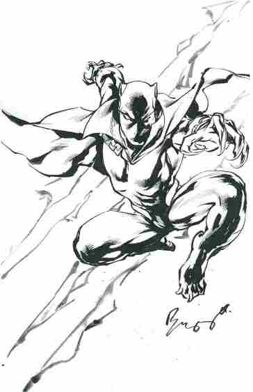
Black Panther, pencils and inks by Buzz

There is no passion to be found playing small – in settling for a life that is less than the one you are capable of living.

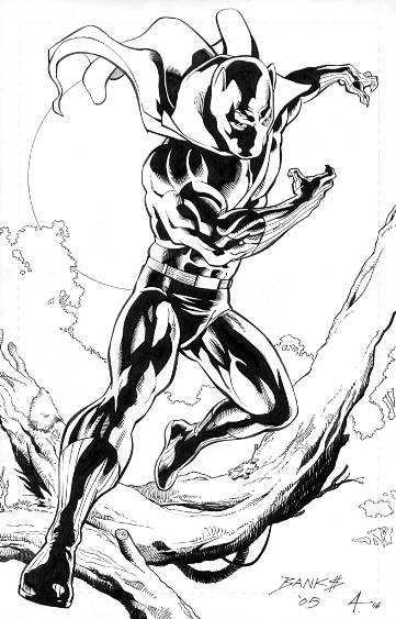
Black Panther, pencils by Darryl Banks, inks by Bob Almond

A fundamental concern for others in our individual and community lives would go a long way in making the world the better place we so passionately dreamt of.

Black Panther, pencils by Paul Boudreaux

I learned that courage was not the absence of fear, but the triumph over it. The brave man is not he who does not feel afraid, but he who conquers that fear.

Black Panther, pencils and inks by Steve Rude

We must use time wisely, and forever realize that the time is always ripe to do right.

Black Panther and Storm, pencils by Ron Adrian, inks by Bob Almond

A good head and a good heart are always a formidable combination.

Black Panther, pencils and inks by Geof Isherwood

Rest in peace, Mr. Mandela.

And that’s your Comic Art Friday.