Archive for the ‘Hero of the Day’ category

Comic Art Friday: Common Elements Sesquicentennial

December 1, 2017

When I began my Common Elements commission series back in 2004, the thought never really seeped into my consciousness that one day I would own 150 of these custom artworks. And yet, 13 years later, here we are.

Mary Marvel and Isis, pencils and inks by Ramona Fradon

From the beginning, Common Elements has been a labor of love. (Or maybe obsession.) Not only has it afforded me the opportunity to interact with more than 100 individual comic artists — 111 at present count — but it’s also served as a unique testimony to my spider-web-like thought process.

People who know me in the real world will attest that I have a bizarre knack for mentally tying disparate things together. Mention a movie, a book, a song, or even just a word, and I immediately think of a dozen other items that connect in some way to whatever you mentioned. (If you want to know the secret to my dubious success as a Jeopardy! champion, that’s two-thirds of it right there.) Sometimes those connections are obvious. Sometimes they’re ties that almost no one else would identify. And that, of course, is Common Elements in a nutshell.

(Which reminds me: I really need to get Squirrel Girl into a CE. And yes, I already have a couple of ideas.)

When I realized that the next Common Elements piece I commissioned would be #150, I wanted to do something special to mark the anniversary. Then a note scrolled by on my Facebook feed indicating that Eisner Hall of Fame artist Ramona Fradon was celebrating her 91st birthday. Since I don’t know of any comic artists who are 150 years of age and still drawing breathing, I figured that the legendary Ms. Fradon was as close as I was likely to find. Toss in the fact that Ramona also penciled Common Elements #91 (featuring her co-creation Metamorpho alongside Hourman), and the appropriateness could not have been more clear.

Knowing the lovely lighter tone which with Ms. Fradon depicts characters, I assigned her the pairing of Mary Marvel and Isis. Those of you of a certain vintage will remember that Mary’s brother Captain Marvel (called Shazam in more recent DC comics, mostly due to trademark conflicts involving the several Marvel Comics characters known as Captain Marvel, all of whom postdate the Big Red Cheese) headlined his own live-action Saturday morning TV series in the mid-1970s.

Originally, Filmation — the studio that produced the program — wanted to pair Captain Marvel with his sister Mary. Depending on whose account you believe, either DC wanted more money in broadcast rights fees for the use of Mary Marvel than Filmation wanted to pay, or DC refused to offer Filmation Mary’s broadcast rights in order to keep her available for future TV/movie projects. Whatever the particulars, Filmation decided to proceed without Mary. Instead, they created a new character called Isis, who shared several of Mary’s attributes — an ordinary young woman (an adult schoolteacher, unlike the teenaged Mary) gained a costume and superpowers (based on figures from Egyptian mythology, whereas Mary’s derived from mostly Greco-Roman deities) by speaking a magical incantation (“O mighty Isis!” instead of “Shazam!”). Thus, The Secrets of Isis became the companion series to Filmation’s Shazam!

DC published, concurrent with the TV show, a comic book series featuring Isis. They didn’t hire Ramona Fradon to illustrate it, but as you can judge from our featured artwork, they would not have been wrong if they had. (No slight intended to the talented Mike Vosburg, who drew most of the Isis comics and did a fantastic job.)

Interestingly, a retooled version of Isis recently joined the cast of the TV series, DC’s Legends of Tomorrow. The new character, played by actress Tala Ashe, goes by the code name Zari instead of Isis, for reasons that you can easily surmise if you’ve read or watched the news anytime in the last decade. And though she doesn’t transform, she does wear an amulet resembling the one originally worn by Isis.

In honor of Common Elements’ 150th, I’ll share a few random facts about the series to date:

Most prolific pencil artist: Ron Lim, with six Common Elements credits (CE #’s 48, 80, 100, 111, 118, and 124).

Most prolific inker: Bob Almond, who has inked 15 Common Elements projects thus far, and will doubtless ink more in days and years ahead.

Characters most frequently represented: Wonder Woman and Vixen, with four appearances each (although none together). Six characters have made three appearances: Storm, Valkyrie, Luke Cage, Ms. Marvel, Mary Marvel, and Black Cat (that’s Linda Turner, the Golden Age Black Cat; the modern-era Black Cat, Felicia Hardy, appears only twice, counting one commission that is currently in progress). A total of 39 characters appear twice each.

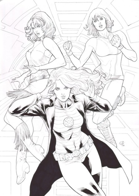
Characters who appear in multiple guises: Four Jean Grey (as Marvel Girl and Phoenix), Steve Rogers (as Captain America and Nomad), Michael Jon Carter (as Booster Gold and Supernova), and Greer Nelson (as Tigra and The Cat).

And the saddest list of all — the artists who have passed since contributing their Common Elements creations: RIP Herb Trimpe, Rich Buckler, Ernie Chan, Dave Hoover, Tony DeZuniga, and Al Rio. I’ll extend an honorary mention to Dave Simons, who was working on a Common Elements commission at the time of his passing. The concept Dave was assigned was later commissioned to, and completed by, Dave’s longtime collaborator Bob Budiansky (CE #92).

Questions I’m asked:

What’s your favorite Common Elements commission? I’d never be able to narrow it to just one. Even if I chose a Top Ten, I might pick an entirely different group if you asked me on another day. Thus, my standard answer: “The next one.”

If money were no object, who’s the “holy grail” Common Elements artist? It would be difficult to top a Common Elements piece by Adam Hughes, Alex Ross, or Mark Schultz. There are several others close to those three, but whom I realistically think I might be able to land someday.

Are there artists who are no longer with us whom you regret not commissioning when you could have? So many… but at the top of the list (limiting the scope to artists active since I began Common Elements) would have to be Mike Wieringo and Darwyn Cooke. My all-time dream would be Dave Stevens, but Stevens would have been unattainable even when he was still alive and working.

Name three artists from any period in history you’d resurrect to draw a Common Elements commission. Titian, Alphonse Mucha, and Albert Joseph Moore. Add one from comics history: Matt Baker.

How many Common Elements concepts are still on your to-do list? Probably another 150… and the list grows all the time.

And that’s your Comic Art Friday.

SwanShadow Gives Thanks 14: As God is my witness, I thought turkeys could fly

November 23, 2017

Each year, since this humble (in the classic sense of “low to the ground”) blog began in 2004, I’ve paused on Thanksgiving Day to take stock of the many things in my life and in the world about me for which I’m grateful. If I took the honest measure of my blessings, I’d be typing nonstop between Thanksgivings, and I’d never get much life lived. (Plus, these posts would get even more unbearably lengthy than they already are.)

So I hit upon the idea of choosing just 26 items, sorted alphabetically, to represent by means of metonymy the countless people and things for which I am grateful.

It’s been an interesting year. The Pirate Queen began a new job, which she enjoys, and where she is appreciated and fulfilled. I landed one of my most daunting voiceover projects this summer, survived a hectic busy season with my largest client, and checked a box off my career bucket list by booking a gig for one of the most recognizable companies on the planet. We traveled a bit, as we are wont to do.

The Daughter hit a pair of milestones: she, like the Pirate Queen, began a new job — one that she’s been chasing hard for a few years — and she and her beloved (formerly The Boyfriend, now The Fiance) got engaged. They’ll be married next May, prompting yet another nomenclatural change. The Daughter is  thrilled to begin these new chapters in her life, and I am thrilled — with a father’s wistful trepidation — for her. She wishes her mother was here to share her joy. I wish that too. But as the old saying goes, if wishes were horses, beggars would ride. So walk on, we shall.

2017 will be forever remembered in the North Bay as the Year of the Firestorm. If you live hereabouts, you know — and perhaps lived through — the devastating wildfires that destroyed thousands of structures across Sonoma and Napa counties. The Daughter and her Grandma were evacuated from their home for a week. Many longtime friends and acquaintances don’t have homes to which to return. The city of Santa Rosa and the other hard-hit communities will rebuild, but the lives that were lost will never be restored, and the precious possessions of thousands of people will never truly be replaced. I can’t put into words the sadness I feel for those I know — and so many others I don’t know — whose lives were irrevocably altered, even as I also can’t express my relief that my precious Daughter’s life was spared.

Walk on, we shall, indeed.

But enough preamble. Here’s the fourteenth installment of my annual Thanksgiving list. Next year, should we all live to see it, I’ll have to add a whole new table in the Word document where I keep track of each year’s offerings. (The chart is seven columns wide, and this will fill out the second chart.) For now, here’s what I’m grateful for… among so much else.

Almond butter. The Pirate Queen brought a jar home the other day from Trader Joe’s. In a world awhirl with chaos, the simple pleasure of an almond butter and blackberry jelly sandwich is an amazing comfort.

Blue Öyster Cult. This year on LearnedLeague (the world’s toughest online trivia league, and why haven’t you asked me for a referral yet?), I was privileged to write a quiz about a band whose music I’ve grokked since my high school days. (Yes, we had music then, you young punk. With electric guitars and everything.) I’ve still got a fever, and the only prescription is more cowbell.

Cabo San Lucas. Neither the Pirate Queen nor I had ever been to Cabo before our weeklong vacation there in February. We enjoyed our stay immensely. It’s not Hawaii — this was the first year in the last five that we didn’t visit my childhood home — but it’s lovely nonetheless. We’ll return, no doubt.

Draymond Green. He may be the third or fourth best player on the Warriors. He might also be the most irreplaceable. No one plays defense at a more intense level than Money 23. The Daughter has a picture of herself with him from a photo op before he rose to NBA All-Stardom.

Electricity. Thank you, Ben Franklin. (I’m still annoyed about that $100 bill question from Millionaire, though. Just so you know.)

Firefighters and First Responders. They couldn’t save every home and storefront in the North Bay, but they worked tirelessly and valiantly to save as many as they could, and to rescue and help as many people as possible. The community will never forget their efforts and dedication.

Gal Gadot. As a lifelong fan of Diana of Themyscira, I wasn’t fully convinced when the little-known Israeli actress landed the role. I’m convinced now. I’m glad Gal is our Wonder Woman. Change our minds, and change the world.

Hamilton. We had the opportunity to see the smash hit musical in San Francisco this summer. We did not throw away our shot. Few popular entertainments live up to their hype, but Lin-Manuel Miranda’s masterpiece gets as close as you’d imagine.

Ice hockey. I know, I know. I’m the guy who refers to hockey as “soccer on ice with sticks.” But thanks to the largesse of a good friend who’s a San Jose Sharks season ticketholder, we saw our first in-person game last season. It really is a heck of a sport to watch in person, in ways that don’t translate well on television. I’m a believer.

Jetways. I’m old enough to remember… okay, slow down; not the Wright brothers — but the days when you actually had to walk out onto the tarmac and climb a mobile staircase in order to board a plane at many airports. Give me the stretchable hallway any day.

Kilimanjaro. She rises like Olympus above the Serengeti.

Linseed oil. Also called flaxseed oil, it’s the stuff that keeps the insides of my cast iron skillets silky smooth and nonstick. Liquid gold, it is.

Monet and Munch. We toured a pair of spectacular art exhibitions this year: Claude Monet: The Early Years at the Legion of Honor, and Edvard Munch: Between the Clock and the Bed at SFMOMA. In general, I’m not especially partial to Expressionist art, but seeing the work of these two great masters up close was powerfully impactful. I’m already looking forward to the next Monet exhibition here in two years.

NextDraft. Every day, I check in with several news sites and aggregators to keeptrack of what’s going on in this crazy world. Dave Pell’s NextDraft stands as one of the best curated aggregators I’ve come across. Dave skillfully mixes links to the day’s hard news with items that are merely fascinating. Always topical, always informative.

‘Oumuamua. “Strange visitor from another world” used to just mean Superman. Now, it’s the first object officially identified by astronomers as having traveled into our solar system from interstellar space. A cigar-shaped asteroid estimated at around 500 feet in length, its Hawaiian name means “scout” or “messenger.”

Patek Philippe. I narrated the first-ever full-scale North American exhibition by the world-renowned Swiss watchmaker this summer. In the process, I learned a ton about the craftspeople who design and build these incredible (and incredibly expensive) timepieces that can not only tell time, but in some instances play symphonies, display lunar cycles, and calculate dates hundreds of years into the future — all using mechanical, analog functionality. No microchip, no battery, just precision clockworks.

Quesadillas. Because hot, melty, delicious cheese.

Red Special, the one-of a kind guitar built by Brian May in his garage when he was a teenager, and which has lent its unique tone to Queen albums and concerts for more than four decades. I recently saw Brian wield his legendary axe in person for the first time in 35 years, and both guitar and guitarist amaze me still as much today as they did back then. If Brian and the Red Special had never given the world anything besides “Fat Bottomed Girls,” it would have been gift enough.

My Steel Will 1505, a.k.a. the Gekko, has featured as my everyday carry pocket knife for most of the past year. Solid, sturdy, and wicked sharp, with its maroon Micarta handle scales and black D2 steel blade, it’s both a workhorse and a creature of quiet beauty.

Thumbtack. The online service offers access to all kinds of local professionals, from electricians to mobile disc jockeys to personal trainers. Plus, they keep the Pirate Queen gainfully employed, for which we are enormously thankful.

“Unwritten”
Feel the rain on your skin.
No one else can feel it for you —
Only you can let it in.
No one else, no one else
Can speak the words on your lips.
Drench yourself in words unspoken;
Live your life with arms wide open;
Today is where your book begins —
The rest is still unwritten.

Vision. Last night, I stood on a BART train next to a blind man accompanied by his golden retriever guide dog. Even with my acute myopia and astigmatism — easily remedied by contact lenses — I am blessed that, unlike that unfortunate gentleman, I can open my eyes and see the world. Today, I’m not taking that for granted.

Women — and I have some wonderful ones in my life: the Pirate Queen, The Daughter, her Grandma, and more treasured friends and colleagues than I can list, along with the memory of KJ and the three decades we shared together. Our culture is currently awash with a tsunami of women finally feeling emboldened to speak out against the abuse, harassment, and disrespect they’ve experienced, and I applaud and support them. Be heard, sisters. Your voices matter.

XTC. Quirky, edgy, and impossible to categorize, Andy Partridge, Colin Moulding, and company formed one of the most underrated bands in the history of pop music. “Generals and Majors,” “Senses Working Overtime,” “The Mayor of Simpleton,” and the controversial “Dear God” — even if you didn’t understand all of the ideas (or didn’t agree with them), you had to admire the style.

Yeast — fueling bakeries and breweries for thousands of years. Except during Passover.

Zapper — that’s what I call my racket-shaped electric wand that strikes fear into the hearts of flying pests that dare disturb the sanctity of my abode. I’m perfectly content to let buzzing bugs buzz outdoors in their own environment, as long as they don’t attack me. But if you come into my airspace, critter, I’ve got some voltage waiting for you.

And as always, friend reader, I’m grateful for you, and the time you take to peruse my rambling prose. May you and yours find much for which to be appreciative on this Thanksgiving Day.


Comic Art Friday: I’m tho Thor I can’t even potht

November 10, 2017

Have you seen Thor: Ragnarok yet? In a word: Go!

The two previous Thor films were my least favorite Marvel Cinematic Universe entries — that is, aside from The Incredible Hulk, for which I give Marvel Studios a pass because they were still figuring things out at that point. (Also, Edward Norton.) But Thor: Ragnarok totally makes up for its two predecessors by abandoning their ponderous tone and going all-in on fun, humor, and visual bombast. I hope director Taika Waititi gets to make a few more Marvel movies, because he hammered this one out of the park.

My Ragnarok afterglow had me looking back at Thor’s representation in my comic art collection. One of the very first artworks I purchased — I think it’s the fourth or fifth longest-tenured piece in my entire collection — was this dazzling portrait by Geof Isherwood, later inked by Bob Almond.

Thor_IsherwoodAlmond

Purely by coincidence, the very next piece I bought also featured Thor, this time alongside his Ragnarok costar, the Hulk. Dan Jurgens penciled this one, and again, I commissioned Bob Almond some time afterward to complete the piece in ink.

HulkThor_JurgensAlmond

Thor has made, to date, two appearances in my Common Elements theme. In Common Elements #12, penciler Trevor Von Eeden and inker Joe Rubinstein pit the Odinson in a “Showdown!” against another hammer-wielder, Steel.

ThorSteel_VonEedenRubinstein

And in Common Elements #82, Thor meets his fellow demigod-turned-superhero Isis, under the creative auspices of the great Steve Rude.

Isis_Thor_Rude

The Valkyrie makes her cinematic debut in Thor: Ragnarok, portrayed with grit, grace, and swagger by actress Tessa Thompson. Here’s the comics version of Val with her trusty winged steed Aragorn (who also makes a brief cameo in Ragnarok via a flashback sequence) as envisioned by Geof Isherwood.

Valkyrie_Isherwood

Just for good measure, one more Valkyrie image, this time by Phil Noto.

Valkyrie_Noto

Again, if you haven’t seen Thor: Ragnarok already, I highly recommend it. Pro tip: It’s worth the extra few bucks to see it in IMAX 3D (or just regular 3D, if the IMAX option isn’t available in your neck of the woods), for the astounding visuals.

And that’s your Comic Art Friday.

Comic Art Friday: All those who oppose this Shield must yield

October 20, 2017

I’ve noted many times in this space that I don’t collect much published comic art, preferring to focus on pieces I commission for my various themes. But there have been occasional exceptions to this policy. Case in point: today’s featured artwork.

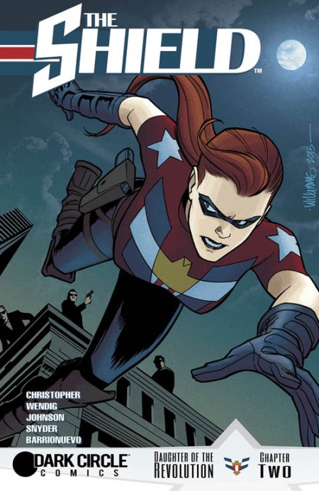
The Shield, issue 2, original cover art by David Williams

Archie Comics, best known for the comedic adventures of its namesake character and his teenage friends, has over the years made periodic forays into the superhero genre. Most of these efforts have been short-lived and nonimpactful. That’s not to say that they haven’t been good comics; only they haven’t left much of a mark against the more familiar lines published by Marvel and DC.

The parent company of Archie, then known as MLJ Comics, began offering superhero stories way back in 1939, when the genre first exploded onto the scene. Their most successful character was the Shield, a patriotic-themed hero who preceded the ultimately more famous Captain America to the newsstands by several months. The Shield was ostensibly the star of the MLJ line until Archie Andrews and pals arrived in December 1941, at which point the Shield and MLJ’s other costumed crusaders (including the Black Hood and the Wizard) got shuffled off into the dustbin of oblivion.

When superheroes became popular again in the late 1950s — the beginning of the Silver Age of Comics — the Archie folks launched a new version of the Shield in a series titled The Double Life of Private Strong. The revamped Shield sprang from the imagination of Joe Simon, co-creator (with the now-legendary Jack Kirby) of Captain America. By the mid-’60s, the Shield had teamed up with a motley assortment of other heroes — including the revived Black Hood and new characters like the Comet and the Fly — to form the Mighty Crusaders, a team intended to compete with DC’s Justice League of America and Marvel’s Avengers. The series lasted less than a year.

In the 1980s, Archie took another stab at its superhero properties, launching the Red Circle Comics brand. Red Circle brought back most of the Mighty Crusaders: Black Hood, the Fly, and the Comet, along with both versions of the Shield — original flavor (real identity: Joe Higgins) and the ’50s-’60s update (a.k.a. Lancelot Strong). As happened previously, sales lacked staying power, and the Red Circle heroes vanished once again.

These characters’ most lasting effect was inspiring the initial concept of Alan Moore’s Watchmen. Moore’s first Watchmen pitch to DC involved using the Mighty Crusaders as the leads in his dark vision, which would later morph into the former Charlton Comics heroes that DC had recently purchased (Blue Beetle, Peacemaker, Thunderbolt, et al.) before DC editorial prevailed upon Moore to create all-new characters for the project. Still, Watchmen‘s Comedian retained some of the patriotic iconography first associated with the Shield.

Most recently, in 2015, Archie once again dusted off its superheroes under the Dark Circle imprint. The latest iteration of the Shield, now a young woman named Victoria Adams, starred in her own four-issue miniseries subtitled “Daughter of the Revolution.” The book was written by Adam Christopher and Chuck Wendig, with interior art by Drew Johnson, Al Barrionuevo (issue 2), and Greg Scott (issue 4), and covers by David Williams. You can see David’s original cover art for The Shield #2 at the beginning of this post; the published version (with digital colors by Kelly Fitzpatrick) appears below.

The Shield, issue 2, published cover art by David Williams with color by Kelly Fitzpatrick

It remains to be seen whether the Shield and his/her cohorts will merit any additional love at Archie Comics. Perhaps, as has been the case previously, they’ll disappear for a couple of decades before resurfacing once more.

And that’s your Comic Art Friday.

Comic Art Friday: Cons, commissions, and connections

September 8, 2017

One of the things I enjoy most about attending comics conventions is connecting in person with the people who create comics, and more specifically, who create the original comic art that I collect. It’s easy to forget, when commissioning a piece of art via email and the Internet, that there’s a real live human being putting the pencil, pen and/or ink brush to paper to bring these images into existence.

At a con, you can look into the eyes of an artist and see the passion for his or her work; hear the thoughtfulness in her or his voice as they talk about drawing, favorite characters, and the business of comics; and watch the deft skillfulness of their hands guiding the instrument across the once-blank surface as something appears from nothingness.

I was reminded of this during the pre-Labor Day weekend, as I attended the second annual San Francisco Comic Con. Over the three days of the convention, I had several opportunities to connect personally with artists whose works have graced my collection for many years.

Among the first pieces I ever bought when I started collecting in 2004 was a pinup of Spider-Man drawn by longtime Spidey artist Alex Saviuk, who penciled a phenomenal seven-year run on the Web of Spider-Man series beginning in 1988. At the time of the purchase, Alex and I corresponded briefly via email, and he also included a lovely handwritten note — which I’ve kept with the art to this day — when he shipped the piece to me. I recall my surprise when I opened the package and discovered that Alex had hand-colored the drawing (which had been a plain ink sketch when I bought it) before sending it.

Now, thirteen years later, I finally had the chance to thank Alex in person for his kindness. Better still, I got to chat with him about comics and media — we had fun discussing the relative merits of the Spider-Man feature films, as well as the Marvel/Netflix series — and commission a new entry into my Common Elements theme. (More about the latter in an upcoming Comic Art Friday.) I was thrilled to finally put a face and voice to the note Alex had written to me back in the day.

Alex Saviuk, San Francisco Comic Con 2017

Rags Morales was another artist whose work had entered my collection more than a decade ago. In 2006, I commissioned Rags through his representative at the time for a Common Elements pairing of the Falcon and Lady Blackhawk. When I showed the drawing to Rags at SFCC, he remembered it vividly eleven years after the fact. Mostly, he recalled his dissatisfaction with how the piece had turned out — he felt that he’d nailed the depiction of Lady Blackhawk, but that his Falcon didn’t represent his finest work. (To my non-artist eyes, they both look spectacular. I’ve loved the piece since the day it arrived.)

In addition to some lively conversation, Rags also took time to create a dynamic new drawing for my Taarna gallery. Again, I’ll talk more about this artwork in a later post.

Rags Morales, San Francisco Comic Con 2017

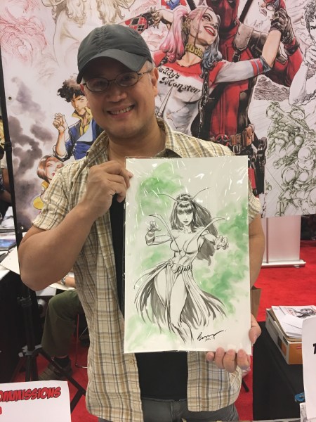
When I checked my records after the show, I was surprised to see that it had been 10 years since I’ve added a new commission by the artist known as Buzz. At WonderCon 2005, Buzz drew the very first piece I ever commissioned in person at a convention — a striking image of Vixen that remains a favorite of mine. Over the next couple of years, I became a regular at Buzz’s table when he attended both WonderCon and Super-Con (which later morphed into Big Wow ComicFest). After WonderCon moved south, though, I’d lost track of Buzz until this year’s SFCC.

Amazingly, not only did Buzz remember my name (first and last!) after all this time, but he also recalled several of the pieces he’d drawn for me — the Taarna I got at WonderCon 2007 in particular. I was pleased at how beautifully his newest creation — this drawing of Mantis, whom I don’t believe Buzz had ever drawn before — turned out. She’ll be in excellent company alongside the other Buzz masterpieces in my gallery.

Buzz, San Francisco Comic Con 2017

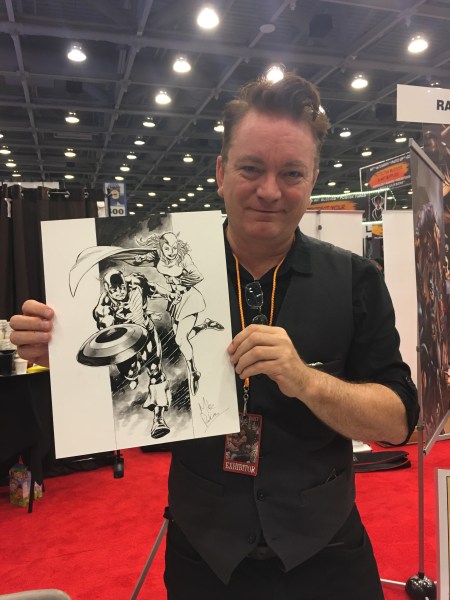
Alas, I don’t have a novel story to share about Mike Perkins, whom I’d never met or communicated with before this show. Knowing, however, that Mike had done splendid work on the Captain America series some years back, I knew that he’d be a perfect choice for this Cap-connected Common Elements pairing of the U.S. Agent and Golden Girl. And of course, Mike rocked it.

Mike Perkins, San Francisco Comic Con 2017

About San Francisco Comic Con: This event, the first of its kind in San Francisco proper since WonderCon abandoned us for southern California a few years back, is still finding its footing, but seems well on its way to carving out a niche as an outlet for Bay Area fans to get their con on.

If I have a quibble, it’s that I’d like to see the organizers doing more to court the local comic artist community. Most of SFCC’s artist guests come from outside northern California, while few of the sizable number of comics creators who live and work here have a presence at this show. One of the factors that made WonderCon and our other late, lamented local convention, Big Wow, so much fun was that most of the Bay Area-based name comic artists turned out for these shows. SFCC (which is owned by a company based in the eastern U.S.) doesn’t yet have that homegrown feel, and I miss it.

And that’s your Comic Art Friday.

Comic Art Friday: Let’s make some REAL news

August 11, 2017

I’m just back from my annual junket to the Trivia Championships of North America (TCONA) in Las Vegas, and man, is my brain fried.

I’ve attended every TCONA since the first one in 2011, and it seems as though it’s even more of a blast each successive year. It’s my one opportunity every summer to interface in person with fellow quizzers (including many other former — and some yet future — Jeopardy! champions) from all over the continent (and in a few cases, from other continents), amid the diz-busting, face-melting heat of Vegas in August.

Once again, I managed to keep my six-year medal-winning streak alive, with a bronze in the Team Trivia Championship (shared with five of the nicest and smartest people you’d meet anywhere). When you can’t be the brightest bulb in the room, it’s good to be one of the luckiest.

Best of all, the Pirate Queen joined me as usual at the end of the convention for a few days of Vegas-style R&R, as we are wont to enjoy.

But you’re here for the comic art, aren’t you?

All righty then.

Starman and The Creeper, pencils and inks by Tom Derenick

Today’s featured artwork is this tremendous effort by Tom Derenick, a leading contender in the Why Isn’t This Artist More Famous? sweepstakes. Our latest dip in the Common Elements theme pool matches The Creeper, one of Steve Ditko’s less prominent creations, with the Golden Age hero Starman. What in the wide world of DC Comics might these two have in common, you ask? Perhaps more than you’d think.

When we first encounter the man who would become The Creeper in Showcase #73 (March 1968), he’s Jack Ryder, an obnoxious blowhard TV personality. Starman in civilian life is Ted Knight, who shares his name with an actor (sadly, no longer with us) best known for playing… wait for it… an obnoxious blowhard TV personality. There’s your first common element.

I say “first” because sometimes when I devise a new Common Elements concept, I’m so focused on the idea I have for the project that I miss entirely plausible alternate connections between the characters involved. My good friend and colleague, the legendary commission collector Damon Owens, was quick to point out one here that I didn’t even think about.

The alter egos of these two characters go together to form “Knight Ryder,” a title differing only in spelling from that of a popular action-adventure program from the 1980s. That series, coincidentally, starred David Hasselhoff, a man who also fits the description of… wait for it… an obnoxious blowhard TV personality.

(Incidentally, any additional connection, real or imagined, to an obnoxious blowhard TV personality currently in national public office is 100% serendipitous. *cough*)

So, there’s another common element — one you’d suppose that a self-professed trivia maven such as your Uncle Swan would have picked up on from Jump Street.

Alas, no. Therefore, my thanks to Damon for sweeping the glass and snatching the uncontested rebound.

Back to our spotlight heroes for a moment. As noted previously, The Creeper sprang from the fevered imagination of Steve Ditko — probably best known as the artist co-creator of Marvel’s Spider-Man and Doctor Strange, but also the source of such characters as The Question, Hawk and Dove, and Shade the Changing Man.

In his debut adventure, Jack Ryder becomes The Creeper through the most unlikely of circumstances. In his capacity as a security expert for the television network that recently fired him from his talk-show-hosting duties, Ryder hunts down the subversive agents who kidnapped a famous scientist. While tracking the kidnappers, Ryder crashes a high-society masquerade ball wearing a costume he threw together from random items — the costume that later becomes The Creeper’s signature look. When Ryder finds the missing scientist, the man gives him a serum that speeds healing from injury, along with a device that enables Ryder to transform his apparel from his everyday clothes to his Creeper garb in the blink of an eye. The scientist is soon murdered, leading Ryder to devote himself to battling evildoers.

Starman’s history dates back to Adventure Comics #61 (April 1941), wherein astronomer Ted Knight invents a device he dubs a gravity rod. This handheld implement allows Knight to fly and to fire blasts of energy at his opponents. Almost a year later, in All-Star Comics #8 (January 1942 — the same issue in which Wonder Woman makes her debut appearance, although in a separate story), Starman and blind crimefighter Doctor Mid-Nite join the Justice Society of America, the original superhero team.

Starman faded from the scene (like most Golden Age superheroes) in the late 1940s. In the intervening decades, several other DC characters have used the Starman identity — some connected by legacy to the original Ted Knight version, others completely unrelated. A cynic might opine that DC keeps creating new Starman types merely to keep its trademark alive… but we’re not cynics here, are we?

Returning to our artwork: Not only does Tom Derenick draw with classic style and razor-sharp precision, but he also employs a brilliant twist of perspective here. If you look closely at the background, you’ll notice that the “bottom” of the scene from a real-world point of view is actually the right-hand side of the frame (in other words, that’s where the “ground” is). Thus, in portrait orientation — which is clearly how Derenick expects the viewer to see the image — it appears that The Creeper is jumping down onto an upwardly rising Starman, in attack mode. But when we adjust the angle, and put the bottom of the frame where it would actually be, we observe that it is in fact Starman who has the upper hand, and The Creeper is leaping (or falling) backward, away from his opponent. (See the rotated image below.)

Starman and The Creeper, pencils and inks by Tom Derenick

It’s a masterful shot, perfectly designed and executed. When Tom sent me his preliminary sketch early on in the project, the background was merely suggested by a handful of lines. Only when I saw the finished piece fully rendered could I understand and appreciate what the artist envisioned. I was completely blown away. You might be too.

As with so many things in this life, it’s all in how you look at it.

And that’s your Comic Art Friday.

Comic Art Friday: Grass queen

July 21, 2017

It’s no secret that my comic art collection focuses primarily on characters in the superhero genre. When it comes to reading, however, I’ve always enjoyed a broad range of comics — everything from Conan the Barbarian to Josie and the Pussycats.

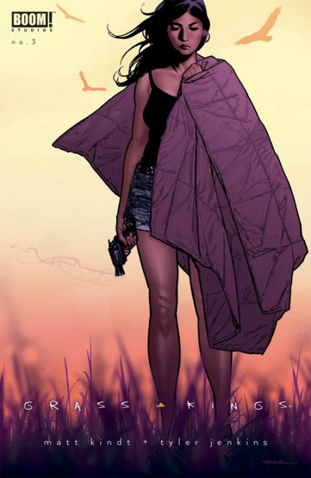
One of my current jams is a series from BOOM! Studios called Grass Kings, written by Matt Kindt, and illustrated in pencils and watercolors by Tyler Jenkins. It’s difficult to describe what Grass Kings is about. In terms of genre, I suppose you could classify it as a mystery or suspense thriller, wrapped tightly in character drama. Tonally, it’s sort of like Twin Peaks meets The Walking Dead, only without the psycho-supernatural weirdness of the former or the zombies of the latter.

The series tells the story of a trailer-park community in the middle of the Western prairie (the “grass” of the title) that has set itself up as a more-or-less self-sufficient outpost of civilization under the leadership of three brothers (the “kings”). The inhabitants of the Grass Kingdom strive to avoid interaction with the outside world at all costs… until circumstances make that impossible.

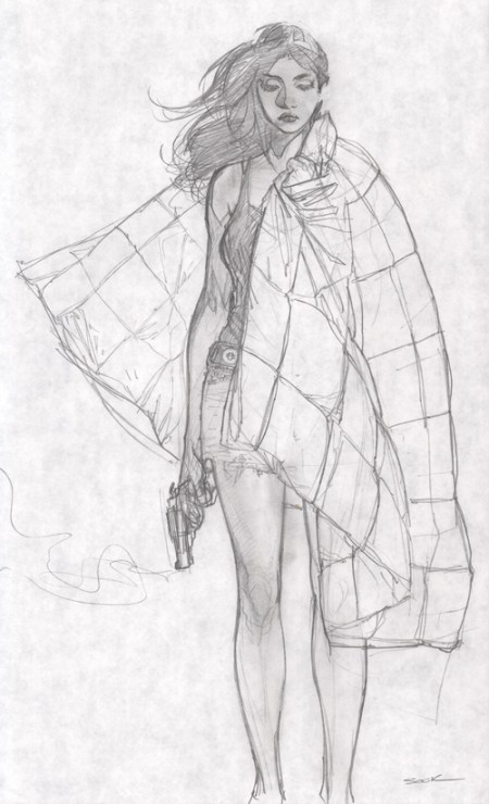
Regular artist Jenkins contributes the cover art as well as the interiors. As is the way of things in the present-day comics world, however, most of the issues have been released with variant covers available as retailer premiums. When I talked with Ryan Sook at Silicon Valley Comic Con a few months back, I learned that he had just completed the variant cover for the then-upcoming Grass Kings #3. I was thrilled to score Ryan’s preliminary sketch for this cover, which appears below, along with the finished art as published.

Grass Kings issue 3 variant cover, preliminary pencil sketch by Ryan Sook

Grass Kings issue 3 variant cover, art by Ryan Sook

There’s a tiny niche gallery in my collection entitled Pin-Ups With Pistols (a spin on the Tommy Shaw 1984 album title song Girls With Guns) where this sketch fits perfectly. It’s a callback to all those noir films — and the femmes fatale who starred in them — before which I sat transfixed in my youth. They sure don’t make ’em like that any more.

And that’s your Comic Art Friday.

Comic Art Friday: She shelled Bombshells by the seashore

July 14, 2017

One of the many things I enjoy about my Bombshells! commission theme is the opportunity to spotlight heroines from long-ago comics history who’ve either been forgotten or are simply no longer as prominent as they once were.

Case in point: Namora, cousin of Namor the Sub-Mariner.

Namora, pencils and inks by Tim Tyler

The late 1940s and early 1950s were something of a dark period for superhero comics. After World War II ended in 1945, superheroes — a mainstay of American popular culture during the war years — quickly faded in popularity. Many of the hundreds of costumed characters who’d sprung up in the first half of the decade disappeared, and relatively few new superheroes popped up until Barry Allen, the Silver Age Flash, arrived in late 1956.

Namora made her debut appearance in May 1947, in Marvel Mystery Comics #82. She proved popular enough that she was promoted to her own title a year later, a book which lasted all of three issues. (I know what you’re thinking — three issues is not a very solid run. Still, it’s three more issues than either you or I have headlined our own comic book.) After her title was cancelled, Namora continued to appear as a regular supporting player in her better-known cousin’s adventures well into the Fifties.

The Namora series was part of a forward-thinking but short-lived initiative by Timely Publications (predecessor of what would become Marvel Comics by the early 1960s) to promote superheroines in their own eponymous titles. Two other female characters, Sun Girl (seen below in her Bombshells! appearance, drawn by Gene Gonzales) and Venus, also received ongoing series at the same time. Although Sun Girl, like Namora, only managed to eke out three issues, Venus sailed along for a total of 19, a run that lasted into early 1952.

Sun Girl, pencils and inks by Gene Gonzales

As for Namora, she’s still around the Marvel Universe in the 21st century. She turned up as a key member of the super-team Agents of Atlas a decade ago, and also played a role in the World War Hulk storyline.

Artist Tim Tyler, usually a horror specialist, turns in a nice nostalgic effort for Namora’s Bombshells! portrait. Tim’s style reminds me a bit of the EC Comics of the 1950s, so I thought he’d be perfect for an entry in my retro theme.

And that’s your Comic Art Friday for this Bastille Day.

Comic Art Friday: Top Ten from the Temple of Diana

June 23, 2017

Yes, I know this Wonder Woman tribute post is a few weeks overdue. I had intended to do something to coincide with the premiere of the film (which I loved, incidentally), but just didn’t get to it until now.

Wonder Woman has been one of my favorite comic book heroes for nearly half a century. She has also been a cornerstone of my comic art gallery since I began collecting in earnest 13 years ago. I own more artworks featuring Diana of Themyscira than of any other character — more than 60 pieces, at current count, which is twice as many as the second leading character in my collection (Supergirl). Aside from my Common Elements theme, Wonder Woman art represents the largest single segment of my collecting hobby.

Choosing among my Dianas proved no easy task, but here are my ten favorite (at least today) Wonder Woman images, listed alphabetically by penciler.

Diego Bernard

WonderWoman_Bernard

As classic as it gets — powerful, graceful, beautiful. When I close my eyes and think “Wonder Woman,” she looks pretty much like this.

Michael Dooney (Bob Almond, inks)

WonderWoman_DooneyAlmond

Michael Dooney is a pinup artist par excellence. His stylish take on Diana — with a couple of costume suggestions from your Uncle Swan — demonstrates that.

Adam Hughes

WonderWoman_Hughes

If I can only own one Adam Hughes original — and to date, that’s been the way that circumstances and budget have worked out — it might as well be his deft take on Diana. Hughes is most widely renowned for his rendering of the feminine form, but it’s the eyes that make this one.

James E. Lyle (Buzz Setzer, colors)

WonderWoman_LyleSetzer

I love seeing a unique take on a familiar character. James E. Lyle (“Doodle” to his friends) creates a winner here.

Peter Krause

WonderWoman_Krause

I refer to this picture as “Diana’s Day Off.” I love the idea of her just relaxing by a lake, dipping her toes into the cool water, and letting someone else battle evil for a day.

Geof Isherwood

WonderWoman_Isherwood

Geof Isherwood is one of the most underrated artists in the business, period. His approach to Diana here is simultaneously classic, ultra-modern, and just a tiny bit off-center… in a good way.

Alan Patrick (Bob Almond, inks)

WonderWoman_PatrickAlmond

A perfect setting for our Amazon warrior — a battle that might be taking place in ancient Greece a couple of millennia ago. Alan Patrick’s composition is outright stunning.

Jason Michael Paz (Geof Isherwood, inks)

WonderWoman_PazIsherwood

I often post this piece online to honor one of our traditional servicepersons’ holidays, Memorial Day or Veterans Day. Wonder Woman leads the charge into battle as only she can.

Brian Stelfreeze

WonderWoman_Stelfreeze

Few artists can convey as much with just a few perfectly placed lines as can Brian Stelfreeze. And his acting — the expressions on his faces, the body language of his figures — never fails to be anything but powerful.

Al Rio (Geof Isherwood, inks)

WonderWoman_RioIsherwood

The first Wonder Woman piece I ever personally commissioned. The particulars of Diana’s costume were my suggestion. Everything else you see here sprang from the imagination of the now departed and deeply missed Al Rio. What a phenomenal talent the comic art world lost when he left us.

Let’s add one honorable mention. I don’t fully embrace the notion of a Wonder Woman / Superman romance for several reasons, but this piece is just so darned cute, it almost makes me a believer. Sadly, it’s the only original artwork I own by the late Mike Wieringo, whose work I absolutely love.

Mike Wieringo (Richard Case, inks)

WonderWoman_Superman_WieringoCase

If you’re interested in checking out my Temple of Diana in its entirety, pop on over to my gallery at Comic Art Fans. There, you can see every Wonder Woman artwork I own, along with a bunch of other amazing art that happens not to feature the Themysciran Princess.

And that’s your Wonder Woman Art Friday.


Comic Art Friday: Quoth the Raven: “Nevermore!”

May 19, 2017

As much as I enjoy concocting convoluted connections between otherwise unrelated characters for my Common Elements commission series, quite often the simpler and more obvious matchups produce equally fine results.

Case in point: this pairing of long-time X-Men nemesis Mystique (real name: Raven Darkhölme) and Raven from the Teen Titans, drawn by veteran comic artist Ron Randall.

Mystique_Raven_Randall

The later films in Fox’s X-Men series cast Mystique as a member of the heroic superteam, which in my opinion doesn’t serve the character well. I’m perfectly cool with versions of comics characters in live-action media diverging somewhat from their comic-book counterparts — I think Marvel Studios has, for the most part, done a decent job of tweaking characters to fit the needs of its big-budget blockbuster movies — but I just don’t think Mystique works as a heroine. She’s much more compelling as a villain.

(And yes, I understand why Fox took the turn they did. When Mystique was recast from C-lister Rebecca Romijn to Oscar-winning superstar Jennifer Lawrence, Fox made Mystique a “good guy” because J-Law’s Millennial fans won’t pay to see her playing a “bad guy.” Such are the realities of Hollywood.)

In addition to switching sides mid-series, the movie Mystique also lost one of the key distinctions that made her backstory unique. In the comics, the ancient and ageless Mystique is the birth mother of the X-Man Nightcrawler, and the foster mother of another X-Man, Rogue. Because Mystique begins the cinematic narrative as a young girl, she doesn’t have these familial connections. Again, I understand why the changes happened, but I think the comics character’s history is much more interesting.

Speaking of interesting histories, Raven comes equipped with one — she’s the spawn of the dimension-hopping demon Trigon and a human woman named Angela Roth, who later calls herself Arella. As a teenager, Raven joins the Teen Titans to combat her father and ultimately defeat him. Her hybrid parentage endows Raven with a variety of superhuman powers, ranging from empathic sensitivity to the ability to cast a “soul-self” — a sort of astral projection — that usually takes the form of a (wait for it…) raven.

Today’s artist, Ron Randall, has been drawing comics for the major publishers for more than 35 years. Beginning his career with a healthy run on DC’s classic war comic Sgt. Rock in the early 1980s, Ron has illustrated significant stints on such series as The Warlord, Arak, Son of Thunder, Dragonlance, and both Justice League International and Justice League Europe for DC, Star Trek Unlimited and Venom for Marvel, and his own creation Trekker (no relation). Most recently, Ron’s work appears alongside that of other outstanding artists — among them Steve Rude and Evan “Doc” Shaner — in DC’s entertaining Future Quest, which weaves together the adventures of several Hanna-Barbera animated heroes from the 1960s, including Jonny Quest, Space Ghost, and the Herculoids.

Back to Ravens for a moment. Edgar Allan Poe’s The Raven has been one of my favorite poems as long as I can remember. It’s a flawless blend of atmosphere, wordplay, and desperation. These days, I frequently read it aloud as a warmup when I have character voice work — particularly narration — on my work agenda for the day. Every time I perform it, I find new twists and nuances in the words and rhythms. Well done, Mr. Poe.

And that’s your Comic Art Friday.